首先看官网的DataFrame.plot( )函数
DataFrame.plot(x=None, y=None, kind='line', ax=None, subplots=False,
        sharex=None, sharey=False, layout=None,figsize=None,
        use_index=True, title=None, grid=None, legend=True,
        style=None, logx=False, logy=False, loglog=False,
        xticks=None, yticks=None, xlim=None, ylim=None, rot=None,
        xerr=None,secondary_y=False, sort_columns=False, **kwds)
参数详解如下:
Parameters:
x : label or position, default None#指数据框列的标签或位置参数

y : label or position, default None

kind : str
‘line' : line plot (default)#折线图
‘bar' : vertical bar plot#条形图
‘barh' : horizontal bar plot#横向条形图
‘hist' : histogram#柱状图
‘box' : boxplot#箱线图
‘kde' : Kernel Density Estimation plot#Kernel 的密度估计图,主要对柱状图添加Kernel 概率密度线
‘density' : same as ‘kde'
‘area' : area plot#不了解此图
‘pie' : pie plot#饼图
‘scatter' : scatter plot#散点图 需要传入columns方向的索引
‘hexbin' : hexbin plot#不了解此图

ax : matplotlib axes object, default None#**子图(axes, 也可以理解成坐标轴) 要在其上进行绘制的matplotlib subplot对象。如果没有设置,则使用当前matplotlib subplot**其中,变量和函数通过改变figure和axes中的元素(例如:title,label,点和线等等)一起描述figure和axes,也就是在画布上绘图。

subplots : boolean, default False#判断图片中是否有子图
Make separate subplots for each column

sharex : boolean, default True if ax is None else False#如果有子图,子图共x轴刻度,标签
In case subplots=True, share x axis and set some x axis labels to invisible; defaults to True if ax is None otherwise False if an ax is passed in; Be aware, that passing in both an ax and sharex=True will alter all x axis labels for all axis in a figure!

sharey : boolean, default False#如果有子图,子图共y轴刻度,标签
In case subplots=True, share y axis and set some y axis labels to invisible

layout : tuple (optional)#子图的行列布局
(rows, columns) for the layout of subplots

figsize : a tuple (width, height) in inches#图片尺寸大小

use_index : boolean, default True#默认用索引做x轴
Use index as ticks for x axis

title : string#图片的标题用字符串
Title to use for the plot

grid : boolean, default None (matlab style default)#图片是否有网格
Axis grid lines

legend : False/True/'reverse'#子图的图例,添加一个subplot图例(默认为True)
Place legend on axis subplots

style : list or dict#对每列折线图设置线的类型
matplotlib line style per column

logx : boolean, default False#设置x轴刻度是否取对数
Use log scaling on x axis
logy : boolean, default False
Use log scaling on y axis

loglog : boolean, default False#同时设置x,y轴刻度是否取对数
Use log scaling on both x and y axes

xticks : sequence#设置x轴刻度值,序列形式(比如列表)
Values to use for the xticks

yticks : sequence#设置y轴刻度,序列形式(比如列表)
Values to use for the yticks

xlim : 2-tuple/list#设置坐标轴的范围,列表或元组形式
ylim : 2-tuple/list

rot : int, default None#设置轴标签(轴刻度)的显示旋转度数
Rotation for ticks (xticks for vertical, yticks for horizontal plots)

fontsize : int, default None#设置轴刻度的字体大小
Font size for xticks and yticks

colormap : str or matplotlib colormap object, default None#设置图的区域颜色
Colormap to select colors from. If string, load colormap with that name from matplotlib.

colorbar : boolean, optional #图片柱子
If True, plot colorbar (only relevant for ‘scatter' and ‘hexbin' plots)

position : float
Specify relative alignments for bar plot layout. From 0 (left/bottom-end) to 1 (right/top-end). Default is 0.5 (center)

layout : tuple (optional) #布局
(rows, columns) for the layout of the plot

table : boolean, Series or DataFrame, default False #如果为正,则选择DataFrame类型的数据并且转换匹配matplotlib的布局。
If True, draw a table using the data in the DataFrame and the data will be transposed to meet matplotlib's default layout. If a Series or DataFrame is passed, use passed data to draw a table.

yerr : DataFrame, Series, array-like, dict and str
See Plotting with Error Bars for detail.

xerr : same types as yerr.

stacked : boolean, default False in line and
bar plots, and True in area plot. If True, create stacked plot.

sort_columns : boolean, default False # 以字母表顺序绘制各列,默认使用前列顺序

secondary_y : boolean or sequence, default False ##设置第二个y轴(右y轴)
Whether to plot on the secondary y-axis If a list/tuple, which columns to plot on secondary y-axis

mark_right : boolean, default True
When using a secondary_y axis, automatically mark the column labels with “(right)” in the legend

kwds : keywords
Options to pass to matplotlib plotting method

Returns:axes : matplotlib.AxesSubplot or np.array of them
1、画图图形
import pandas as pd
from pandas import DataFrame,Series
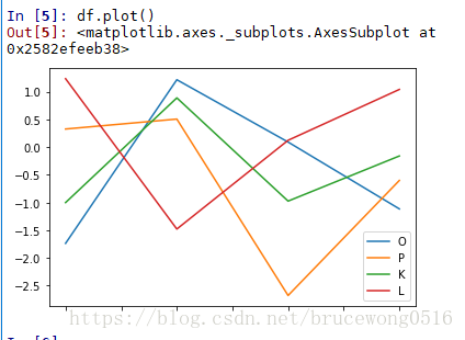
df = pd.DataFrame(np.random.randn(4,4),index = list('ABCD'),columns=list('OPKL'))
df
Out[4]:
O P K L
A -1.736654 0.327206 -1.000506 1.235681
B 1.216879 0.506565 0.889197 -1.478165
C 0.091957 -2.677410 -0.973761 0.123733
D -1.114622 -0.600751 -0.159181 1.041668
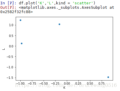
注意一下散点图scatter是需要传入两个Y的columns参数的:
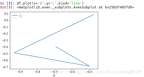
传入x,y参数
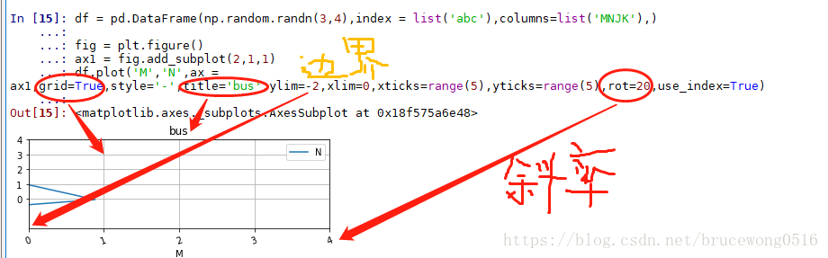
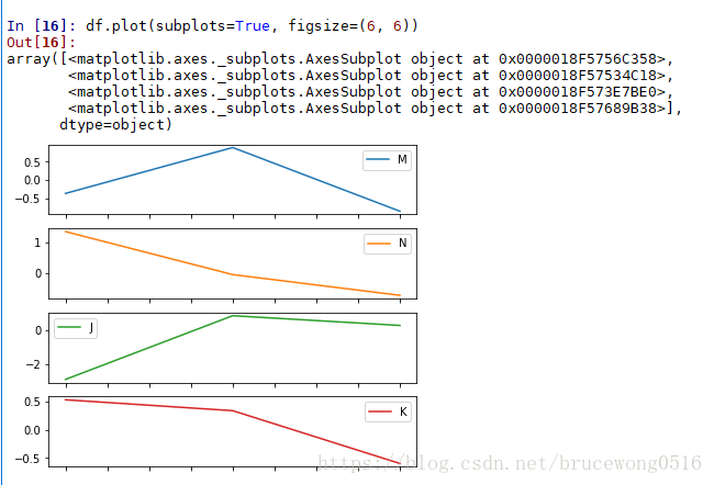
同时画多个子图,可以设置 subplot = True
2、注意事项:
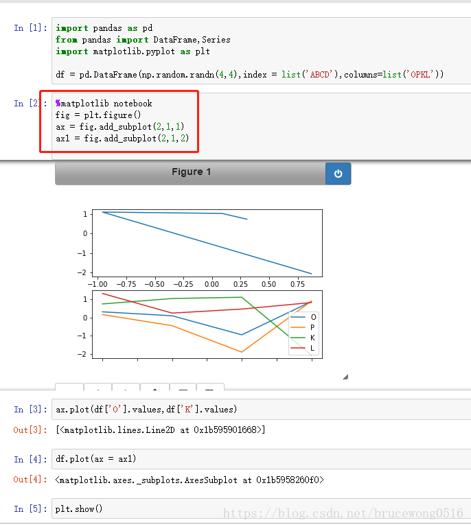
- 在画图时,要注意首先定义画图的画布:fig = plt.figure( )
- 然后定义子图ax ,使用 ax= fig.add_subplot( 行,列,位置标)
- 当上述步骤完成后,可以用 ax.plot()函数或者 df.plot(ax = ax)
- 在jupternotebook 需要用%定义:%matplotlib notebook;如果是在脚本编译器上则不用,但是需要一次性按流程把代码写完;
- 结尾时都注意记录上plt.show()