1、开启配置自定义顶部
{
 "window": {
 "navigationStyle":"custom"
 }
}
在app.json的文件window配置"navigationStyle": "custom"属性即可
2、自定义顶部计算原理
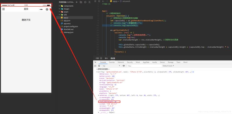
2.1 获取系统状态栏的高度和屏幕宽度
使用wx.getSystemInfo这个函数获取系统状态栏的高度和屏幕宽度。
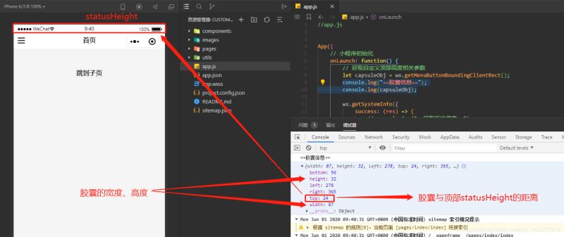
2.2 获取右上角胶囊位置信息
使用wx.getMenuButtonBoundingClientRect()方法获取右上角胶囊位置信息。
关键问题在于自定义胶囊的上、下和左边距。
2.3 自定义顶部距离计算代码
app.js代码如下
App({
 // 小程序初始化
 onLaunch: function() {
 // 获取自定义顶部高度相关参数
 let capsuleObj = wx.getMenuButtonBoundingClientRect();
 // console.log("==胶囊信息==");
 // console.log(capsuleObj);

 wx.getSystemInfo({
 success: (res) => {
 // console.log("==获取系统信息==");
 // console.log(res)
 var statusBarHeight = res.statusBarHeight; //顶部状态栏高度

 this.globalData.capsuleObj = capsuleObj;
 this.globalData.titleHeight = statusBarHeight + capsuleObj.height + (capsuleObj.top - statusBarHeight) * 2;
 },
 failure() {
 }
 })
 },

 // 全局缓存
 globalData: {
 loginStatus: false,
 },
})
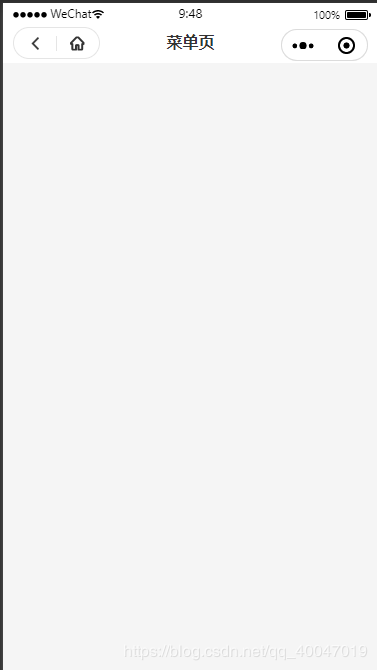
3、封装自定义顶部
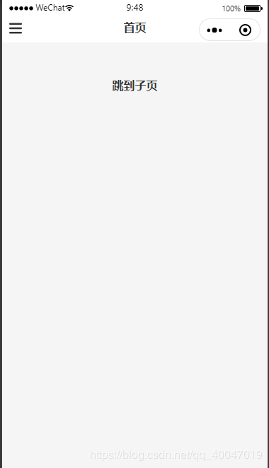
3.1效果图展示
3.2组件代码
index.wxml
<!--components/customHeader/index.wxml-->
<view class="customHeader_box" style="height:{{titleHeight}}px; background-color:{{bgColor}};">
 <!-- 菜单 -->
 <view wx:if="{{menuFlag}}" class="menu_box" style="height:{{capsuleObj.height}}px; top:{{capsuleObj.top}}px;">
 <view class="customIcon" bindtap="meunClick">
 <image src="/images/customMenu.png"></image>
 </view>
 </view>

 <!-- 返回+首页 -->
 <view wx:if="{{backHomeFlag}}" class="backHome_box" style="width:{{capsuleObj.width}}px; height:{{capsuleObj.height}}px; top:{{capsuleObj.top}}px;">
 <view class="customIcon backIcon" bindtap="backClick">
 <image src="/images/customBack.png"></image>
 </view>
 <view class="customIcon homeIcon" bindtap="homeClick">
 <image src="/images/customHome.png"></image>
 </view>
 </view>

 <!-- 标题 -->
 <view class="customHeader_title" style="top:{{capsuleObj.top}}px; height:{{capsuleObj.height}}px; line-height:{{capsuleObj.height}}px;">
 {{customTitle}}
 </view>
</view>

<!-- 自定义顶部距离修正 -->
<view class="customWrap" style="height:{{titleHeight}}px;"></view>
index.wxss
/* components/customHeader/index.wxss */

.customHeader_box {
 width: 100%;
 overflow: hidden;
 position: fixed;
 top: 0;
 left: 0;
 z-index: 99999;
}

.customIcon {
 flex: 1;
}

.customIcon image {
 width: 30rpx;
 height: 30rpx;
}

/* 菜单 */
.menu_box{
 text-align: center;
 box-sizing: border-box;
 overflow: hidden;
 position: absolute;
 left: 10px;
 z-index: 11;
 display: flex;
 justify-content: space-between;
 align-items: center;
}

.menu_box .customIcon image{
 width: 36rpx;
 height: 36rpx;
}

/* 返回+首页 */

.backHome_box {
 text-align: center;
 border: 1px solid #e5e5e5;
 border-radius: 20px;
 box-sizing: border-box;
 overflow: hidden;
 position: absolute;
 left: 10px;
 z-index: 11;
 display: flex;
 justify-content: space-between;
 align-items: center;
}

.backIcon {
 border-right: 1rpx solid #e5e5e5;
}

/* 标题 */

.customHeader_title {
 width: 100%;
 padding-left: 115px;
 padding-right: 115px;
 text-align: center;
 font-size: 32rpx;
 font-weight: bold;
 color: #333;
 text-overflow: ellipsis;
 box-sizing: border-box;
 overflow: hidden;
 white-space: nowrap;
 position: absolute;
 left: 0;
 z-index: 10;
}

/* 自定义顶部距离修正 */
.customWrap{
 width: 100%;
 position: relative;
 left: 0;
 z-index: 99998;
}
index.js
// components/customHeader/index.js
const app = getApp();

Component({
 /**
 * 组件的属性列表
 */
 properties: {
 customTitle: String,
 bgColor: {
 type: String,
 value: '#fff'
 },
 menuFlag: {
 type: Boolean,
 value: false
 },
 backHomeFlag: {
 type: Boolean,
 value: false
 },
 },

 /**
 * 组件的初始数据
 */
 data: {

 },

 attached: function() {
 this.setData({
 titleHeight: app.globalData.titleHeight,
 capsuleObj: app.globalData.capsuleObj
 })
 },

 options: {
 multipleSlots: true, //开启多slot
 },

 /**
 * 组件的方法列表
 */
 methods: {
 // 菜单
 meunClick: function () {
 wx.navigateTo({
 url: '/pages/menu/menu',
 })
 },

 // 返回
 backClick: function() {
 wx.navigateBack({
 delta: 1
 })
 },

 // 回首页
 homeClick: function() {
 wx.navigateTo({
 url: '/pages/index/index'
 })
 },
 }
})
index.json
{
 "component": true
}
4、组件使用方法
index.wxml
<!--pages/index/index.wxml-->

<!-- 自定义顶部 -->
<customHeader menuFlag customTitle="首页"></customHeader>

<view class="url">
	<navigator hover-class="none" url="../child/child">跳到子页</navigator>
</view>
ps:我这边封装了2个样式,meneFlag是菜单的。backHomeFlag是“返回+首页”样式的。
json配置
{
 "usingComponents": {
 "customHeader": "/components/customHeader/index"
 }
}
5、小结
此组件兼容性,可以兼容安卓、IOS、刘海屏,如果你们测试出来有新bug,可以在gitHub提出issues,帮助您解决。
链接在此:
微信小程序自定义顶部组件

