散点图和折线图是数据分析中最常用的两种图形。其中,折线图用于分析自变量和因变量之间的趋势关系,最适合用于显示随着时间而变化的连续数据,同时还可以看出数量的差异,增长情况。
Matplotlib 中绘制散点图的函数为 plot() ,使用语法如下:matplotlib.pyplot.plot(*args, scalex=True, scaley=True, data=None, **kwargs)
常用参数及说明:
| 参数 | 接收值 | 说明 | 默认值 |
| x,y | array | 表示 x 轴与 y 轴对应的数据; | 无 |
| color | string | 表示折线的颜色; | None |
| marker | string | 表示折线上数据点处的类型; | None |
| linestyle | string | 表示折线的类型; | - |
| linewidth | 数值 | 线条粗细:linewidth=1.=5.=0.3 | 1 |
| alpha | 0~1之间的小数 | 表示点的透明度; | None |
| label | string | 数据图例内容:label=‘实际数据' | None |
其他参数请参考文档:https://matplotlib.org/api/_as_gen/matplotlib.pyplot.plot.html
基本用法
import pandas as pd
import matplotlib.pyplot as plt
#读取数据
datafile = u'D:\\pythondata\\learn\\matplotlib.xlsx'
data = pd.read_excel(datafile)
plt.figure(figsize=(10,5))#设置画布的尺寸
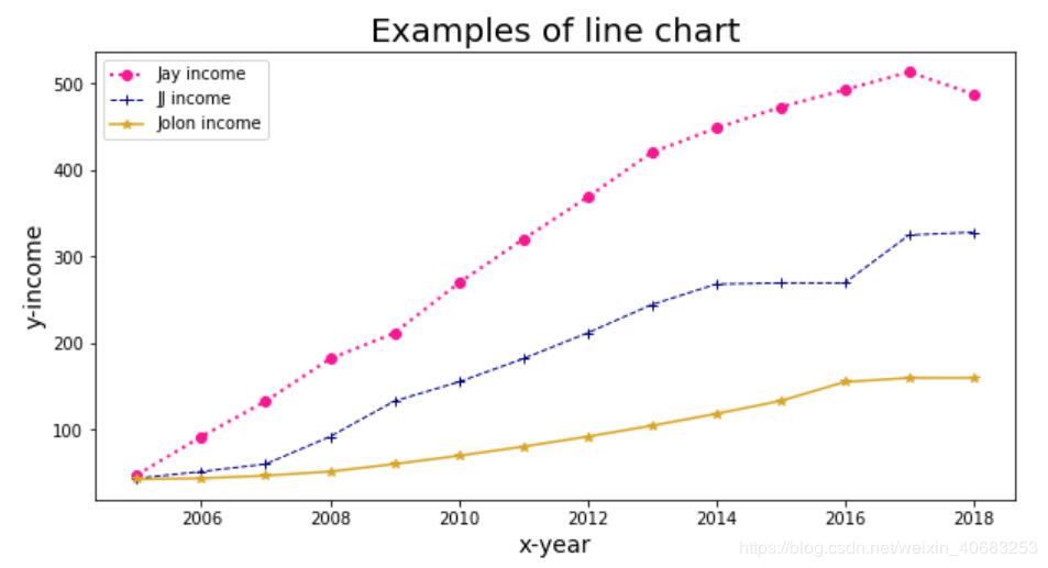
plt.title('Examples of line chart',fontsize=20)#标题,并设定字号大小
plt.xlabel(u'x-year',fontsize=14)#设置x轴,并设定字号大小
plt.ylabel(u'y-income',fontsize=14)#设置y轴,并设定字号大小
#color:颜色,linewidth:线宽,linestyle:线条类型,label:图例,marker:数据点的类型
plt.plot(data['时间'],data['收入_Jay'],color="deeppink",linewidth=2,linestyle=':',label='Jay income', marker='o')
plt.plot(data['时间'],data['收入_JJ'],color="darkblue",linewidth=1,linestyle='--',label='JJ income', marker='+')
plt.plot(data['时间'],data['收入_Jolin'],color="goldenrod",linewidth=1.5,linestyle='-',label='Jolon income', marker='*')
plt.legend(loc=2)#图例展示位置,数字代表第几象限
plt.show()#显示图像