环境
IDE: WebStorm 2019.1.4
系统: Mac OS X 10.15.4
VueJs: 2.6.11
Vue-cli: 4.2.2
前言
最近一直在忙毕设,前端终于还是对我这个Java小后端下手了o(╥﹏╥)o 可算明白前端大佬们有多不容易。 项目需要用到VueJs,于是在看了半天vue文档后写个小Demo。
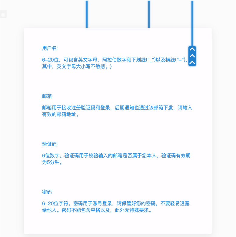
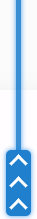
效果图

开干
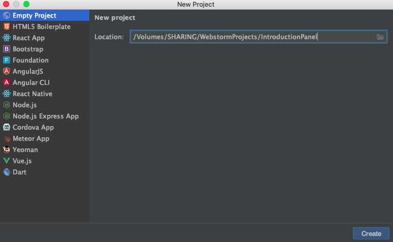
第一步,创建项目环境
WebStorm新建Project -> EmptyProject
终端下使用"vue create"创建vue脚手架工程(不同版本命令可能不同)
项目名称不能含有大写字母

选择default

终端cd到vue-cli文件夹下,运行"npm run serve",vue-cli3.0版本以下,应该默认是"npm run dev",详见"package.json"
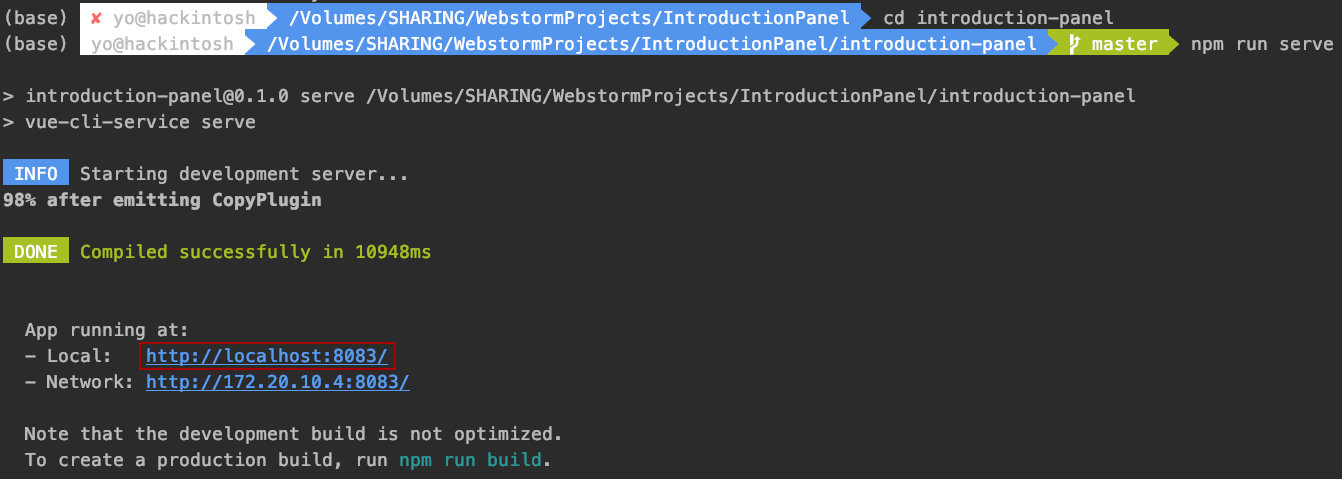
点击链接
第二步,敲哩个敲
好了,开始敲代码o( ̄︶ ̄)o
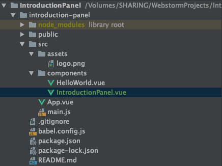
新建组件文件
components 文件夹右键 -> new -> Vue component -> IntroductionPanel。
为什么是"Introduction"? 因为这是用来引导用户注册的。
接着修改 App.vue 文件的 <template> 和 <script> 节点,把原来的组件删了,把自定义的 IntroductionPanel 放进来。
<template>
  <IntroductionPanel></IntroductionPanel>
</template>

<script>
import IntroductionPanel from "./components/IntroductionPanel"

export default {
  name: 'App',
  components: {
    IntroductionPanel
  }
}
</script>
当然也可以直接修改 main.js 编辑应用的入口
编写代码
一、 在 IntroductionPanel.vue 文件的 <template> 节点下创建一个 <div> 用来装载所有的组件。
<template>
        <div class="introduction introduction-panel">

        </div>
</template>
二、 在 introduction-panel 下创建 introduction-wrapper 用来装载上面的两根绳子以及下面的面板;创建 introduction-trigger 充当右边的绳索开关。
<template>
<div class="introduction introduction-panel">
<div class="introduction introduction-wrapper">
</div>>
<div class="introduction introduction-trigger">
</div>
</div>
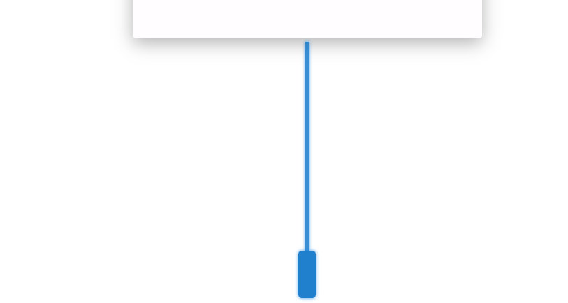
</template>三、把上面的两根绳子做出来,这两根绳子实际上是一个 div 的两边。
<template>
    <div class="introduction introduction-panel">
        <div class="introduction introduction-wrapper">
            <div class="introduction rope"></div>
        </div>
        <div class="introduction introduction-trigger">

        </div>
    </div>
</template>
在 IntroductionPanel.vue 的 <style scoped> 节点下,给绳子添加样式。
/*牵引绳*/
.introduction.rope{
    width: 200px;
    height: 100px;
    border-left: 5px rgba(0,129,198,.8) solid;
    border-right: 5px rgba(0,129,198,.8) solid;
    box-shadow: 0px 0px 5px 0px rgba(13,148,225,.8), 0px 0px 5px 0px rgba(13,148,225,.8) inset;
}
四、创建面板 introduction-bar
<template>
    <div class="introduction introduction-panel">
        <div class="introduction introduction-wrapper">
            <div class="introduction rope"></div>
            <div class="introduction introduction-bar"></div>
        </div>
        <div class="introduction introduction-trigger">

        </div>
    </div>
</template>
/*内容面板*/
.introduction.introduction-bar{
width: 500px;
height: 600px;
color: rgba(13,148,225,.9);/*内容颜色,蓝色加透明*/
border-radius: 5px;/*圆角*/
background-color: rgba(254, 253, 255, 0.9);/*背景色,白色加透明*/
box-shadow: 0 7px 25px rgba(0, 0, 0, .3);/*阴影*/
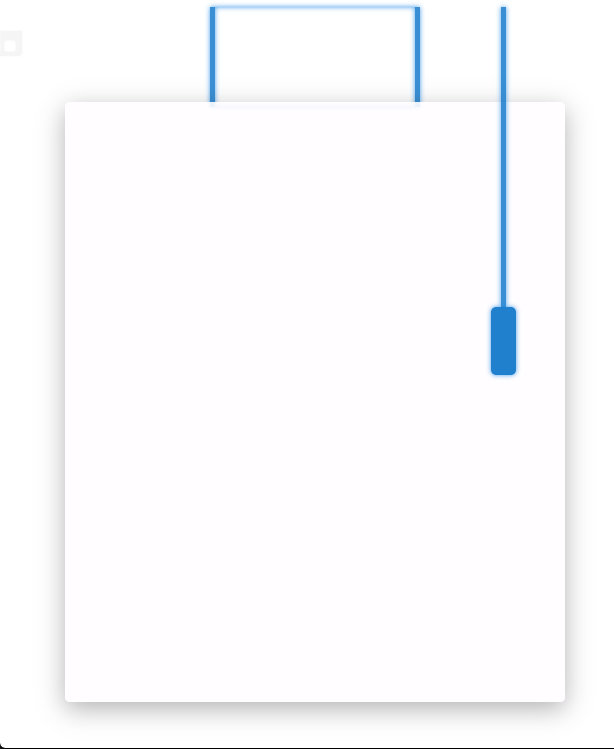
}五、此时左边部分已经完成
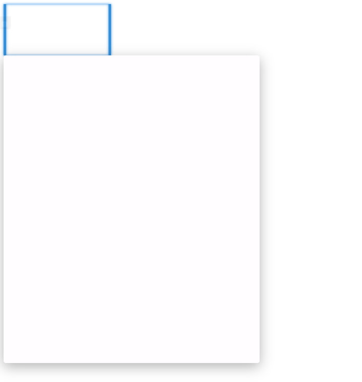
需要进行优化,给这两个元素设置 margin: 0 auto; 并给父元素设置 text-align: center 使得这两个元素保持居中。
/*左侧部分*/
.introduction.introduction-wrapper{
    width: 100%;
    text-align: center;
}

/*牵引绳*/
.introduction.rope{
    width: 200px;
    height: 100px;
    border-left: 5px rgba(0,129,198,.8) solid;
    border-right: 5px rgba(0,129,198,.8) solid;
    box-shadow: 0px 0px 5px 0px rgba(13,148,225,.8), 0px 0px 5px 0px rgba(13,148,225,.8) inset;
    margin: 0 auto;
}

/*内容面板*/
.introduction.introduction-bar{
    width: 500px;
    height: 600px;
    margin: 0 auto;
    color: rgba(13,148,225,.9);/*内容颜色,蓝色加透明*/
    border-radius: 5px;/*圆角*/
    background-color: rgba(254, 253, 255, 0.9);/*背景色,白色加透明*/
    box-shadow: 0 7px 25px rgba(0, 0, 0, .3);/*阴影*/
}
这时可以发现两个元素已经居中,但是上面的 div 露出了上下两条边,不好看,需要调整这两个元素的高度。
/*内容面板*/
.introduction.introduction-bar{
    width: 500px;
    height: 600px;
    margin: 0 auto;
    color: rgba(13,148,225,.9);/*内容颜色,蓝色加透明*/
    top: -5px;
    position: relative;
    border-radius: 5px;/*圆角*/
    background-color: rgba(254, 253, 255, 0.9);/*背景色,白色加透明*/
    box-shadow: 0 7px 25px rgba(0, 0, 0, .3);/*阴影*/
}
效果如下:
绳子的上面暂不处理
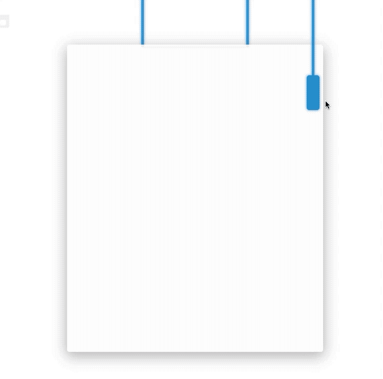
六、下面开始做右边的开关 introduction-trigger
introduction-trigger 包括上面的绳子以及下面的绳结(忽略绳结上的箭头):
<template>
    <div class="introduction introduction-panel">
        <div class="introduction introduction-wrapper">
            <div class="introduction rope"></div>
            <div class="introduction introduction-bar"></div>
        </div>
        <div class="introduction introduction-trigger">
            <div class="introduction trigger-rope"></div>
            <div class="introduction trigger-point">

            </div>
        </div>
    </div>
</template>
/*开关整体*/
.introduction.introduction-trigger{
left: 80%;
}
/*开关的绳子*/
.introduction.trigger-rope{
position: relative;
width: 5px;
height: 300px;
margin: 0 auto;
background-color: rgba(0,129,198,.8);
box-shadow: 0px 0px 5px 0px rgba(13,148,225,.8);
}
/*开关的绳结*/
.introduction.trigger-point{
margin: 0 auto;
position: relative;
width: 25px;
height: 60px;
background-color: rgba(0,129,198,.9);
box-shadow: 0px 0px 5px 0px rgba(13,148,225,.8);
border-radius: 5px;
text-align: center;
cursor: pointer;
}
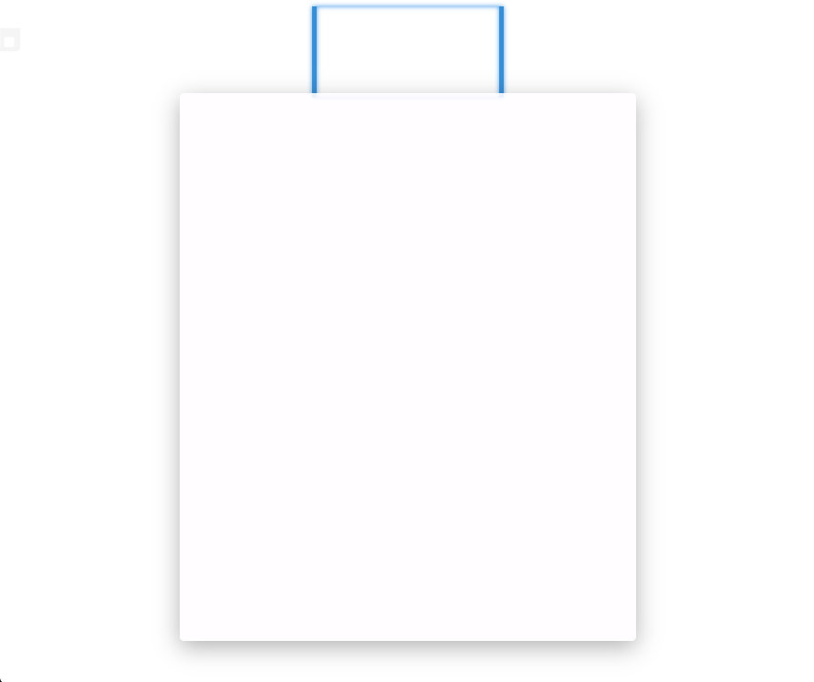
如上,开关的位置不正确,需要修改下 introduction-wrapper 和 introduction-trigger 的样式
/*开关整体*/
.introduction.introduction-trigger{
    left: 80%;
    position: absolute;
}
/*左侧部分*/
.introduction.introduction-wrapper{
    width: 100%;
    position: absolute;
    text-align: center;
}
七、这时页面框架已经完成了,接下来就是给元素添加动效。
编辑 <script>
<script>
    export default {
        name: "IntroductionPanel",
        data() {
            return {
                introduction_active: false
            }
        },
        methods: {
            changeActiveStatus(){
                this.introduction_active = !this.introduction_active;
            }
        }
    }
</script>
给组件添加状态 introdution_active 和 改变状态的方法 changeActiveStatus(), 不需要用到 Vuex 。
然后给元素绑定动态 Class
<template>
    <div class="introduction introduction-panel">
        <div class="introduction introduction-wrapper" v-bind:class="{'active':introduction_active}">
            <div class="introduction rope"></div>
            <div class="introduction introduction-bar"></div>
        </div>
        <div class="introduction introduction-trigger" v-bind:class="{'active':introduction_active}">
            <div class="introduction trigger-rope"></div>
            <div class="introduction trigger-point" @click="changeActiveStatus()">

            </div>
        </div>
    </div>
</template><template>
    <div class="introduction introduction-panel">
        <div class="introduction introduction-wrapper" v-bind:class="{'active':introduction_active}">
            <div class="introduction rope"></div>
            <div class="introduction introduction-bar"></div>
        </div>
        <div class="introduction introduction-trigger" v-bind:class="{'active':introduction_active}">
            <div class="introduction trigger-rope"></div>
            <div class="introduction trigger-point" @click="changeActiveStatus()">

            </div>
        </div>
    </div>
</template>
接下来设置元素动效前后的状态,让CSS实现动画效果,这是补间动画,AE、Flash都可以玩一哈。
/*左侧部分*/
.introduction.introduction-wrapper{
    width: 100%;
    position: absolute;
    top: -1000px;/*左侧部分一开始应该在浏览器上方,在视野之外*/
    text-align: center;
}

/*左侧变换后的位置*/
.introduction.introduction-wrapper.active{
    top: -5px;/*-5是为了遮住绳子的div的上面部分*/
}

/*开关整体*/
.introduction.introduction-trigger{
    top: 0px;/*开关一开始的高度*/
    left: 80%;
    position: absolute;
}

/*开关整体变换后的高度*/
.introduction.introduction-trigger.active{
    top: -150px;/*往浏览器上方走,相当于缩短。也可以设置仅开关上方的绳子变短*/
}
效果如下:
可以看出效果十分生硬,这时可以使用贝塞尔曲线或者关键帧进行优化,关键帧比较麻烦,所以这里用的是贝塞尔曲线。
神器——https://cubic-bezier.com/#.37,1.44,.57,.77 ,用这个网站可以直观地生成合适的贝塞尔曲线的函数。
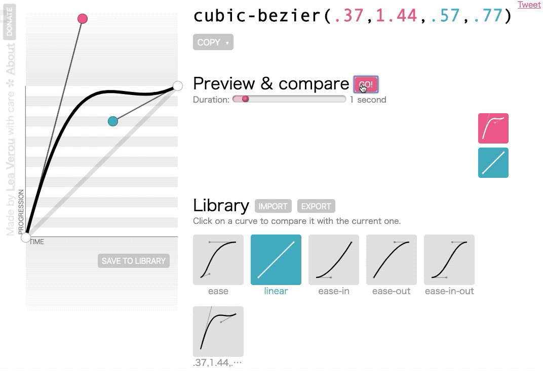
如上是网站的界面,函数的参数分别为坐标系上红球的x轴坐标、y轴坐标和蓝绿球的x轴坐标和y轴坐标。坐标系横轴为时间,纵轴为动画的 progress, 直译过来是进程、进展的意思,映射到平移上就是指移动的点到原点的偏移量。
动图中两个方块是项目中用到的动画与线性动画的对比。动画后面具有弹跳的效果,在左上角坐标系上表现为后段往下的凹陷。动画的整体效果是元素离原点的距离越来越远,到后段反而离近一点点,然后又远离,直至到达终点。线的斜率反映运动的加速度。
获取到合适的贝塞尔函数后应用到项目中:
.introduction{
    transition: 0.3s cubic-bezier(.37,1.44,.57,.77);
}
八、最后给绳结添加箭头指示以及提示。
<template>
    <div class="introduction introduction-panel">
        <div class="introduction introduction-wrapper" v-bind:class="{'active':introduction_active}">
            <div class="introduction rope"></div>
            <div class="introduction introduction-bar"></div>
        </div>
        <div class="introduction introduction-trigger" v-bind:class="{'active':introduction_active}">
            <div class="introduction trigger-rope"></div>
            <div class="introduction trigger-point" @click="changeActiveStatus()" v-bind:class="{'active':introduction_active}">
                <div class="arrow arrow-down"></div>
                <div class="arrow arrow-down"></div>
                <div class="arrow arrow-down"></div>
            </div>
        </div>
    </div>
</template>
/*未激活的绳结需要设置底部padding,以抵消箭头旋转后产生的上下偏移*/
.introduction.trigger-point:not(.active){
padding-bottom: 8px;
}
/*绳结下方的提示,未激活时显示*/
.introduction.trigger-point:not(.active):before{
content: '点击查看帮助';
color: rgba(13,148,225,.8);
width: 100px;
position: absolute;
left: 50%;
top:100%;
transform: translateX(-50%);
}
/*绳结激活后,绳结上的箭头旋转*/
.introduction.trigger-point.active > .arrow-down{
transform: rotate(225deg);
}
/*div的两条边邻边*/
.arrow {
border: solid #ffffff;
border-width: 0 3px 3px 0;
display: inline-block;
padding: 5px;
margin: 0 auto;
}
/*div旋转形成箭头*/
.arrow-down {
transform: rotate(45deg);
-webkit-transform: rotate(45deg);
}九、成品
相关文件

