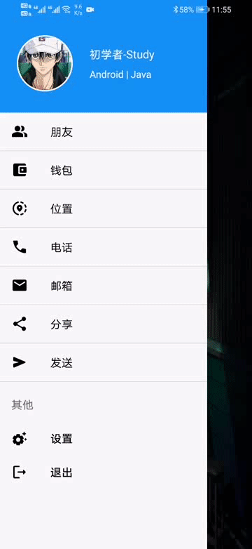
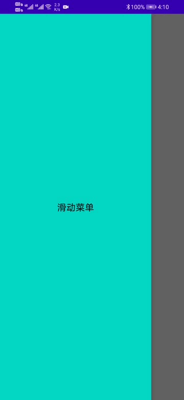
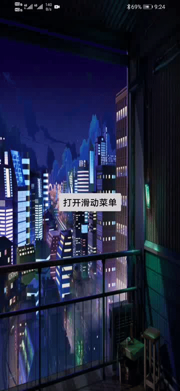
运行效果图:
滑动菜单相信都不会陌生,你可能见过很多这样的文章,但我的文章会给你不一样的阅读和操作体验。
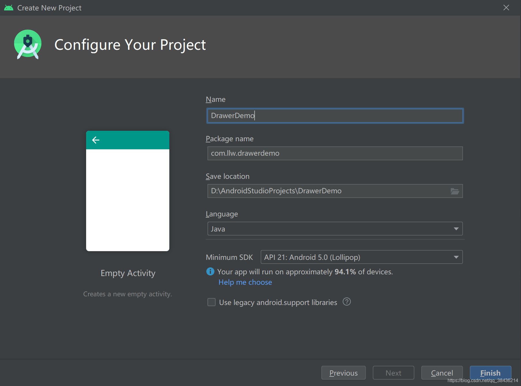
写博客,自然是从创建项目开始了,这样你可以更好的知道这个过程中经历了什么。
项目就命名为DrawerDemo,
绝对的手把手教学,让你清楚每一步怎么做。
然后打开app下的build.gradle,在android{}闭包中添加如下代码:
//配置JDK的版本
 compileOptions {
 targetCompatibility JavaVersion.VERSION_1_8
 sourceCompatibility JavaVersion.VERSION_1_8
 }
这里是配置JDK的版本,为1.8,我个人最喜欢的版本。一旦项目中的build.gradle有改动,便会出现Sync Now或者Sync的同步提示,如下图所示:
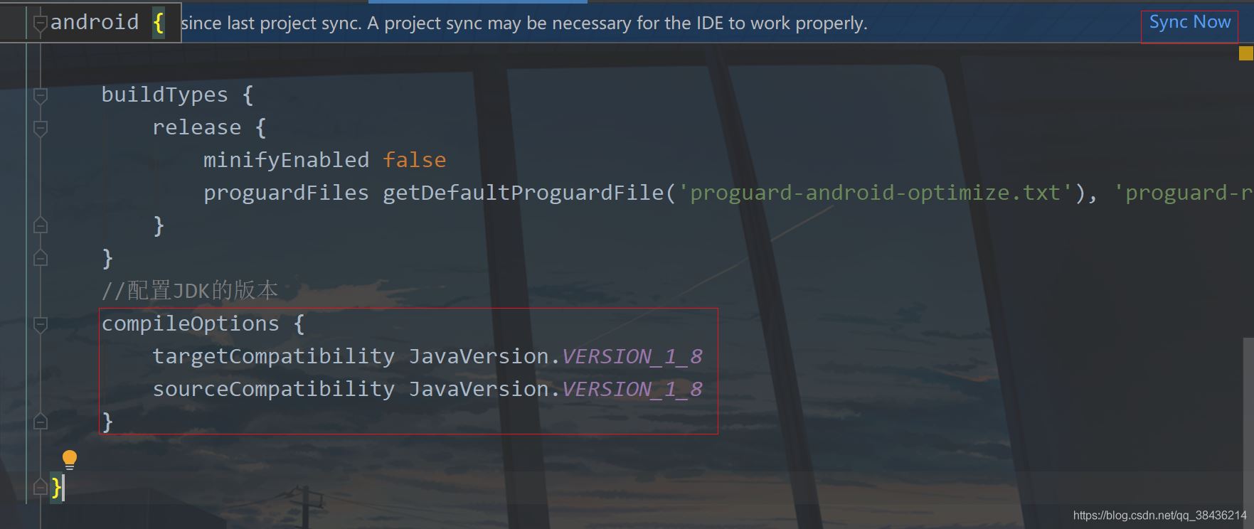
右上角的就是这个同步提示,如果你不点击进行同步,则你刚才在build.gradle中的改动无效,下面点击Sync Now。
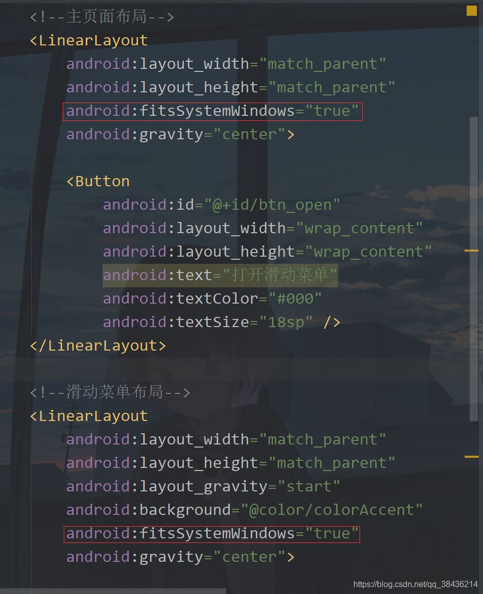
打开layout,找到activity_main.xml,修改代码后如下所示:
<?xml version="1.0" encoding="utf-8"?>
<androidx.drawerlayout.widget.DrawerLayout xmlns:android="http://schemas.android.com/apk/res/android"
 xmlns:tools="http://schemas.android.com/tools"
 android:id="@+id/drawer_layout"
 android:layout_width="match_parent"
 android:layout_height="match_parent"
 tools:context=".MainActivity">

 <!--主页面布局-->
 <LinearLayout
 android:layout_width="match_parent"
 android:layout_height="match_parent"
 android:gravity="center">

 <Button
  android:id="@+id/btn_open"
  android:layout_width="wrap_content"
  android:layout_height="wrap_content"
  android:text="打开滑动菜单"
  android:textColor="#000"
  android:textSize="18sp" />
 </LinearLayout>

 <!--滑动菜单布局-->
 <LinearLayout
 android:layout_width="match_parent"
 android:layout_height="match_parent"
 android:layout_gravity="start"
 android:background="@color/colorAccent"
 android:gravity="center">

 <TextView
  android:layout_width="wrap_content"
  android:layout_height="wrap_content"
  android:text="滑动菜单"
  android:textColor="#000"
  android:textSize="18sp" />
 </LinearLayout>

</androidx.drawerlayout.widget.DrawerLayout>
这里你可以选择复制粘贴到你的项目中,然后来说说这里的细节。
第一个细节就是页面根布局,DrawerLayout ,这个布局现在是在androidx下的,如果你还是v4或者v7的版本下的,请尽早迁移到androidx,至于怎么迁移?你更新Android Studio就可以了,目前最新的AS是4.1.3版本,你可以选择4.0.1就可以了,稳妥。
然后你注意到这个里面放了两个LinearLayout(线性布局),LinearLayout里面一个放了TextView,一个放了Button,居中显示,我这里特地在布局中增加了注释,告诉你哪一个是主页面,哪一个是滑动菜单。
那么是怎么分出来的呢?当你第一次看的时候你不知道为什么的时候,你就找不同,看看两个LinearLayout有什么不同,于是你会发现滑动菜单比主页面布局多了两个属性
	android:layout_gravity="start"
 android:background="@color/colorAccent"
然后结果很明显了,background只能修改布局的布景,那么答案就是
android:layout_gravity="start"
这个属性是什么意思呢?layout_gravity值的是布局重力,这里你要和gravity区分出来,你记住有layout的代表控制本身,没有layout的代表控制内容。而它的属性值你看到是start,这种属性一般都是成对关系,有start自然就有end。而start是Android中新的用法,它代替了left,end代替了right。现在的left和right依然可以用,只不过Google更推荐你使用start和end表示左右。
那么你现在再来看这一行代码就知道是什么意思了。就是当前布局置于根布局的左侧,而因为你的根布局是DrawerLayout,因此你的预览界面应该只能看到页面主布局。
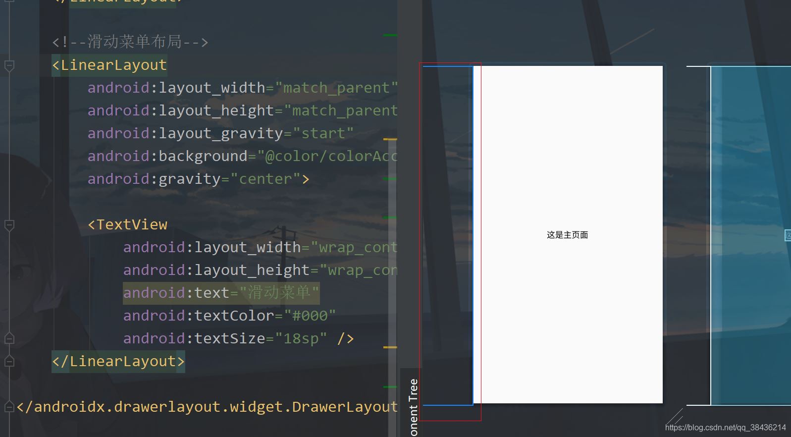
但是你要注意左边的这个蓝色线,这个代表了你当前的滑动菜单的位置。
此时你把start改成end,你再看预览界面就到了右边去了,表示从屏幕右侧出现。记得改回start。
布局介绍完毕了,下面我们通过点击主页面的按钮显示这个滑动菜单。
打开MainActivity,修改后代码如下:
public class MainActivity extends AppCompatActivity {

 private DrawerLayout drawerLayout;//滑动菜单
 @Override
 protected void onCreate(Bundle savedInstanceState) {
 super.onCreate(savedInstanceState);
 setContentView(R.layout.activity_main);

 drawerLayout = findViewById(R.id.drawer_layout);

 findViewById(R.id.btn_open).setOnClickListener(v -> {
  //打开滑动菜单 左侧出现
  drawerLayout.openDrawer(GravityCompat.START);
 });
 }
}
这里我创建一个变量,然后在onCreate中绑定布局id。然后在按钮的点击事件中,通过openDrawer方法打开滑动菜单,里面传入GravityCompat.START,START是左侧,GravityCompat是重力兼容,表示兼容低版本,在低版本的AS中你就要使用Gravity.START。
这里的START和布局中的start是要对应上的,如果你不对应上就会报错,那么下面运行一下吧。

嗯,这个效果是有了,但是感觉比较的丑,那么来美化一下吧。
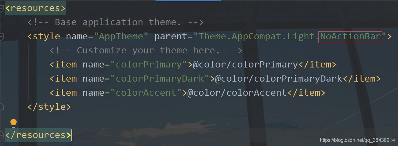
打开res下values文件夹中的styles.xml。
把DarkActionBar改成NoActionBar,意思是去掉默认的导航栏。
然后你再运行一下,你会发现好看了一点点。
不过屏幕顶部还是有那个很丑的状态栏,因此我们还需要美化一下。
在MainActivity中增加一个方法来设置状态栏透明。
/**
 * 透明状态栏
 */
 private void transparentStatusBar() {
 //改变状态栏颜色为透明
 View decorView = getWindow().getDecorView();
 decorView.setSystemUiVisibility(View.SYSTEM_UI_FLAG_LAYOUT_FULLSCREEN | View.SYSTEM_UI_FLAG_LAYOUT_STABLE);
 getWindow().setStatusBarColor(Color.TRANSPARENT);
 }
这个方法先拿到当前Actvity的DecorView,它是Activity的根部视图,相当于最底层的视图,你想要详细的了解就需要去看源码了。
然后调用setSystemUiVisibility来改变系统UI的显示。View.SYSTEM_UI_FLAG_LAYOUT_FULLSCREEN和View.SYSTEM_UI_FLAG_LAYOUT_STABLE表示Activity的布局会显示在状态栏上面,之后调用setStatusBarColor方法设置状态栏颜色为透明。
然后在onCreate中调用这个方法。

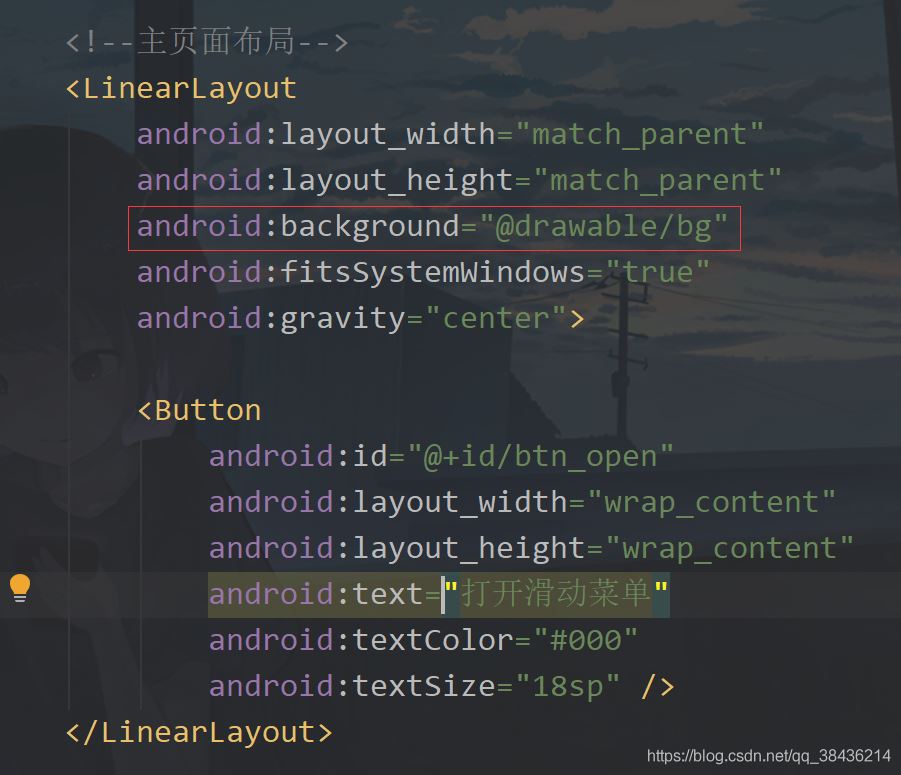
然后你还需要在activity_main.xml中去设置可以显示需要显示在状态栏中的布局。在主页面布局和滑动菜单的父布局中都添加一个属性:
android:fitsSystemWindows="true"
然后再给主页面设置一个背景图,背景图如下:

放到你项目的drawable文件夹下,然后在布局中设置
下面运行一下:
现在这个感觉怎么样呢?比之前是不是好多了呢?但是你会发现这个按钮有一些不上档次了,显得是辣么的突兀。我们像个办法去掉它。
首先修改布局,将之前的按钮替换为如下代码:
<androidx.appcompat.widget.Toolbar
  android:id="@+id/toolbar"
  app:navigationIcon="@drawable/icon_menu"
  android:layout_width="match_parent"
  android:layout_height="?attr/actionBarSize" />
添加位置如下图
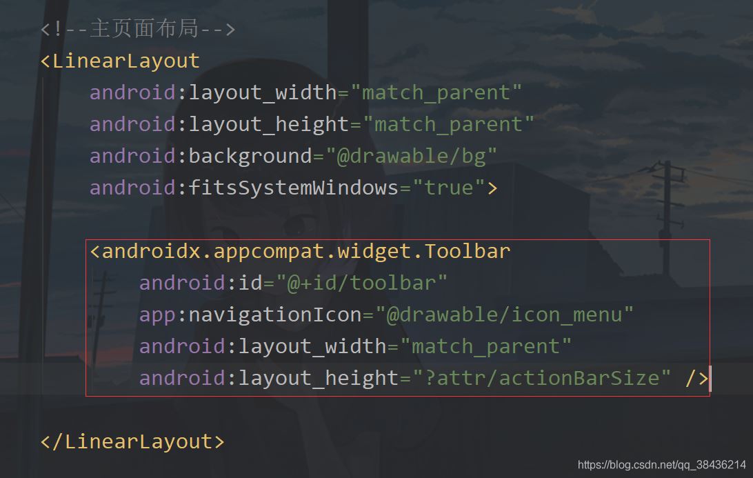
这里的icon_menu是一个图标,在你的drawable下新建一个icon_menu.xml文件,里面的代码如下:
<?xml version="1.0" encoding="UTF-8"?>
<vector xmlns:android="http://schemas.android.com/apk/res/android"
 android:width="24dp"
 android:height="24dp"
 android:tint="#FFFFFF"
 android:viewportWidth="24.0"
 android:viewportHeight="24.0">
 <path
 android:fillColor="@android:color/white"
 android:pathData="M4,18h16c0.55,0 1,-0.45 1,-1l0,0c0,-0.55 -0.45,-1 -1,-1H4c-0.55,0 -1,0.45 -1,1l0,0C3,17.55 3.45,18 4,18zM4,13h16c0.55,0 1,-0.45 1,-1l0,0c0,-0.55 -0.45,-1 -1,-1H4c-0.55,0 -1,0.45 -1,1l0,0C3,12.55 3.45,13 4,13zM3,7L3,7c0,0.55 0.45,1 1,1h16c0.55,0 1,-0.45 1,-1l0,0c0,-0.55 -0.45,-1 -1,-1H4C3.45,6 3,6.45 3,7z" />
</vector>
这是一个白色的菜单图标,下面回到MainActivity中,先声明变量。
private DrawerLayout drawerLayout;//滑动菜单
然后在onCreate中添加如下代码:
toolbar = findViewById(R.id.toolbar);
 //工具栏按钮点击
 toolbar.setNavigationOnClickListener(v -> drawerLayout.openDrawer(GravityCompat.START));
点击之后打开这个滑动菜单。
下面你再运行一下:
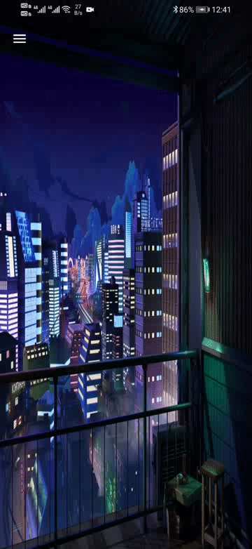
这样就简洁雅致了很多了。
现在我们的滑动菜单用的是一个LinearLayout,虽然用起来没有很大的问题,但是如果有更好的控件为什么不用呢?下面就来介绍一下NavigationView,不过要在AS中使用这个控件还需要添加一个依赖库:
打开你app下的build.gradle,在dependencies{}闭包中添加如下依赖
//添加material库
 implementation 'com.google.android.material:material:1.2.1'
添加之后记得点击Sync Now进行同步项目。
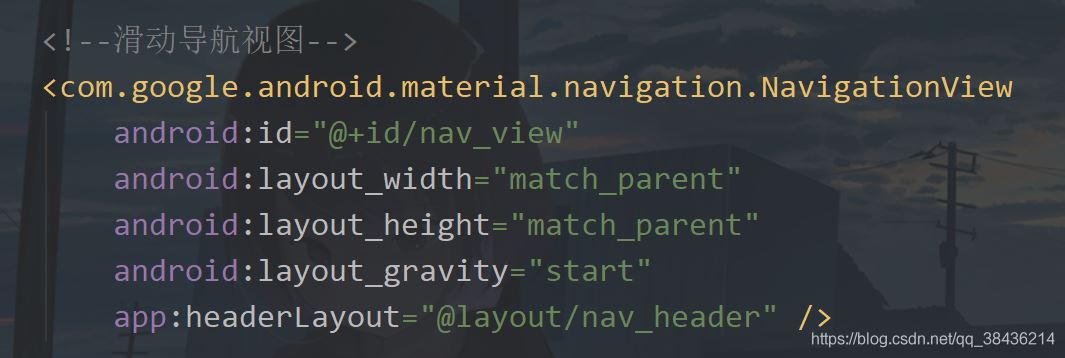
然后修改activity_main.xml,去掉之前的滑动菜单,修改的页面布局代码如下:
<?xml version="1.0" encoding="utf-8"?>
<androidx.drawerlayout.widget.DrawerLayout xmlns:android="http://schemas.android.com/apk/res/android"
 xmlns:app="http://schemas.android.com/apk/res-auto"
 xmlns:tools="http://schemas.android.com/tools"
 android:id="@+id/drawer_layout"
 android:layout_width="match_parent"
 android:layout_height="match_parent"
 tools:context=".MainActivity">

 <!--主页面布局-->
 <LinearLayout
 android:layout_width="match_parent"
 android:layout_height="match_parent"
 android:background="@drawable/bg"
 android:fitsSystemWindows="true">

 <androidx.appcompat.widget.Toolbar
  android:id="@+id/toolbar"
  android:layout_width="match_parent"
  android:layout_height="?attr/actionBarSize"
  app:navigationIcon="@drawable/icon_menu" />

 </LinearLayout>

 <!--滑动导航视图-->
 <com.google.android.material.navigation.NavigationView
 android:id="@+id/nav_view"
 android:layout_width="match_parent"
 android:layout_height="match_parent"
 android:layout_gravity="start" />

</androidx.drawerlayout.widget.DrawerLayout>
不过就算是这样,你当前还需要添加导航视图的头部视图和菜单视图。
在layout下新建一个nav_header.xml,作为导航的头部视图,常规的我们会在导航视图里面放置一些个人信息,头像,名称等。
那么头像是一个图片,而且普遍是圆形图片,常规是通过一些第三方库和自定义VIew来实现。还记得我们刚才导入的material库吗?可以用它里面的控件来实现圆形头像。
首先我们在styles.xml中增加如下代码:
<!-- 圆形图片 -->
 <style name="circleImageStyle">
 <item name="cornerFamily">rounded</item>
 <item name="cornerSize">50%</item>
 </style>
然后在nav_header.xml增加一个图标控件和两个文字控件,里面代码如下:
<?xml version="1.0" encoding="utf-8"?>
<RelativeLayout xmlns:android="http://schemas.android.com/apk/res/android"
 xmlns:app="http://schemas.android.com/apk/res-auto"
 android:layout_width="match_parent"
 android:layout_height="160dp"
 android:background="#1391F8"
 android:fitsSystemWindows="true"
 android:orientation="vertical">
 <!--头像-->
 <com.google.android.material.imageview.ShapeableImageView
 android:id="@+id/iv_avatar"
 android:layout_width="80dp"
 android:layout_height="80dp"
 android:layout_alignParentBottom="true"
 android:layout_marginStart="24dp"
 android:layout_marginBottom="30dp"
 android:padding="1dp"
 android:layout_marginEnd="24dp"
 android:src="@mipmap/icon_default_avatar"
 app:shapeAppearanceOverlay="@style/circleImageStyle"
 app:strokeColor="#FFF"
 app:strokeWidth="2dp" />
 <!--名称-->
 <TextView
 android:layout_marginTop="16dp"
 android:layout_alignTop="@+id/iv_avatar"
 android:id="@+id/tv_name"
 android:textSize="16sp"
 android:textColor="#FFF"
 android:layout_width="wrap_content"
 android:layout_height="wrap_content"
 android:layout_toEndOf="@+id/iv_avatar"
 android:text="初学者-Study" />
 <!--标签-->
 <TextView
 android:layout_marginTop="8dp"
 android:id="@+id/tv_tip"
 android:textSize="14sp"
 android:layout_below="@+id/tv_name"
 android:textColor="#FFF"
 android:layout_width="wrap_content"
 android:layout_height="wrap_content"
 android:layout_toEndOf="@+id/iv_avatar"
 android:text="Android | Java" />

</RelativeLayout>
这里有一个icon_default_avatar的图标,也是我博客的头像,如下图所示

那么这个导航视图的头部就写好了,下面来写导航菜单。
在这之前能先放置五个图标,都是通过路径来绘制的。都放在drawable下。
icon_friend.xml
<?xml version="1.0" encoding="UTF-8"?>
<vector xmlns:android="http://schemas.android.com/apk/res/android"
 android:width="24dp"
 android:height="24dp"
 android:tint="#000000"
 android:viewportWidth="24.0"
 android:viewportHeight="24.0">
 <path
 android:fillColor="@android:color/black"
 android:pathData="M15,8c0,-1.42 -0.5,-2.73 -1.33,-3.76C14.09,4.1 14.53,4 15,4c2.21,0 4,1.79 4,4s-1.79,4 -4,4c-0.43,0 -0.84,-0.09 -1.23,-0.21c-0.03,-0.01 -0.06,-0.02 -0.1,-0.03C14.5,10.73 15,9.42 15,8zM16.66,13.13C18.03,14.06 19,15.32 19,17v3h4v-3C23,14.82 19.42,13.53 16.66,13.13zM9,4c2.21,0 4,1.79 4,4s-1.79,4 -4,4s-4,-1.79 -4,-4S6.79,4 9,4zM9,13c2.67,0 8,1.34 8,4v3H1v-3C1,14.34 6.33,13 9,13z" />
</vector>
icon_wallet.xml
<?xml version="1.0" encoding="UTF-8"?>
<vector xmlns:android="http://schemas.android.com/apk/res/android"
 android:width="24dp"
 android:height="24dp"
 android:tint="#000000"
 android:viewportWidth="24.0"
 android:viewportHeight="24.0">
 <path
 android:fillColor="@android:color/black"
 android:pathData="M10,16V8c0,-1.1 0.89,-2 2,-2h9V5c0,-1.1 -0.9,-2 -2,-2H5C3.89,3 3,3.9 3,5v14c0,1.1 0.89,2 2,2h14c1.1,0 2,-0.9 2,-2v-1h-9C10.89,18 10,17.1 10,16zM13,8c-0.55,0 -1,0.45 -1,1v6c0,0.55 0.45,1 1,1h8c0.55,0 1,-0.45 1,-1V9c0,-0.55 -0.45,-1 -1,-1H13zM16,13.5c-0.83,0 -1.5,-0.67 -1.5,-1.5s0.67,-1.5 1.5,-1.5s1.5,0.67 1.5,1.5S16.83,13.5 16,13.5z" />
</vector>
icon_location.xml
<?xml version="1.0" encoding="UTF-8"?>
<vector xmlns:android="http://schemas.android.com/apk/res/android"
 android:width="24dp"
 android:height="24dp"
 android:tint="#000000"
 android:viewportWidth="24.0"
 android:viewportHeight="24.0">
 <path
 android:fillColor="@android:color/black"
 android:pathData="M13.02,20.77L13.02,20.77c0,0.64 0.59,1.13 1.21,0.99c1.12,-0.26 2.18,-0.7 3.12,-1.3c0.53,-0.34 0.61,-1.1 0.16,-1.55l0,0c-0.32,-0.32 -0.83,-0.4 -1.21,-0.16c-0.77,0.49 -1.62,0.85 -2.53,1.05C13.32,19.9 13.02,20.31 13.02,20.77z" />
 <path
 android:fillColor="@android:color/black"
 android:pathData="M4.03,12c0,-3.79 2.65,-6.97 6.2,-7.79c0.44,-0.1 0.75,-0.51 0.75,-0.96v0c0,-0.64 -0.6,-1.13 -1.22,-0.98C5.33,3.29 2.03,7.26 2.03,12c0,4.74 3.3,8.71 7.73,9.74c0.62,0.15 1.22,-0.34 1.22,-0.98v0c0,-0.46 -0.31,-0.86 -0.75,-0.96C6.68,18.97 4.03,15.79 4.03,12z" />
 <path
 android:fillColor="@android:color/black"
 android:pathData="M20.79,11L20.79,11c0.64,0 1.13,-0.59 0.99,-1.21c-0.26,-1.12 -0.7,-2.17 -1.3,-3.12c-0.34,-0.54 -1.1,-0.61 -1.55,-0.16l0,0c-0.32,0.32 -0.4,0.83 -0.15,1.21c0.49,0.76 0.85,1.61 1.05,2.53C19.92,10.7 20.33,11 20.79,11z" />
 <path
 android:fillColor="@android:color/black"
 android:pathData="M17.35,3.55c-0.95,-0.6 -2,-1.04 -3.12,-1.3c-0.62,-0.14 -1.21,0.35 -1.21,0.98v0c0,0.45 0.3,0.87 0.74,0.96c0.91,0.2 1.77,0.57 2.53,1.05c0.39,0.24 0.89,0.17 1.21,-0.16l0,0C17.96,4.64 17.89,3.89 17.35,3.55z" />
 <path
 android:fillColor="@android:color/black"
 android:pathData="M18.92,17.49L18.92,17.49c0.45,0.45 1.21,0.38 1.55,-0.16c0.6,-0.94 1.04,-2 1.3,-3.12c0.14,-0.62 -0.35,-1.21 -0.98,-1.21h0c-0.45,0 -0.87,0.3 -0.96,0.74c-0.2,0.91 -0.57,1.77 -1.05,2.53C18.52,16.66 18.6,17.17 18.92,17.49z" />
 <path
 android:fillColor="@android:color/black"
 android:pathData="M16,11.1C16,8.61 14.1,7 12,7s-4,1.61 -4,4.1c0,1.51 1.1,3.28 3.31,5.3c0.39,0.36 0.98,0.36 1.38,0C14.9,14.37 16,12.61 16,11.1zM12,12c-0.59,0 -1.07,-0.48 -1.07,-1.07c0,-0.59 0.48,-1.07 1.07,-1.07s1.07,0.48 1.07,1.07C13.07,11.52 12.59,12 12,12z" />
</vector>
icon_phone.xml
<?xml version="1.0" encoding="UTF-8"?>
<vector xmlns:android="http://schemas.android.com/apk/res/android" android:height="24dp"
 android:tint="#000000"
 android:viewportHeight="24.0"
 android:viewportWidth="24.0"
 android:width="24dp">
 <path android:fillColor="@android:color/white"
  android:pathData="M15.63,14.4l-2.52,2.5c-2.5,-1.43 -4.57,-3.5 -6,-6l2.5,-2.52c0.23,-0.24 0.33,-0.57 0.27,-0.9L9.13,3.8C9.04,3.34 8.63,3 8.15,3L4,3C3.44,3 2.97,3.47 3,4.03C3.17,6.92 4.05,9.63 5.43,12c1.58,2.73 3.85,4.99 6.57,6.57c2.37,1.37 5.08,2.26 7.97,2.43c0.56,0.03 1.03,-0.44 1.03,-1l0,-4.15c0,-0.48 -0.34,-0.89 -0.8,-0.98l-3.67,-0.73C16.2,14.07 15.86,14.17 15.63,14.4z"/>
</vector>
icon_email.xml
<?xml version="1.0" encoding="UTF-8"?>
<vector xmlns:android="http://schemas.android.com/apk/res/android" android:height="24dp"
 android:tint="#000000"
 android:viewportHeight="24.0"
 android:viewportWidth="24.0"
 android:width="24dp">
 <path android:fillColor="@android:color/white"
  android:pathData="M20,4H4C2.9,4 2.01,4.9 2.01,6L2,18c0,1.1 0.9,2 2,2h16c1.1,0 2,-0.9 2,-2V6C22,4.9 21.1,4 20,4zM19.6,8.25l-7.07,4.42c-0.32,0.2 -0.74,0.2 -1.06,0L4.4,8.25C4.15,8.09 4,7.82 4,7.53c0,-0.67 0.73,-1.07 1.3,-0.72L12,11l6.7,-4.19C19.27,6.46 20,6.86 20,7.53C20,7.82 19.85,8.09 19.6,8.25z"/>
</vector>
然后我们在res下新建一个menu文件夹,文件夹下新建一个nav_menu.xml文件。里面的代码如下:
<?xml version="1.0" encoding="utf-8"?>
<menu xmlns:android="http://schemas.android.com/apk/res/android">
 <group android:checkableBehavior="single">
 <item
  android:id="@+id/item_friend"
  android:icon="@drawable/icon_friend"
  android:title="朋友" />
 <item
  android:id="@+id/item_wallet"
  android:icon="@drawable/icon_wallet"
  android:title="钱包" />
 <item
  android:id="@+id/item_location"
  android:icon="@drawable/icon_location"
  android:title="位置" />
 <item
  android:id="@+id/item_phone"
  android:icon="@drawable/icon_phone"
  android:title="电话" />
 <item
  android:id="@+id/item_email"
  android:icon="@drawable/icon_email"
  android:title="邮箱" />
 </group>
</menu>
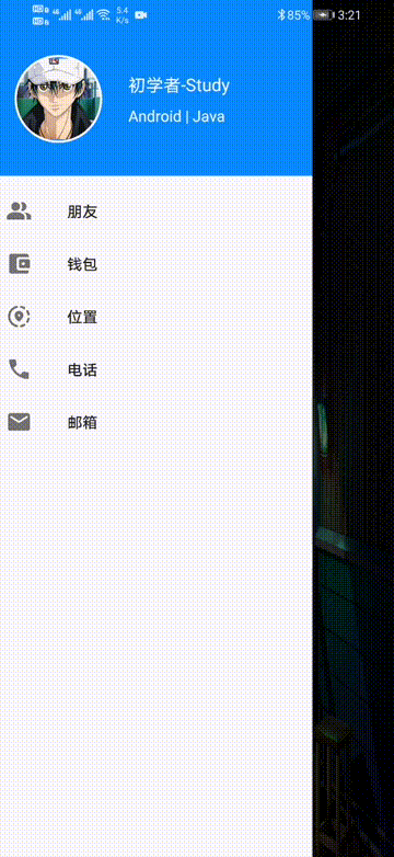
此时你会在预览的地方看到这样的画面
不用担心,图标是有的,只不过和使用方式有关系。
下面我们回到这个activity_main.xml,把我们写的导头部和菜单都引入进NavigationView中。
运行一下吧。

这样的效果如何呢?当然我们还需要与用户交互才行,不然你就是中看不中用。
进入到MainActivity中,首先新建一个showMsg方法,用于弹出Toast提示。
	/**
 * Toast提示
 * @param msg 内容
 */
 private void showMsg(String msg){
 Toast.makeText(this,msg,Toast.LENGTH_SHORT).show();
 }
然后新增变量:
private NavigationView navView;//导航视图
然后在onCreate中绑定xml的id。
navView = findViewById(R.id.nav_view);
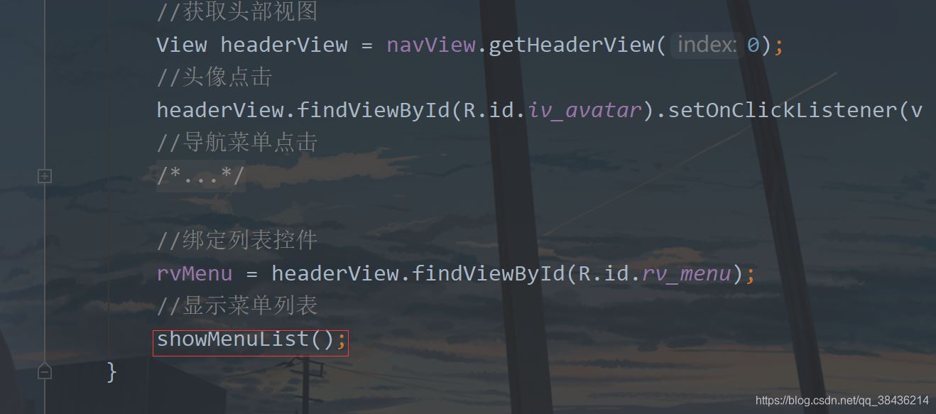
再通过这个navView来获取头部视图。
//获取头部视图
 View headerView = navView.getHeaderView(0);
头部视图中常规的头像是有点击动作的了,那么可以这样写:
//头像点击
 headerView.findViewById(R.id.iv_avatar).setOnClickListener(v -> showMsg("头像"));
然后就是菜单视图的点击了,如下所示,通过点击item的id进行判断,然后提示,之后关闭滑动菜单。
//导航菜单点击
 navView.setNavigationItemSelectedListener(item -> {
  switch (item.getItemId()) {
  case R.id.item_friend:
   showMsg("朋友");
   break;
  case R.id.item_wallet:
   showMsg("钱包");
   break;
  case R.id.item_location:
   showMsg("位置");
   break;
  case R.id.item_phone:
   showMsg("电话");
   break;
  case R.id.item_email:
   showMsg("邮箱");
   break;
  default:
   break;
  }
  //关闭滑动菜单
  drawerLayout.closeDrawer(GravityCompat.START);
  return true;
 });
运行之后一一点击测试一下:
嗯,和预想的效果一致,这也是现在很多APP侧滑菜单的用法,基本上就差不多了。
假如上面的五个菜单是基础功能,那么下面再添加一个扩展菜单。
当然还是要先添加这个菜单图标
icon_share.xml
<?xml version="1.0" encoding="UTF-8"?>
<vector xmlns:android="http://schemas.android.com/apk/res/android"
 android:width="24dp"
 android:height="24dp"
 android:tint="#000000"
 android:viewportWidth="24.0"
 android:viewportHeight="24.0">
 <path
 android:fillColor="@android:color/white"
 android:pathData="M18,16c-0.79,0 -1.5,0.31 -2.03,0.81L8.91,12.7C8.96,12.47 9,12.24 9,12s-0.04,-0.47 -0.09,-0.7l7.05,-4.11C16.49,7.69 17.21,8 18,8c1.66,0 3,-1.34 3,-3s-1.34,-3 -3,-3s-3,1.34 -3,3c0,0.24 0.04,0.48 0.09,0.7L8.04,9.81C7.5,9.31 6.79,9 6,9c-1.66,0 -3,1.34 -3,3s1.34,3 3,3c0.79,0 1.5,-0.31 2.04,-0.81l7.05,4.12C15.04,18.53 15,18.76 15,19c0,1.66 1.34,3 3,3s3,-1.34 3,-3S19.66,16 18,16z" />
</vector>
icon_send.xml
<?xml version="1.0" encoding="UTF-8"?>
<vector xmlns:android="http://schemas.android.com/apk/res/android"
 android:width="24dp"
 android:height="24dp"
 android:autoMirrored="true"
 android:tint="#000000"
 android:viewportWidth="24.0"
 android:viewportHeight="24.0">
 <path
 android:fillColor="@android:color/white"
 android:pathData="M3,5.51v3.71c0,0.46 0.31,0.86 0.76,0.97L11,12l-7.24,1.81C3.31,13.92 3,14.32 3,14.78v3.71c0,0.72 0.73,1.2 1.39,0.92l15.42,-6.49c0.82,-0.34 0.82,-1.5 0,-1.84L4.39,4.58C3.73,4.31 3,4.79 3,5.51z" />
</vector>
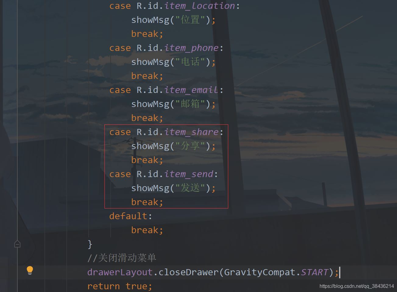
然后修改nav_menu.xml添加如下代码:
<!--增加扩展菜单-->
 <item android:title="扩展">
 <menu>
  <item
  android:id="@+id/item_share"
  android:icon="@drawable/icon_share"
  android:title="分享" />
  <item
  android:id="@+id/item_send"
  android:icon="@drawable/icon_send"
  android:title="发送" />
 </menu>
 </item>
放在group的i下面,然后进入到MainActivity中,添加两个菜单的点击事件
运行
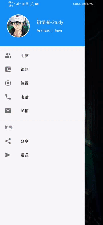
你可以看到这里还有分隔线。
像这种导航菜单一般都是定好的,静态的。但是保不齐就有需要动态的菜单,需要去动态改变一些数据。而动态的菜单就不能再去使用刚才的这种方式添加item了,我们可以用列表来解决。
说到列表你会想到ListView,不过现在都使用RecyclerView了。而为了简化RecyclerView的使用,我打算引入帮助的库,而为了模拟真实的接口返回数据,也会使用一个Json解析库。
下面首先在工程的下build.gradle的添加如下
//添加jitpack仓库
 maven { url "https://jitpack.io" }
添加位置如下图:
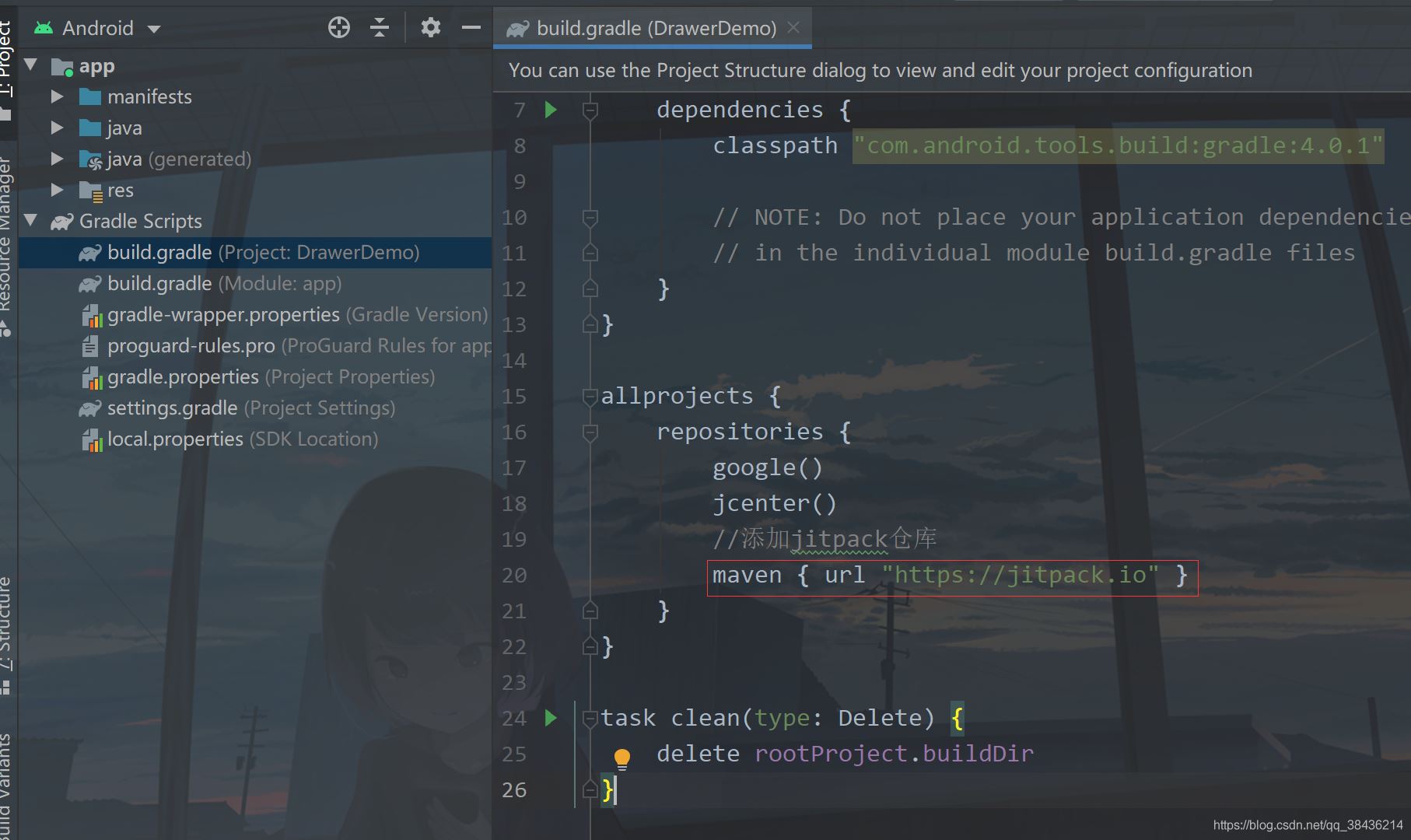
为什么要这么做的呢?这里你就要分清楚Android依赖库的由来,Google自己的库和第三方库。Google自己的库在你创建项目时就已经添加了,如
	google()
 jcenter()
而第三方库要想使用有些是需要添加jitpack仓库的,也就是我上面添加的代码。
下面进入app的build.gradle,在dependencies闭包{}中添加如下依赖库:
//RecyclerView最好的适配器,让你的适配器一目了然,告别代码冗余
 implementation 'com.github.CymChad:BaseRecyclerViewAdapterHelper:2.9.30'
 //Gson库
 implementation 'com.google.code.gson:gson:2.8.5'
然后再点击Sync Now 进行同步,同步没有报错,则我们先来构建这个返回的数据。
{
 "code":200,
 "data":[
 {
  "id":0,
  "name":"朋友"
 },
 {
  "id":1,
  "name":"钱包"
 },
 {
  "id":2,
  "name":"位置"
 },
 {
  "id":3,
  "name":"电话"
 },
 {
  "id":4,
  "name":"邮箱"
 },
 {
  "id":5,
  "name":"分享"
 },
 {
  "id":6,
  "name":"发送"
 }

 ],
 "msg":"Success"
}
实际开发中的返回数据和这个差不多,仅供参考。这一段JSON字符串,里面有三个主体内容,code用来检测你返回的是否合格,通常200表示正常返回,msg则表示描述,对于这个code的描述。data则是返回的数据组数。下面通过这个返回数据,我们可以写出这样的一个实体类。
在com.llw.drawerdemo中新建一个MenuResponse.java类,里面的代码如下:
package com.llw.drawerdemo;

import java.util.List;

/**
 * 菜单返回数据
 * @author lonel
 */
public class MenuResponse {


 /**
 * code : 200
 * data : [{"id":0,"name":"朋友"},{"id":1,"name":"钱包"},{"id":2,"name":"位置"},{"id":3,"name":"电话"},{"id":4,"name":"邮箱"},{"id":5,"name":"分享"},{"id":6,"name":"发送"}]
 * msg : Success
 */

 private int code;
 private String msg;
 private List<DataBean> data;

 public int getCode() {
 return code;
 }

 public void setCode(int code) {
 this.code = code;
 }

 public String getMsg() {
 return msg;
 }

 public void setMsg(String msg) {
 this.msg = msg;
 }

 public List<DataBean> getData() {
 return data;
 }

 public void setData(List<DataBean> data) {
 this.data = data;
 }

 public static class DataBean {
 /**
  * id : 0
  * name : 朋友
  */

 private int id;
 private String name;

 public int getId() {
  return id;
 }

 public void setId(int id) {
  this.id = id;
 }

 public String getName() {
  return name;
 }

 public void setName(String name) {
  this.name = name;
 }
 }
}
然后再创建一个常量类Contanst.java,里面的代码如下:
package com.llw.drawerdemo;

/**
 * 常量
 * @author lonel
 */
public class Contanst {

 public static final int SUCCESS = 200;

 public static final String JSON = "{\n" +
  " \"code\":200,\n" +
  " \"data\":[\n" +
  " {\n" +
  "  \"id\":0,\n" +
  "  \"name\":\"朋友\"\n" +
  " },\n" +
  " {\n" +
  "  \"id\":1,\n" +
  "  \"name\":\"钱包\"\n" +
  " },\n" +
  " {\n" +
  "  \"id\":2,\n" +
  "  \"name\":\"位置\"\n" +
  " },\n" +
  " {\n" +
  "  \"id\":3,\n" +
  "  \"name\":\"电话\"\n" +
  " },\n" +
  " {\n" +
  "  \"id\":4,\n" +
  "  \"name\":\"邮箱\"\n" +
  " },\n" +
  " {\n" +
  "  \"id\":5,\n" +
  "  \"name\":\"分享\"\n" +
  " },\n" +
  " {\n" +
  "  \"id\":6,\n" +
  "  \"name\":\"发送\"\n" +
  " }\n" +
  " \n" +
  " ],\n" +
  " \"msg\":\"Success\"\n" +
  "}";
}
里面是我们返回的数据JSON字符串,用这种方式来模拟真实返回数据。还有一点就是这个成功码用一个全局的常量来表示,尽量不要再代码中直接使用200来做为成功的返回判定。用常量的好处就是改起来快,假如今天你是200为成功,明天变成100,那么我只需要改这个常量的值即可,而不需要你去每一个用200判定的地方都去手动改成100,效率上就提高很多。
下面来写这个item的布局,在layout下新建一个item_menu.xml文件,里面的代码如下:
<?xml version="1.0" encoding="utf-8"?>
<TextView xmlns:android="http://schemas.android.com/apk/res/android"
 android:id="@+id/tv_menu_name"
 android:layout_width="match_parent"
 android:layout_height="wrap_content"
 android:foreground="?attr/selectableItemBackground"
 android:padding="16dp"
 android:textColor="#000"
 android:textSize="16sp" />
这里的
android:foreground="?attr/selectableItemBackground"
就是点击item的效果,体验感更强一些。
然后去写适配器,在com.llw.drawerdemo下新建一个MenuAdapter类,里面的代码如下:
package com.llw.drawerdemo;

import androidx.annotation.Nullable;

import com.chad.library.adapter.base.BaseQuickAdapter;
import com.chad.library.adapter.base.BaseViewHolder;

import java.util.List;


/**
 * 菜单列表适配器
 * @author lonel
 */
public class MenuAdapter extends BaseQuickAdapter<MenuResponse.DataBean, BaseViewHolder> {
 public MenuAdapter(int layoutResId, @Nullable List<MenuResponse.DataBean> data) {
 super(layoutResId, data);
 }

 @Override
 protected void convert(BaseViewHolder helper, MenuResponse.DataBean item) {
 helper.setText(R.id.tv_menu_name,item.getName());
 //添加点击事件
 helper.addOnClickListener(R.id.tv_menu_name);
 }
}
相比于传统的适配器,这样写就简洁很多了,然后是修改布局,首先是activity_main.xml中,我们去掉nav_menu
保留这个headerLayout,然后去修改这个nav_header布局代码:修改后如下:
<?xml version="1.0" encoding="utf-8"?>
<androidx.core.widget.NestedScrollView xmlns:android="http://schemas.android.com/apk/res/android"
 xmlns:app="http://schemas.android.com/apk/res-auto"
 android:layout_width="match_parent"
 android:layout_height="match_parent"
 android:fitsSystemWindows="true"
 android:overScrollMode="never"
 android:orientation="vertical">

 <LinearLayout
 android:orientation="vertical"
 android:layout_width="match_parent"
 android:layout_height="wrap_content">
 <!--头部菜单-->
 <RelativeLayout
  android:background="#1391F8"
  android:layout_width="match_parent"
  android:layout_height="160dp">
  <!--头像-->
  <com.google.android.material.imageview.ShapeableImageView
  android:id="@+id/iv_avatar"
  android:layout_width="80dp"
  android:layout_height="80dp"
  android:layout_alignParentBottom="true"
  android:layout_marginStart="24dp"
  android:layout_marginEnd="24dp"
  android:layout_marginBottom="30dp"
  android:padding="1dp"
  android:src="@mipmap/icon_default_avatar"
  app:shapeAppearanceOverlay="@style/circleImageStyle"
  app:strokeColor="#FFF"
  app:strokeWidth="2dp" />
  <!--名称-->
  <TextView
  android:id="@+id/tv_name"
  android:layout_width="wrap_content"
  android:layout_height="wrap_content"
  android:layout_alignTop="@+id/iv_avatar"
  android:layout_marginTop="16dp"
  android:layout_toEndOf="@+id/iv_avatar"
  android:text="初学者-Study"
  android:textColor="#FFF"
  android:textSize="16sp" />
  <!--标签-->
  <TextView
  android:id="@+id/tv_tip"
  android:layout_width="wrap_content"
  android:layout_height="wrap_content"
  android:layout_below="@+id/tv_name"
  android:layout_marginTop="8dp"
  android:layout_toEndOf="@+id/iv_avatar"
  android:text="Android | Java"
  android:textColor="#FFF"
  android:textSize="14sp" />
 </RelativeLayout>

 <!--列表菜单-->
 <androidx.recyclerview.widget.RecyclerView
  android:id="@+id/rv_menu"
  android:layout_width="match_parent"
  android:layout_height="wrap_content"/>
 </LinearLayout>

</androidx.core.widget.NestedScrollView>
NestedScrollView表示一个滚动视图,它里面只能放一个布局,当这个布局的高度超过屏幕时,则可以上下滚动显示,而这个布局里面又可以嵌套其他的布局。我在里面放置了之前的相对布局和新增的列表控件。下面我们进入到MainActivity。
先声明成员变量
private RecyclerView rvMenu;//列表
然后在onCreate中通过headerView去绑定布局中的id。
//绑定列表控件
 rvMenu = headerView.findViewById(R.id.rv_menu);
然后再写一个方法用来显示菜单列表。
/**
 * 显示菜单列表
 */
 private void showMenuList() {
 //解析JSON数据
 MenuResponse menuResponse = new Gson().fromJson(Contanst.JSON, MenuResponse.class);
 if (menuResponse.getCode() == Contanst.SUCCESS) {
  //为空处理
  if(menuResponse.getData() ==null){
  showMsg("返回菜单数据为空");
  return;
  }
  List<MenuResponse.DataBean> data = menuResponse.getData();
  //设置适配器的布局和数据源
  MenuAdapter menuAdapter = new MenuAdapter(R.layout.item_menu, data);
  //item点击事件
  menuAdapter.setOnItemChildClickListener((adapter, view, position) -> {
   showMsg(data.get(position).getName());
   //关闭滑动菜单
   drawerLayout.closeDrawer(GravityCompat.START);
  });
  //设置线性布局管理器,默认是纵向
  rvMenu.setLayoutManager(new LinearLayoutManager(this));
  //设置适配器
  rvMenu.setAdapter(menuAdapter);
 } else {
  //错误提示
  showMsg(menuResponse.getMsg());
 }
 }
里面的代码都有注释,相信你一定可以看懂。
然后在onCreate中调用这个方法
运行。
效果是有了,但是好像没有图标有点不得劲是吧。因为实际开发中的图标也是从后台返回过来的,一般来说是一个网络图标地址,这个地址你可以通过Glide库去进行图标显示。而我们没有这个网络地址,不过幸运的是,我们有之前手写的七个图标,不是吗。我们将这七个图标组成一个int数组,然后在适配器中进行配置就好了,不过首先呢需要改变一下item_menu.xml。
<?xml version="1.0" encoding="utf-8"?>
<LinearLayout xmlns:android="http://schemas.android.com/apk/res/android"
 android:id="@+id/item_menu"
 android:layout_width="match_parent"
 android:layout_height="wrap_content"
 android:foreground="?attr/selectableItemBackground"
 android:gravity="center_vertical"
 android:orientation="horizontal"
 android:paddingStart="16dp">
 <!--菜单图标-->
 <ImageView
 android:id="@+id/iv_menu_icon"
 android:layout_width="24dp"
 android:layout_height="24dp" />
 <!--菜单名称-->
 <TextView
 android:layout_marginStart="16dp"
 android:id="@+id/tv_menu_name"
 android:layout_width="match_parent"
 android:layout_height="wrap_content"
 android:padding="16dp"
 android:textColor="#000"
 android:textSize="16sp" />

</LinearLayout>
然后进入MenuAdapter中,
新增一个图标数组
private int[] iconArray = {R.drawable.icon_friend, R.drawable.icon_wallet, R.drawable.icon_location
  , R.drawable.icon_phone, R.drawable.icon_email, R.drawable.icon_share, R.drawable.icon_send};
然后在convert中通过item的位置来获取图标数组中的图标,然后设置到ImageVIew中,这样写是有弊端的,当你的数据条目和图标数组长度不一致时,就会出现数组越界,然后就报错崩溃,程序闪退,因此实际中不会采取这种方式,我这里只是演示。其次我还改变了添加点击事件的图标,之前是给TextView添加点击事件,现在是给LinearLayout添加点击事件。

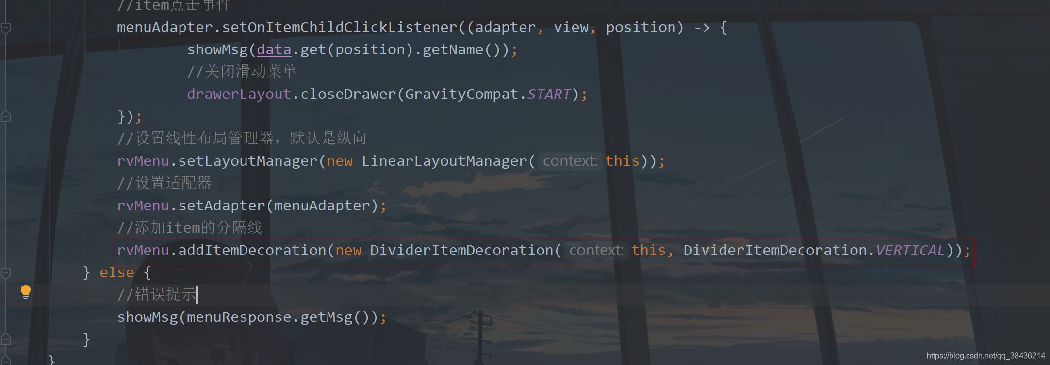
然后我们回到MainActivity中,去给item添加分割线。
//添加item的分隔线
 rvMenu.addItemDecoration(new DividerItemDecoration(this, DividerItemDecoration.VERTICAL));
添加位置如下:
下面再运行一次。
这里菜单图标有了,分割线也有了,不过实际为了美感,通常会去掉最后一个item的分隔线,这个可以通过自定义View来实现,网上多的是。继承RecyclerView.ItemDecoration然后获取item数量,最后一个item不绘制分割线。
我这里就不详细介绍这种方式了,我们可以用另一种巧妙的方式来解决:
添加静态菜单。
下面再添加两个图标,
item_setting.xml
<?xml version="1.0" encoding="UTF-8"?>
<vector xmlns:android="http://schemas.android.com/apk/res/android"
 android:width="24dp"
 android:height="24dp"
 android:tint="#000000"
 android:viewportWidth="24.0"
 android:viewportHeight="24.0">
 <path
 android:fillColor="@android:color/white"
 android:pathData="M18.04,7.99l-0.63,-1.4l-1.4,-0.63c-0.39,-0.18 -0.39,-0.73 0,-0.91l1.4,-0.63l0.63,-1.4c0.18,-0.39 0.73,-0.39 0.91,0l0.63,1.4l1.4,0.63c0.39,0.18 0.39,0.73 0,0.91l-1.4,0.63l-0.63,1.4C18.78,8.38 18.22,8.38 18.04,7.99zM21.28,12.72L20.96,12c-0.18,-0.39 -0.73,-0.39 -0.91,0l-0.32,0.72L19,13.04c-0.39,0.18 -0.39,0.73 0,0.91l0.72,0.32L20.04,15c0.18,0.39 0.73,0.39 0.91,0l0.32,-0.72L22,13.96c0.39,-0.18 0.39,-0.73 0,-0.91L21.28,12.72zM16.24,14.37l1.23,0.93c0.4,0.3 0.51,0.86 0.26,1.3l-1.62,2.8c-0.25,0.44 -0.79,0.62 -1.25,0.42l-1.43,-0.6c-0.2,0.13 -0.42,0.26 -0.64,0.37l-0.19,1.54c-0.06,0.5 -0.49,0.88 -0.99,0.88H8.38c-0.5,0 -0.93,-0.38 -0.99,-0.88L7.2,19.59c-0.22,-0.11 -0.43,-0.23 -0.64,-0.37l-1.43,0.6c-0.46,0.2 -1,0.02 -1.25,-0.42l-1.62,-2.8c-0.25,-0.44 -0.14,-0.99 0.26,-1.3l1.23,-0.93C3.75,14.25 3.75,14.12 3.75,14s0,-0.25 0.01,-0.37L2.53,12.7c-0.4,-0.3 -0.51,-0.86 -0.26,-1.3l1.62,-2.8c0.25,-0.44 0.79,-0.62 1.25,-0.42l1.43,0.6c0.2,-0.13 0.42,-0.26 0.64,-0.37l0.19,-1.54C7.45,6.38 7.88,6 8.38,6h3.23c0.5,0 0.93,0.38 0.99,0.88l0.19,1.54c0.22,0.11 0.43,0.23 0.64,0.37l1.43,-0.6c0.46,-0.2 1,-0.02 1.25,0.42l1.62,2.8c0.25,0.44 0.14,0.99 -0.26,1.3l-1.23,0.93c0.01,0.12 0.01,0.24 0.01,0.37S16.25,14.25 16.24,14.37zM13,14c0,-1.66 -1.34,-3 -3,-3s-3,1.34 -3,3s1.34,3 3,3S13,15.66 13,14z" />
</vector>
icon_logout.xml
<?xml version="1.0" encoding="UTF-8"?>
<vector xmlns:android="http://schemas.android.com/apk/res/android"
 android:width="24dp"
 android:height="24dp"
 android:autoMirrored="true"
 android:tint="#000000"
 android:viewportWidth="24.0"
 android:viewportHeight="24.0">
 <path
 android:fillColor="@android:color/white"
 android:pathData="M5,5h6c0.55,0 1,-0.45 1,-1v0c0,-0.55 -0.45,-1 -1,-1H5C3.9,3 3,3.9 3,5v14c0,1.1 0.9,2 2,2h6c0.55,0 1,-0.45 1,-1v0c0,-0.55 -0.45,-1 -1,-1H5V5z" />
 <path
 android:fillColor="@android:color/white"
 android:pathData="M20.65,11.65l-2.79,-2.79C17.54,8.54 17,8.76 17,9.21V11h-7c-0.55,0 -1,0.45 -1,1v0c0,0.55 0.45,1 1,1h7v1.79c0,0.45 0.54,0.67 0.85,0.35l2.79,-2.79C20.84,12.16 20.84,11.84 20.65,11.65z" />
</vector>
然后修改之前的nav_menu.xml,修改后如下:
<?xml version="1.0" encoding="utf-8"?>
<menu xmlns:android="http://schemas.android.com/apk/res/android">
 <!--增加其他菜单-->
 <item android:title="其他">
 <menu>
  <item
  android:id="@+id/item_setting"
  android:icon="@drawable/icon_settings"
  android:title="设置" />
  <item
  android:id="@+id/item_logout"
  android:icon="@drawable/icon_logout"
  android:title="退出" />
 </menu>
 </item>
</menu>
然后在styles.xml中增加一个item字体的大小设置
<!--menu文字样式-->
	<style name="MenuTextStyle">
 <item name="android:textSize">16sp</item>
 </style>
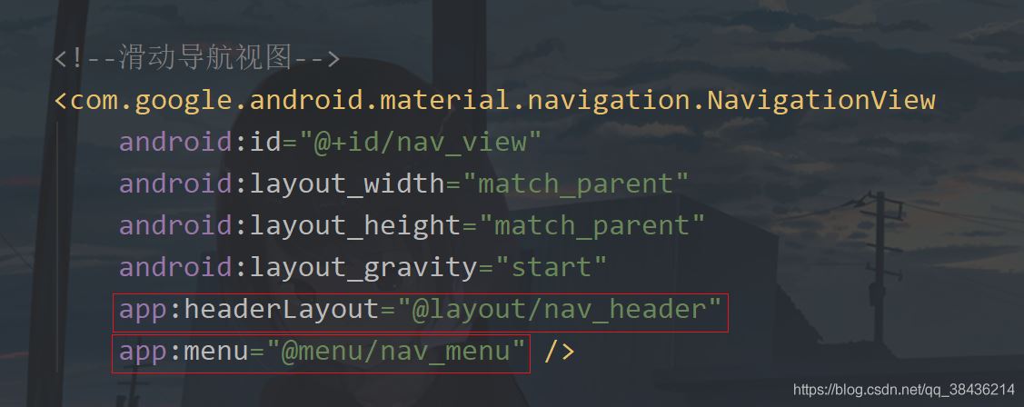
再进入activity_main.xml,修改NavigationView,修改内容如下:
<!--滑动导航视图-->
 <com.google.android.material.navigation.NavigationView
 android:id="@+id/nav_view"
 android:layout_width="match_parent"
 android:layout_height="match_parent"
 android:layout_gravity="start"
 android:theme="@style/MenuTextStyle"
 app:headerLayout="@layout/nav_header"
 app:itemIconSize="24dp"
 app:itemIconTint="#000"
 app:itemTextColor="#000"
 app:menu="@menu/nav_menu" />
再进入MainActivity中,修改菜单点击事件
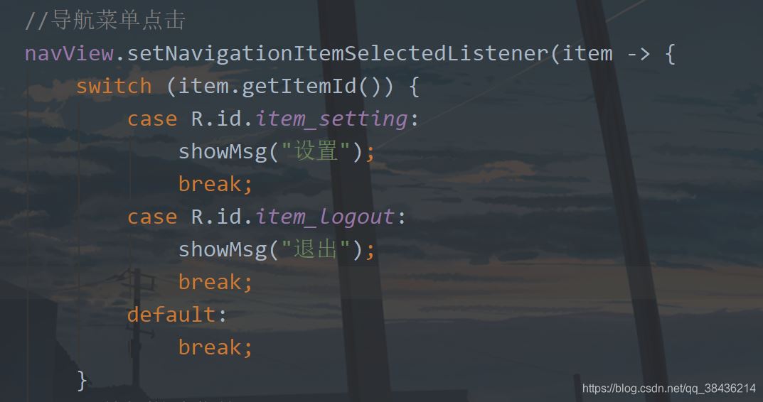
然后运行一下:
嗯,这样你现在动态也有静态也有,挺好的,本文就写到这里了。
上高水长,后会有期。
源码地址:DrawerDemo

