wxml:
<view class="body">
      <view class="body-content">
       第1题:企业的价值观是 ?
      </view>
      <view class="label">单选</view>
     </view>
     <view class="options">

      <radio-group class="radio-group" bindchange="radioChange">
       <label class="radio" wx:for="{{items}}" wx:key="{{index}}">
        <view>
         <radio value="{{item.name}}" checked="{{item.checked}}"/>{{item.value}}
        </view>
       </label>

      </radio-group>

     </view>
我们看一下原生的效果:
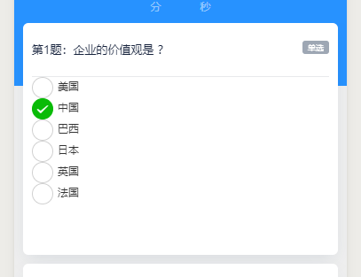
修改wxml中的redio 组件的color属性:
<radio value="{{item.name}}" checked="{{item.checked}}" color="#fff"/>{{item.value}}
wxss(只有修改样式的部分):
/* 单选、多选 勾选 */


/*radio未选中时样式 */
radio .wx-radio-input{
 /* 自定义样式.... */
/* 我这里没有进行,未选中的样式修改
  height: 40rpx;
  width: 40rpx;
  margin-top: -4rpx;
  border-radius: 50%;
  border: 2rpx solid #999;
  background: transparent;
   */

 }


/* 选中后的 背景样式 (红色背景 无边框 可根据UI需求自己修改) */
radio .wx-radio-input.wx-radio-input-checked {
  /* border: none; */
  border-color: #2792ff!important;
  /* background-color: #fff!important; */
  /* background-color: transparent!important; */
  /* 居中 */
/*
  display: flex;
  justify-content: center;
  align-items: center;
  */

}

/* 选中后的 对勾样式 (白色对勾 可根据UI需求自己修改) */
radio .wx-radio-input.wx-radio-input-checked::before {
 /* 去除对号 */
 content: '';
 /* background: #fff; */
 width: 36rpx;
 height: 36rpx;
 border-radius: 50%;
 /* background: red; */
 background-color: #2792ff;
 /* 居中 */
 /* margin-top: 0rpx; */
 /* display: flex; */
 /* position: relative; */

}
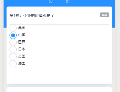
修改后的单选框样式:
复选框同理
wxml:
<view class="body">
      <view class="body-content">
       第1题:企业的价值观是 ?
      </view>
      <view class="label">多选</view>
     </view>
     <view class="options">


      <checkbox-group bindchange="checkboxChange">
       <label class="checkbox" wx:for="{{items}}">
        <view>
         <checkbox value="{{item.name}}" checked="{{item.checked}}"/>{{item.value}}

        </view>
       </label>
      </checkbox-group>
     </view>
wxss:
/*checkbox未选中时样式 */
checkbox .wx-checkbox-input{
 /* 自定义样式.... */
 border-radius: 50%;

 }


/* 选中后的 背景样式 (红色背景 无边框 可根据UI需求自己修改) */
checkbox .wx-checkbox-input.wx-checkbox-input-checked {
  /* border: none; */
  border-radius: 50%;
  border-color: #2792ff!important;


}

/* 选中后的 对勾样式 (白色对勾 可根据UI需求自己修改) */
checkbox .wx-checkbox-input.wx-checkbox-input-checked::before {
 /* 去除对号 */
 content: '';
 /* background: #fff; */
 width: 36rpx;
 height: 36rpx;
 border-radius: 50%;
 /* background: red; */
 background-color: #2792ff;
 /* 居中 */
 /* margin-top: 0rpx; */
 /* display: flex; */
 /* position: relative; */

}
修改前后对比:
前
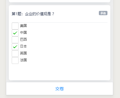
后


