python绘图的包大家应该不会陌生,但是,对图的常规设置不一定会知道(其实自己也是才知道的),比如:坐标轴的字体大小、颜色设置;标题的字体颜色大小设置;线的粗细、颜色;图片风格的设置等。了解这些常规设置必定会让图片更加美观。
下面就具体来说说matplotlib中有哪些常规设置。
我主要总结了这几个函数:
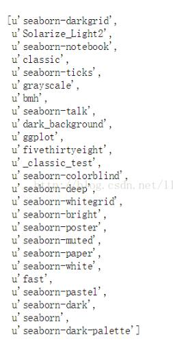
plt.style.use()函数;可以对图片的整体风格进行设置。可以通过plt.style.availabel知道一共有多少种主题。
import matplotlib.pyplot as plt
import numpy as np
import pandas as pd
import matplotlib as mpl
print plt.style.availabel
我们试用其中两个主题。
plt.style.use("fivethirtyeight")
data = np.random.randn(50)
plt.scatter(range(50), data)

with plt.style.context(('dark_background')):
  plt.plot(np.sin(np.linspace(0, 2 * np.pi)), 'r-o') # "r-o"表示红色的点用线连接起来。
plt.show()

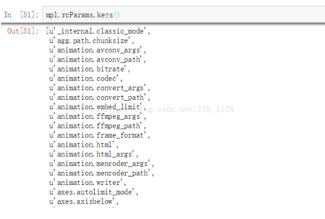
mpl.rcParams()函数;这个函数可以设置图片的坐标轴以及标题的字体大小、颜色、宽度等。同时,也可以用mpl.rcParams.keys()进行查看有哪些设置。
mpl.rcParams['xtick.labelsize'] = 16
mpl.rcParams["ytick.color"] = 'b'
plt.plot(range(50), data, 'g^')
plt.show()
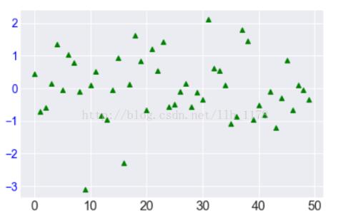
这张图就通过rcParams()函数设置了y轴的字体颜色,x轴的字体大小。同时,将点的marker变成了三角形、颜色变为了绿色。
mpl.rc()函数;它可以用来设置线的粗细、风格、颜色等。
mpl.rc('lines', linewidth=4, color='r', linestyle='-.')
plt.plot(data)

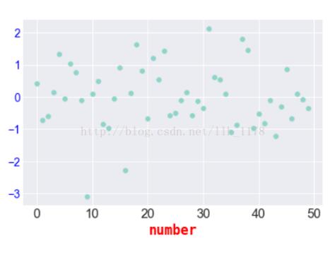
fontdict()函数;也可以来办同样的事情。
font = {'family' : 'monospace',
    'weight' : 'bold',
    'size'  : 'larger',
    'color' : "r"
    }
plt.scatter(range(50), data)
plt.xlabel("number", fontdict=font)
font()字典中主要存在这么几类键:
font.family ;一共有5种设置: serif sans-serif cursive antasy monospace
font.style ;一种有3种设置:normal italic oblique
font.variant ;一共有2种设置:normal or small-caps
font.weight ;一共有4种设置:normal, bold, bolder, lighter
font.stretch ;一共有13种设置:
ultra-condensed, extra-condensed, condensed, semi-condensed, normal, semi-expanded, expanded, extra-expanded, ultra-expanded, wider, and narrower. font.size ;默认值是10pt
plt.setp()函数;也是可以设置线的粗细以及颜色,还可以设置坐标轴的方向,位置。
例如:
setp(lines, 'linewidth', 2, 'color', 'r')
借用帮助文档上的一个例子:
import numpy as np
import matplotlib.pyplot as plt
data = {'Barton LLC': 109438.50,
    'Frami, Hills and Schmidt': 103569.59,
    'Fritsch, Russel and Anderson': 112214.71,
    'Jerde-Hilpert': 112591.43,
    'Keeling LLC': 100934.30,
    'Koepp Ltd': 103660.54,
    'Kulas Inc': 137351.96,
    'Trantow-Barrows': 123381.38,
    'White-Trantow': 135841.99,
    'Will LLC': 104437.60}
group_data = list(data.values())
group_names = list(data.keys())
group_mean = np.mean(group_data)
fig, ax = plt.subplots()
ax.barh(group_names, group_data)
labels = ax.get_xticklabels()
plt.setp(labels, rotation=45, horizontalalignment='right')
ax.set(xlim=[-10000, 140000], xlabel='Total Revenue', ylabel='Company',
    title='Company Revenue')

可以看到x轴坐标斜向45°旋转了,整个图片变得更加美观了。为了对数据更加一步分析,做下面操作:

def currency(x, pos):
  """The two args are the value and tick position"""
  if x >= 1e6:
    s = '${:1.1f}M'.format(x*1e-6)
  else:
    s = '${:1.0f}K'.format(x*1e-3)
  return s
formatter = FuncFormatter(currency)
fig, ax = plt.subplots(figsize=(6, 8))
ax.barh(group_names, group_data)
labels = ax.get_xticklabels()
plt.setp(labels, rotation=45, horizontalalignment='right')

ax.set(xlim=[-10000, 140000], xlabel='Total Revenue', ylabel='Company',
    title='Company Revenue')
ax.xaxis.set_major_formatter(formatter)


fig, ax = plt.subplots(figsize=(8, 8))
ax.barh(group_names, group_data)
labels = ax.get_xticklabels()
plt.setp(labels, rotation=45, horizontalalignment='right')

# 以所有收益的平均值画一条垂直线,看哪些公司是超越平均收益的
ax.axvline(group_mean, ls='--', color='r')

# 标注新成立的公司
for group in [3, 5, 8]:
  ax.text(145000, group, "New Company", fontsize=10,
      verticalalignment="center")

# 将标题移动一点,与图片保持一点距离。
ax.title.set(y=1.05)
ax.set(xlim=[-10000, 140000], xlabel='Total Revenue', ylabel='Company',
    title='Company Revenue')
ax.xaxis.set_major_formatter(formatter)
ax.set_xticks([0, 25e3, 50e3, 75e3, 100e3, 125e3])
plt.show()
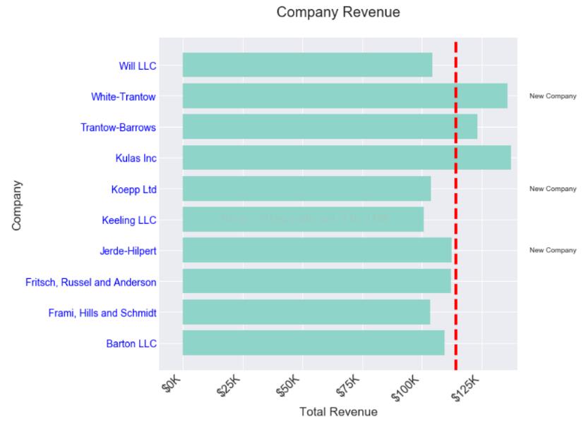
现在好了,可以直观的看出哪些公司是新成立得,同时哪些公司的收益是超越平均水平的。对之后的数据分析和统计都是有非常大的帮助的。
以上这篇python画图常规设置方式就是小编分享给大家的全部内容了,希望能给大家一个参考,也希望大家多多支持。

