使用pyecharts进行数据可视化
安装 pip install pyecharts
也可以在pycharm软件里进行下载pyecharts库包。
下载成功后进行查询版本号
import pyecharts
print(pyecharts.__version__)
pyecharts的中文官网
可以查看pyecharts的中文官网介绍http://pyecharts.org/。
一般的使用方法
add()
该方法主要用于添加图表的数据和设置各种配置项。
show_config()
用于打印输出图表的所有配置项
render()
该方法默认将会在根目录下生成一个 render.html 的文件,支持 path 参数,设置文件保存位置,如 render(r"e:my_first_chart.html"),文件用浏览器打开。
注意*
默认的编码类型为 UTF-8,在 Python3 中是没什么问题的,Python3 对中文的支持好很多。但是在 Python2 中,编码的处理是个很头疼的问题,暂时没能找到完美的解决方法,目前只能通过文本编辑器自己进行二次编码,我用的是 Visual Studio Code,先通过 Gbk 编码重新打开,然后再用 UTF-8 重新保存,这样用浏览器打开的话就不会出现中文乱码问题了。
基本使用
用示例来解决实际问题
1.美国1995年-2009年邮费变化折线图、阶梯图;
数据如下:
年份 : [“1995”, “1996”, “1997”, “1998”, “1999”, “2000”,
“2001”, “2002”, “2003”, “2004”, “2005”, “2006”,
“2007”, “2008”, “2009”]
邮费: [0.32, 0.32, 0.32, 0.32, 0.33, 0.33, 0.34, 0.37, 0.37, 0.37, 0.37, 0.39, 0.41, 0.42, 0.44]
折线图 代码如下:
import pyecharts.options as opts
from pyecharts.charts import Line

year= ["1995", "1996", "1997", "1998", "1999", "2000",
   "2001", "2002", "2003", "2004", "2005", "2006",
   "2007", "2008", "2009"]
postage= [0.32, 0.32, 0.32, 0.32, 0.33, 0.33, 0.34, 0.37, 0.37, 0.37, 0.37, 0.39, 0.41, 0.42, 0.44]

(
 Line()
 .set_global_opts(
  tooltip_opts=opts.TooltipOpts(is_show=False),
  xaxis_opts=opts.AxisOpts(type_="category"),
  yaxis_opts=opts.AxisOpts(
   type_="value",
   axistick_opts=opts.AxisTickOpts(is_show=True),
   splitline_opts=opts.SplitLineOpts(is_show=True),
  ),
 )
 .add_xaxis(xaxis_data=year)
 .add_yaxis(
  series_name="",
  y_axis=postage,
  symbol="emptyCircle",
  is_symbol_show=True,
  label_opts=opts.LabelOpts(is_show=False),
 )
 .render("basic_line_chart.html")
)
会在同目录下生成一个basic_line_chart.html的网页,打开网页则会显示该代码的运行结果。(此不展示,与下同)
阶梯图 代码如下:
import pyecharts.options as opts
from pyecharts.charts import Line

year = ["1995", "1996", "1997", "1998", "1999", "2000",
   "2001", "2002", "2003", "2004", "2005", "2006",
   "2007", "2008", "2009"]
postage = [0.32, 0.32, 0.32, 0.32, 0.33, 0.33, 0.34, 0.37, 0.37, 0.37, 0.37, 0.39, 0.41, 0.42, 0.44]

c = (
 Line()
 .add_xaxis(xaxis_data=year)
 .add_yaxis("美国1995年-2009年邮费", y_axis=postage, is_step=True)
 .set_global_opts(title_opts=opts.TitleOpts(title="Line-阶梯图"))
 .render("line_step.html")
)
会在同目录下生成一个line_step.html的网页,打开网页则会显示该代码的运行结果:

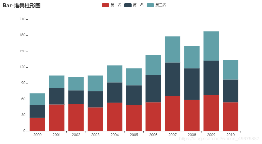
2.2000年-2010年热狗大胃王比赛前三名成绩的堆叠柱形图、极坐标系-堆叠柱状图(南丁格尔玫瑰图);
数据文件:hot-dog-places.csv
hot-dog-places.csv内写着:
2000,2001,2002,2003,2004,2005,2006,2007,2008,2009,2010
25,50,50.5,44.5,53.5,49,54,66,59,68,54
24,31,26,30.5,38,37,52,63,59,64.5,43
22,23.5,25.5,29.5,32,32,37,49,42,55,37
等数据将其保存为csv文件
堆叠柱形图 代码如下:
from pyecharts import options as opts
from pyecharts.charts import Bar
import csv

filename="hot-dog-places.csv"
data_x=[]
#打开文件循环读取数据
with open(filename) as f:
 reader = csv.reader(f)
 for data_row in reader:
  data_x.append(data_row)
x=data_x[0]			#读取数据列表集中第一行数据进行赋值
y1=data_x[1]
y2=data_x[2]
y3=data_x[3]

c = (
 Bar()
 .add_xaxis(x)
 .add_yaxis("第一名", y1, stack="stack1")
 .add_yaxis("第二名", y2, stack="stack1")
 .add_yaxis("第三名", y3, stack="stack1")#显示在同一条柱状图中,不带stack属性则会分为三条柱状图
 .set_series_opts(label_opts=opts.LabelOpts(is_show=False))
 .set_global_opts(title_opts=opts.TitleOpts(title="Bar-堆叠柱形图"))
 .render("bar_stack0.html")
)
会在同目录下生成一个bar_stack0.html的网页,打开网页则会显示该代码的运行结果:
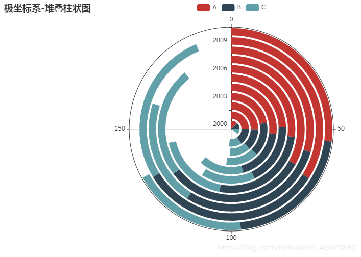
极坐标系-堆叠柱状图(南丁格尔玫瑰图) 代码如下:
from pyecharts import options as opts
from pyecharts.charts import Polar
import csv

filename="hot-dog-places.csv"
data_x=[]
#打开文件循环读取数据
with open(filename) as f:
 reader = csv.reader(f)
 for data_row in reader:
  data_x.append(data_row)
x=data_x[0]			#读取数据列表集中第一行数据进行赋值
y1=data_x[1]
y2=data_x[2]
y3=data_x[3]

c = (
 Polar()
 .add_schema(angleaxis_opts=opts.AngleAxisOpts(data=x, type_="category"))
 .add("A", y1, type_="bar", stack="stack0")
 .add("B", y2, type_="bar", stack="stack0")
 .add("C", y3, type_="bar", stack="stack0")
 .set_global_opts(title_opts=opts.TitleOpts(title="极坐标系-堆叠柱状图(南丁格尔玫瑰图)"))
 .render("极坐标系-堆叠柱状图(南丁格尔玫瑰图).html")
)
打开网页则会显示该代码的运行结果:

极坐标系-堆叠柱状图 代码与上面相同,需要改的是c后面接的将其更改为如下代码:
d = (
 Polar()
 .add_schema(
  radiusaxis_opts=opts.RadiusAxisOpts(data=x, type_="category"),
  angleaxis_opts=opts.AngleAxisOpts(is_clockwise=True, max_=200),
 )
 .add("A", y1, type_="bar", stack="stack1")
 .add("B", y2, type_="bar", stack="stack1")
 .add("C", y3, type_="bar", stack="stack1")
 .set_global_opts(title_opts=opts.TitleOpts(title="极坐标系-堆叠柱状图"))
 .set_series_opts(label_opts=opts.LabelOpts(is_show=True))
 .render("极坐标系-堆叠柱状图.html")
)
打开网页则会显示该代码的运行结果:
3.某网站用户感兴趣的领域的投票结果绘制饼图、环形图;
数据文件:vote_result.csv
vote_result.csv内写着:
感兴趣的领域,票数
金融,172
医疗保健,136
市场业,135
零售业,101
制造业,80
司法,68
工程与科学,50
保险业,29
其他,41
饼图 代码如下:
from pyecharts import options as opts
from pyecharts.charts import Pie
import csv

filename="vote_result.csv"
data_x=[]
#打开文件循环读取数据
with open(filename,'r', encoding='UTF-8') as f:
 reader = csv.reader(f)
 for data_row in reader:
  data_x.append(data_row)
b=[]
c=[]
for index,values in enumerate(data_x):
 if(index>0):
  b.append(values[0])
  c.append(values[1])

x=data_x[0]			#读取数据列表集中第一行数据进行赋值

d = (
 Pie()
 .add(
  "",
  [list(z) for z in zip(b, c)],
  center=["35%", "50%"],
 )
 .set_global_opts(
  title_opts=opts.TitleOpts(title="投票结果饼图"),
  legend_opts=opts.LegendOpts(pos_left="15%"),
 )
 .set_series_opts(label_opts=opts.LabelOpts(formatter="{b}: {c}"))
 .render("pie_position.html")
)
打开网页则会显示该代码的运行结果:

环形图 代码如下:
from pyecharts import options as opts
from pyecharts.charts import Pie
import csv

filename="vote_result.csv"
data_x=[]
#打开文件循环读取数据
with open(filename,'r', encoding='UTF-8') as f:
 reader = csv.reader(f)
 for data_row in reader:
  data_x.append(data_row)
b=[]
c=[]
for index,values in enumerate(data_x):
 if(index>0):
  b.append(values[0])
  c.append(values[1])

d = (
 Pie()
 .add(
  "",
  [list(z) for z in zip(b, c)],
  radius=["40%", "75%"],
 )
 .set_global_opts(
  title_opts=opts.TitleOpts(title="环形图"),
  legend_opts=opts.LegendOpts(orient="vertical", pos_top="15%", pos_left="2%"),
 )
 .set_series_opts(label_opts=opts.LabelOpts(formatter="{b}: {c}"))
 .render("投票结果+环形图.html")
)
打开网页则会显示该代码的运行结果:

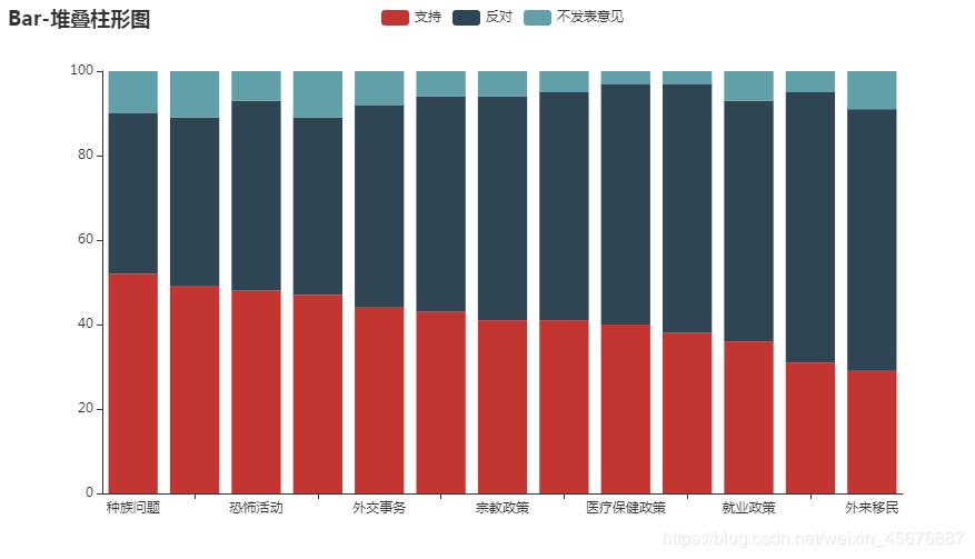
4.奥巴马的政治举措民意调查结果的堆叠柱形图;
数据文件:approval_rate.csv
approval_rate.csv内写着:
政治举措,支持,反对,不发表意见
种族问题,52,38,10
教育,49,40,11
恐怖活动,48,45,7
能源政策,47,42,11
外交事务,44,48,8
环境,43,51,6
宗教政策,41,53,6
税收,41,54,5
医疗保健政策,40,57,3
经济,38,59,3
就业政策,36,57,7
贸易政策,31,64,5
外来移民,29,62,9
堆叠柱形图 代码如下:
from pyecharts import options as opts
from pyecharts.charts import Bar
import csv

filename="approval_rate.csv"
data_x=[]
#打开文件循环读取数据
with open(filename,'r', encoding='UTF-8') as f:
 reader = csv.reader(f)
 for data_row in reader:
  data_x.append(data_row)
x=[]			#读取数据列表集中第一行数据进行赋值
b=[]
c=[]
d=[]
e=[]
for index,values in enumerate(data_x):
 if(index>0):
  b.append(values[0])
  c.append(values[1])
  d.append(values[2])
  e.append(values[3])
 elif(index==0):
  x.append(values)

print(b)
c = (
 Bar()
 .add_xaxis(b)
 .add_yaxis(x[0][1], c, stack="stack1")
 .add_yaxis(x[0][2], d, stack="stack1")
 .add_yaxis(x[0][3], e, stack="stack1")#显示在同一条柱状图中,不带stack属性则会分为三条柱状图
 .set_series_opts(label_opts=opts.LabelOpts(is_show=False))
 .set_global_opts(title_opts=opts.TitleOpts(title="Bar-堆叠柱形图"))
 .render("政治举措民意调查结果.html")
)
打开网页则会显示该代码的运行结果: