在绘制正负样本在各个特征维度上的CDF(累积分布)图时出现了以下问题:

问题具体表现为:
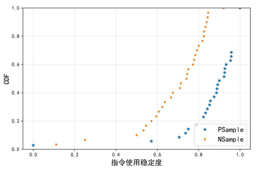
1.几个负样本的数据点位置倒错
2.X轴刻度变成了乱七八糟一团鬼东西
最终解决办法
造成上述情况的原因其实是由于输入matplotlib.plot()函数的数据x_data和y_data从CSV文件中直接导入后格式为string,因此才会导致所有数据点的x坐标都被直接刻在了x轴上,且由于坐标数据格式错误,部分点也就表现为“乱点”。解决办法就是导入x,y数据后先将其转化为float型数据,然后输入plot()函数,问题即解决。
补充知识:matplotlib如何在绘制时间序列时跳过无数据的区间
其实官方文档里就提供了方法,这里简单的翻译并记录一下.
11.1.9 Skip dates where there is no data
When plotting time series, e.g., financial time series, one often wants to leave out days on which there is no data, e.g., weekends.
By passing in dates on the x-xaxis, you get large horizontal gaps on periods when there is not data.The solution is to pass in some proxy x-data, e.g., evenly sampled indices, and then use a custom formatter to format these as dates.
The example below shows how to use an ‘index formatter' to achieve the desired plot:
解决方案是通过传递x轴数据的代理,比如下标,
然后通过自定义的'formatter'去取到相对应的时间信息
manual内示例代码:
import numpy as np
import matplotlib.pyplot as plt
import matplotlib.mlab as mlab
import matplotlib.ticker as ticker

#读数据
r = mlab.csv2rec('../data/aapl.csv')
r.sort()
r = r[-30:] # get the last 30 days
N = len(r)
ind = np.arange(N) # the evenly spaced plot indices
def format_date(x, pos=None):
 #保证下标不越界,很重要,越界会导致最终plot坐标轴label无显示
 thisind = np.clip(int(x+0.5), 0, N-1)
 return r.date[thisind].strftime('%Y-%m-%d')

fig = plt.figure()
ax = fig.add_subplot(1,1,1)
ax.plot(ind, r.adj_close, 'o-')
ax.xaxis.set_major_formatter(ticker.FuncFormatter(format_date))
fig.autofmt_xdate()
plt.show()
示例:
同样一段数据上为原始,下为去掉无数据间隔区间

import pandas as PD
import numpy as NP
import matplotlib.pyplot as PLT
import matplotlib.ticker as MTK

file = r'vix_series.csv'
df = PD.read_csv(file, parse_dates=[0, 2])
#用下标代理原始时间戳数据
idx_pxy = NP.arange(df.shape[0])
#下标-时间转换func
def x_fmt_func(x, pos=None):
 idx = NP.clip(int(x+0.5), 0, df.shape[0]-1)
 return df['datetime'].iat[idx]
#绘图流程
def decorateAx(ax, xs, ys, x_func):
 ax.plot(xs, ys, color="green", linewidth=1, linestyle="-")
 ax.plot(ax.get_xlim(), [0,0], color="blue",
   linewidth=0.5, linestyle="--")
 if x_func:
  #set数据代理func
  ax.xaxis.set_major_formatter(MTK.FuncFormatter(x_func))
 ax.grid(True)
 return

fig = PLT.figure()
ax1 = fig.add_subplot(2,1,1)
ax2 = fig.add_subplot(2,1,2)
decorateAx(ax1, df['datetime'], df['vix_all'], None)
decorateAx(ax2, idx_pxy, df['vix_all'], x_fmt_func)
#优化label显示,非必须
fig.autofmt_xdate()
PLT.show()
很多时候乱翻google还不如好好通读官方manual…
以上这篇解决Python Matplotlib绘图数据点位置错乱问题就是小编分享给大家的全部内容了,希望能给大家一个参考,也希望大家多多支持。

