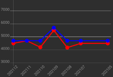
效果图,数据可平移查看历史
build.gradle
implementation 'com.github.lecho:hellocharts-library:1.5.8@aar'
layout
直接在布局中加入相应的图表控件
<lecho.lib.hellocharts.view.LineChartView
    android:id="@+id/ChartLine"
    android:layout_width="0dp"
    android:layout_height="300dp"
    android:padding="6dp"/>
常用图表类型
图表上每一点的数据 PointValue(float x, float y)
第一个参数表示点的位置,第二个参数表示点上的数据。如果是多条折线,则需要为每一条拆线相同位置定义不同的PointValue
PointValue point1 = new PointValue(0, 1000);
PointValue point2 = new PointValue(1, 1500);
PointValue point1 = new PointValue(0, 1200);
PointValue point2 = new PointValue(1, 1600);
setLabel() 可以为数据点定义显示文本
point1.setLabel("202101");
实例
List<PointValue> valuesR = new ArrayList<>();
List<PointValue> valuesS = new ArrayList<>();
for (int i = 0; i < dataEntities.size(); i++) {
    DataEntity dataEntity = dataEntities.get(i);
    if (dataEntity.getDataR() < 3000 || dataEntity.getDataS() < 3000)
        continue;
    valuesR.add(new PointValue(i, dataEntity.getDataR()).setLabel(String.valueOf(dataEntity.getDataR())));
    valuesS .add(new PointValue(i, dataEntity.getDataS()).setLabel(String.valueOf(dataEntity.getDataS())));
}
如果数据太小,则跳过。数据不加载入数据点集合,但 i 索引会增加,折线上会出现大的间隔。如果不想出现此情况,可更换 for 循环为 foreach 循环,然后手动控制 i 的增长。
定义线条上的数据和颜色等
构造函数传入包含PointValue的列表,有几条折线就创建几条并绑定不同的点数据列表
List<Line> lines = new ArrayList<>();
lines.add(new Line(valuesR).setColor(Color.RED).setCubic(false).setHasLabelsOnlyForSelected(true));
lines.add(new Line(valuesS).setColor(Color.BLUE).setCubic(false).setHasLabelsOnlyForSelected(true));
常用属性方法
X轴
List<AxisValue> xValue = new ArrayList<>();
for(int i = 0; i < dataEntities.size(); i++){
    DataEntity dataEntity = dataEntities.get(i);
    xValue.add(new AxisValue(i).setLabel(dataEntity .getDate()));
}
Axis axisX = new Axis();
axisX.setHasTiltedLabels(true);
axisX.setTextColor(Color.GRAY);
axisX.setValues(xValue);
Y轴
List<AxisValue> yValue = new ArrayList<>();
for(int i = 0; i < 8000; i = i + 1000){
    yValue.add(new AxisValue(i).setLabel(String.valueOf(i)));
}
Axis axisY  = new Axis();
axisY.setTextColor(Color.GRAY);
axisY.setValues(yValue);
axisY.setHasLines(true);
LineChartData data = new LineChartData();
data.setLines(lines);
data.setAxisXBottom(axisX);
data.setAxisYLeft(axisY);
创建实例
AxisValue v = new AxisValue(i).setLabel(String.valueOf(i));
常用属性方法
将以上包含了点数据列表的折线添加到 LineChartData 中并绑定给图表控件
//设置是否允许平移以及平移的方向
bindingView.chartLine.setContainerScrollEnabled(true, ContainerScrollType.HORIZONTAL);
//填充数据
bindingView.chartLine.setLineChartData(data);
实现平移必须设置视图大小
//实例化一个新的ViewPort 构造函数中传入填充数据后的默认最大视图
Viewport viewport = new Viewport(bindingView.chartLine.getMaximumViewport());
//设置y轴的显示
viewport.top = MyApplication.getSharedPreferences().getInt("max", 8000);
viewport.bottom = MyApplication.getSharedPreferences().getInt("min", 3000);
//一定要先设置最大视图范围
bindingView.chartLine.setMaximumViewport(viewport); //图表最大视图
//设置x轴的显示
viewport.right = MyApplication.getSharedPreferences().getInt("chart_right", 7);
viewport.left = 0;
//最后设置当前显示的视图范围
bindingView.chartLine.setCurrentViewport(viewport); //图表当前视图
完整代码
private void initChart(List<DataEntity> dataEntities) {
    List<PointValue> valuesR = new ArrayList<>();
    List<PointValue> valuesS = new ArrayList<>();
    List<AxisValue> xValue = new ArrayList<>();
    List<AxisValue> yValue = new ArrayList<>();
    for (int i = 0; i < dataEntities.size(); i++) {
        DataEntity dataEntity = dataEntities.get(i);
        if (dataEntity.getDataR() < MyApplication.getSharedPreferences().getInt("min", 3000) || dataEntity.getDataS() < MyApplication.getSharedPreferences().getInt("min", 3000))
            continue;
        valuesR.add(new PointValue(i, dataEntity .getDataR()).setLabel(String.valueOf(dataEntity .getDataR())));
        valuesS.add(new PointValue(i, dataEntity .getDataS()).setLabel(String.valueOf(dataEntity .getDataS())));
        xValue.add(new AxisValue(i).setLabel(dataEntity .getDate()));
    }
    for (int i = 0; i < MyApplication.getSharedPreferences().getInt("salary_max", 8000); i = i + 500) {
        yValue.add(new AxisValue(i).setLabel(String.valueOf(i)));
    }
    List<Line> lines = new ArrayList<>();
    lines.add(new Line(valuesR).setColor(Color.RED).setCubic(false).setHasLabelsOnlyForSelected(true));
    lines.add(new Line(valuesS).setColor(Color.BLUE).setCubic(false).setHasLabelsOnlyForSelected(true));
    Axis axisX = new Axis();
    axisX.setHasTiltedLabels(true);
    axisX.setTextColor(Color.GRAY);
    axisX.setValues(xValue);
    Axis axisY = new Axis();
    axisY.setTextColor(Color.GRAY);
    axisY.setValues(yValue);
    axisY.setHasLines(true);


    LineChartData data = new LineChartData();
    data.setLines(lines);
    data.setAxisXBottom(axisX);
    data.setAxisYLeft(axisY);
    bindingView.chartLine.setContainerScrollEnabled(true, ContainerScrollType.HORIZONTAL);
    bindingView.chartLine.setLineChartData(data);
    //设置图表显示的大小
    Viewport viewport = new Viewport(bindingView.chartLine.getMaximumViewport()); //填充数据后的默认最大视图
    viewport.top = MyApplication.getSharedPreferences().getInt("max", 8000);
    viewport.bottom = MyApplication.getSharedPreferences().getInt("min", 3000);
    bindingView.chartLine.setMaximumViewport(viewport); //图表最大视图
    viewport.right = MyApplication.getSharedPreferences().getInt("chart_right", 7);
    viewport.left = 0;
    bindingView.chartLine.setCurrentViewport(viewport); //图表当前视图
}

