使用matplotlib需引入:
import matplotlib.pyplot as plt
通常2会配合着numpy使用,numpy引入:
import numpy as np
def matplotlib_draw():
    # 从-1到1生成100个点,包括最后一个点,默认为不包括最后一个点
    x = np.linspace(-1, 1, 100, endpoint=True)

    y = 2 * x + 1
    plt.plot(x, y)  # plot将信息传入图中
    plt.show()  # 展示图片
def matplotlib_figure():
    x = np.linspace(-1, 1, 100)
    y1 = 2 * x + 1
    y2 = x ** 2  # 平方

    plt.figure()  # figure是视图面板
    plt.plot(x, y1)

    # 这里再创建一个视图面板,最后会生成两张图,figure只绘制范围以下的部分
    plt.figure(figsize=(4, 4))  # 设置视图长宽
    plt.plot(x, y2)

    plt.show()

def matplotlib_style():
    x = np.linspace(-3, 3, 100)
    y1 = 2 * x + 1
    y2 = x ** 2  # 平方

    # 限制xy输出图像的范围
    plt.xlim((-1, 2))  # 限制x的范围
    plt.ylim((-2, 3))  # 限制y的范围

    # xy描述
    plt.xlabel('I am X')
    plt.ylabel('I am Y')

    # 设置xy刻度值
    # 从-2到2上取11个点,最后生成一个一维数组
    new_sticks = np.linspace(-2, 2, 11)
    plt.xticks(new_sticks)
    # 使用文字代替数字刻度
    plt.yticks([-1, 0, 1, 2, 3], ['level1', 'level2', 'level3', 'level4', 'level5'])

    # 获取坐标轴 gca get current axis
    ax = plt.gca()
    ax.spines['right'].set_color('red')  # 设置右边框为红色
    ax.spines['top'].set_color('none')  # 设置顶部边框为没有颜色,即无边框

    # 把x轴的刻度设置为'bottom'
    ax.xaxis.set_ticks_position('bottom')
    # 把y轴的刻度设置为'left'
    ax.yaxis.set_ticks_position('left')
    # 设置xy轴的位置,以下测试xy轴相交于(1,0)
    # bottom对应到0点
    ax.spines['bottom'].set_position(('data', 0))
    # left对应到1点
    ax.spines['left'].set_position(('data', 1))  # y轴会与1刻度对齐

    # 颜色、线宽、实线:'-',虚线:'--',alpha表示透明度
    plt.plot(x, y1, color="red", linewidth=1.0, linestyle='--', alpha=0.5)
    plt.plot(x, y2, color="blue", linewidth=5.0, linestyle='-')
    plt.show()  # 这里没有设置figure那么两个线图就会放到一个视图里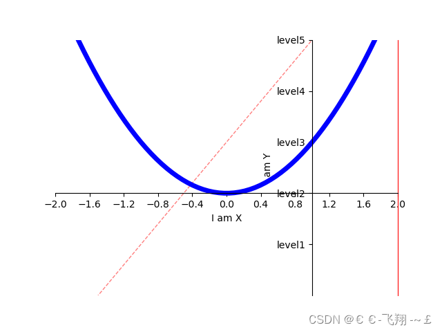
def matplotlib_legend():
    x = np.linspace(-3, 3, 100)
    y1 = 2 * x + 1
    y2 = x ** 2  # 平方

    l1, = plt.plot(x, y1, color="red", linewidth=1.0, linestyle='--', alpha=0.5)
    l2, = plt.plot(x, y2, color="blue", linewidth=5.0, linestyle='-')
    # handles里面传入要产生图例的关系线,labels中传入对应的名称,
    # loc='best'表示自动选择最好的位置放置图例
    plt.legend(handles=[l1, l2], labels=['test1', 'test2'], loc='best')
    plt.show()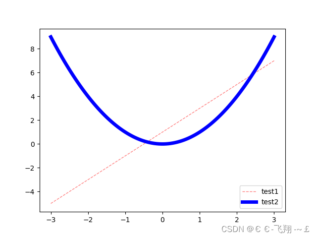
def matplotlib_describe():
    x = np.linspace(-3, 3, 100)
    y = 2 * x + 1
    plt.plot(x, y, color="red", linewidth=1.0, linestyle='-')

    # 画点,s表示点的大小
    x0 = 0.5
    y0 = 2 * x0 + 1
    plt.scatter(x0, y0, s=50, color='b')

    # 画虚线,
    # k代表黑色,--代表虚线,lw线宽
    # 表示重(x0,y0)到(x0,-4)画线
    plt.plot([x0, x0], [y0, -4], 'k--', lw=2)
    # 标注,xytext:位置,textcoords设置起始位置,arrowprops设置箭头,connectionstyle设置弧度
    plt.annotate(r'$2x+1=%s$' % y0, xy=(x0, y0), xytext=(+30, -30),
                 textcoords="offset points", fontsize=16,
                 arrowprops=dict(arrowstyle='->', connectionstyle='arc3,rad=.2'))

    # 文字描述
    plt.text(-3, 3, r'$this\ is\ the\ text$', fontdict={'size': '16', 'color': 'r'})

    plt.show()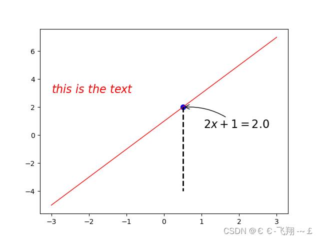
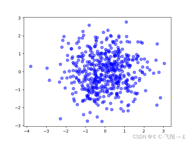
(1)scatter绘制散点图:
def matplotlib_scatter():
    plt.figure()
    plt.scatter(np.arange(5), np.arange(5))  # 安排两个0到4的数组绘制

    x = np.random.normal(0, 1, 500)  # 正态分布的500个数
    y = np.random.normal(0, 1, 500)

    plt.figure()
    plt.scatter(x, y, s=50, c='b', alpha=0.5)

    plt.show()
(2)bar绘制直方图:
def matplotlib_bar():
    x = np.arange(10)
    y = 2 ** x + 10
    # facecolor块的颜色,edgecolor块边框的颜色
    plt.bar(x, y, facecolor='#9999ff', edgecolor='white')
    # 设置数值位置
    for x, y in zip(x, y):  # zip将x和y结合在一起
        plt.text(x + 0.4, y, "%.2f" % y, ha='center', va='bottom')

    plt.show()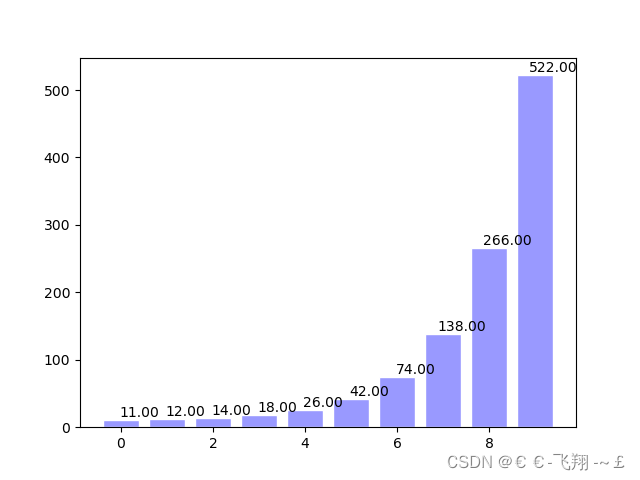
(3)contour轮廓图:
def matplotlib_contours():
    def f(a, b):
        return (1 - a / 2 + a ** 5 + b ** 3) * np.exp(-a ** 2 - b ** 2)

    x = np.linspace(-3, 3, 100)
    y = np.linspace(-3, 3, 100)

    X, Y = np.meshgrid(x, y)  # 将x和y传入一个网格中
    # 8表示条形线的数量,数量越多越密集
    plt.contourf(X, Y, f(X, Y), 8, alpha=0.75, cmap=plt.cm.hot)  # cmap代表图的颜色

    C = plt.contour(X, Y, f(X, Y), 8, color='black', linewidth=.5)
    plt.clabel(C, inline=True, fontsize=10)

    plt.xticks(())
    plt.yticks(())
    plt.show()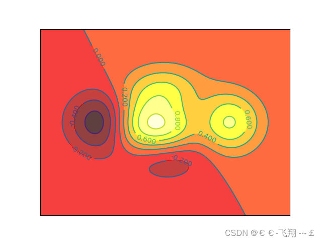
(4)3D图:
3D图绘制需额外再引入依赖:
from mpl_toolkits.mplot3d import Axes3D
def matplotlib_Axes3D():
    fig = plt.figure()  # 创建绘图面版环境
    ax = Axes3D(fig)  # 将环境配置进去

    x = np.arange(-4, 4, 0.25)
    y = np.arange(-4, 4, 0.25)
    X, Y = np.meshgrid(x, y)
    R = np.sqrt(X ** 2 + Y ** 2)
    Z = np.sin(R)

    # stride控制色块大小
    ax.plot_surface(X, Y, Z, rstride=1, cstride=1, cmap=plt.get_cmap('rainbow'))
    ax.contourf(X, Y, Z, zdir='z', offset=-2, cmap='rainbow')
    ax.set_zlim(-2, 2)

    plt.show()

(5)subplot子图绘制:
def matplotlib_subplot():
    plt.figure()  # 生成绘图面板
    plt.subplot(2, 1, 1)  # 两行1列绘图位置的第1个位置
    plt.plot([0, 1], [0, 1])  # 绘制从(0,0)绘制到(1,1)的图像
    plt.subplot(2, 3, 4)  # 两行3列绘图位置的第4个位置
    plt.plot([0, 1], [0, 1])  # 绘制从(0,0)绘制到(1,1)的图像
    plt.subplot(2, 3, 5)  # 两行3列绘图位置的第5个位置
    plt.plot([0, 1], [0, 1])  # 绘制从(0,0)绘制到(1,1)的图像
    plt.subplot(2, 3, 6)  # 两行3列绘图位置的第6个位置
    plt.plot([0, 1], [0, 1])  # 绘制从(0,0)绘制到(1,1)的图像

    plt.show()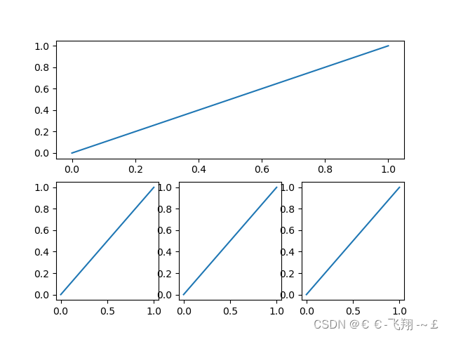
(6)animation动图绘制
需额外导入依赖:
from matplotlib import animation
# ipython里运行可以看到动态效果
def matplotlib_animation():
    fig, ax = plt.subplots()

    x = np.arange(0, 2 * np.pi, 0.01)
    line, = ax.plot(x, np.sin(x))

    def animate(i):
        line.set_ydata(np.sin(x + i / 10))
        return line,

    def init():
        line.set_ydata(np.sin(x))
        return line,

    ani = animation.FuncAnimation(fig=fig, func=animate, init_func=init, interval=20)

    plt.show()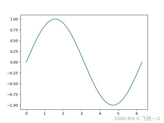
附:直方图代码实现
import numpy as np
import matplotlib.pyplot as plt

np.random.seed(1)
# 产生30个学生身高数据
hight = np.random.randint(low=140, high=190, size=30)
print("身高数据", hight)

# 绘制直方图 plt.hist

# 参数1:要统计的数据; 参数2:区间信息

# 区间信息有默认值 bins =10  分10组
# bins = [140, 145, 160, 170, 190]
# 除了最后一个 都是前闭后开;最后一组是前闭后闭
# [140,145) [145,160) [160,170) [170,190]

bins = [140, 180, 190]

cnt, bins_info, _ = plt.hist(hight,
                             bins=10,
                             # bins=bins,
                             edgecolor='w'  # 柱子的边缘颜色 白色
                             )
# 直方图的返回值有3部分内容
# 1. 每个区间的数据量
# 2. 区间信息
# 3. 区间内数据数据信息 是个对象 不能直接查看
# print("直方图的返回值", out)

# cnt, bins_info, _ = out


# 修改x轴刻度
plt.xticks(bins_info)

# 增加网格线
# 参数1:b bool类型 是否增加网格线
# 参数 axis 网格线 垂直于 哪个轴
plt.grid(b=True,
         axis='y',
         # axis='both'
         alpha=0.3
         )

# 增加标注信息 plt.text
print("区间信息", bins_info)
print("区间数据量", cnt)

bins_info_v2 = (bins_info[:-1] + bins_info[1:]) / 2
for i, j in zip(bins_info_v2, cnt):
    # print(i, j)
    plt.text(i, j + 0.4, j,
             horizontalalignment='center',  # 水平居中
             verticalalignment='center',  # 垂直居中
             )

# 调整y轴刻度
plt.yticks(np.arange(0, 20, 2))

plt.show()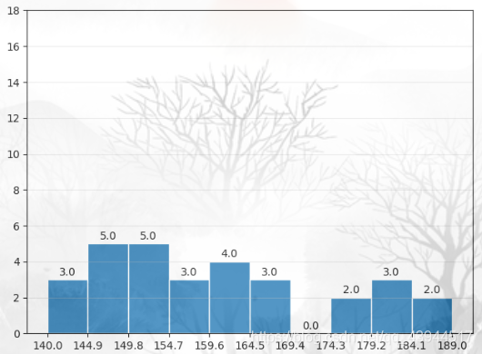
更多见官方文档:教程 | Matplotlib 中文

