body{
    display: flex;
    width: 100%;
    height: 100%;
    flex-direction: column;
}
.header{
    background-color:grey;
    height: 50px;
}
.footer{
    background-color:grey;
    height: 50px;
}
.outer{
    flex:1;
}<style>
* {
padding: 0;
margin: 0;
text-align: center;
}
html{
height: 100%;
}
body{
display: flex;
flex-direction: column;
height: 100%;;
}
.header{
width: 100%;
height: 50px;
background-color:dimgray;
}
.footer{
width: 100%;
height: 50px;
background-color:dimgray;
}
.outer{
flex:1;
padding-left: 100px;
padding-right: 200px;
}
.center{
float: left;
background-color: darkslateblue;
height: 100%;
width: 100%;
}
.left{
float: left;
width: 100px;
margin-left: -100%;
background-color: burlywood;
height: 100%;
position: relative;
left: -100px;
}
.right{
float: left;
width: 200px;
margin-left: -200px;
height: 100%;
position: relative;
right: -200px;
background-color: cyan;
}
</style>
<body>
<div class="header">header</div>
<div class="outer">
<div class="center">center</div>
<div class="left">left</div>
<div class="right">right</div>
</div>
<div class="footer">footer</div>
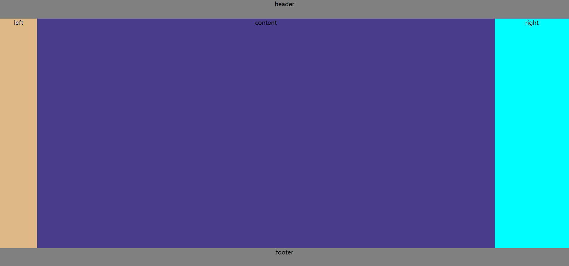
</body><style>
*{
padding: 0;
margin: 0;
}
html{
width: 100%;
height: 100%;
text-align: center;
}
body{
display: flex;
width: 100%;
height: 100%;
flex-direction: column;
}
.header{
background-color:grey;
height: 50px;
}
.footer{
background-color:grey;
height: 50px;
}
.outer{
flex:1;
}
.center{
float: left;
width: 100%;
background-color: darkslateblue;
height: 100%;
}
.left{
float: left;
margin-left: -100%;
width: 100px;
background-color: burlywood;
height: 100%;
}
.right{
float: left;
width: 200px;
background-color: cyan;
margin-left: -200px;
height: 100%;
}
.content{
margin-left: 100px;
margin-right: 200px;
height: 100%;
}
</style>
<body>
<div class="header">header</div>
<div class="outer">
<div class="center">
<div class="content">content</div>
</div>
<div class="left">left</div>
<div class="right">right</div>
</div>
<div class="footer">footer</div>
</body>回答:圣杯布局和双飞翼布局都可以实现三栏布局,即两侧宽度固定,中间自适应的效果。圣杯布局是先用padding将中间内容留出,再定位左右盒子到相应位置;而双飞翼布局首先将中间盒子的宽度设为了100%,在定位左右盒子的时候会覆盖中间盒子的两端,这样就需要在中间盒子中在定义一个盒子,并留出margin的两侧值。两种布局都需要把center盒子写在left和right前面,为了最先渲染。

