Echarts 是一个由百度开源的数据可视化,凭借着良好的交互性,精巧的图表设计,得到了众多开发者的认可。而 Python 是一门富有表达力的语言,很适合用于数据处理。当数据分析遇上数据可视化时,pyecharts 诞生了。
pyecharts 官网:http://pyecharts.org/#/zh-cn/
pyecharts 画廊地址:https://gallery.pyecharts.org/#/README
pip install pyecharts
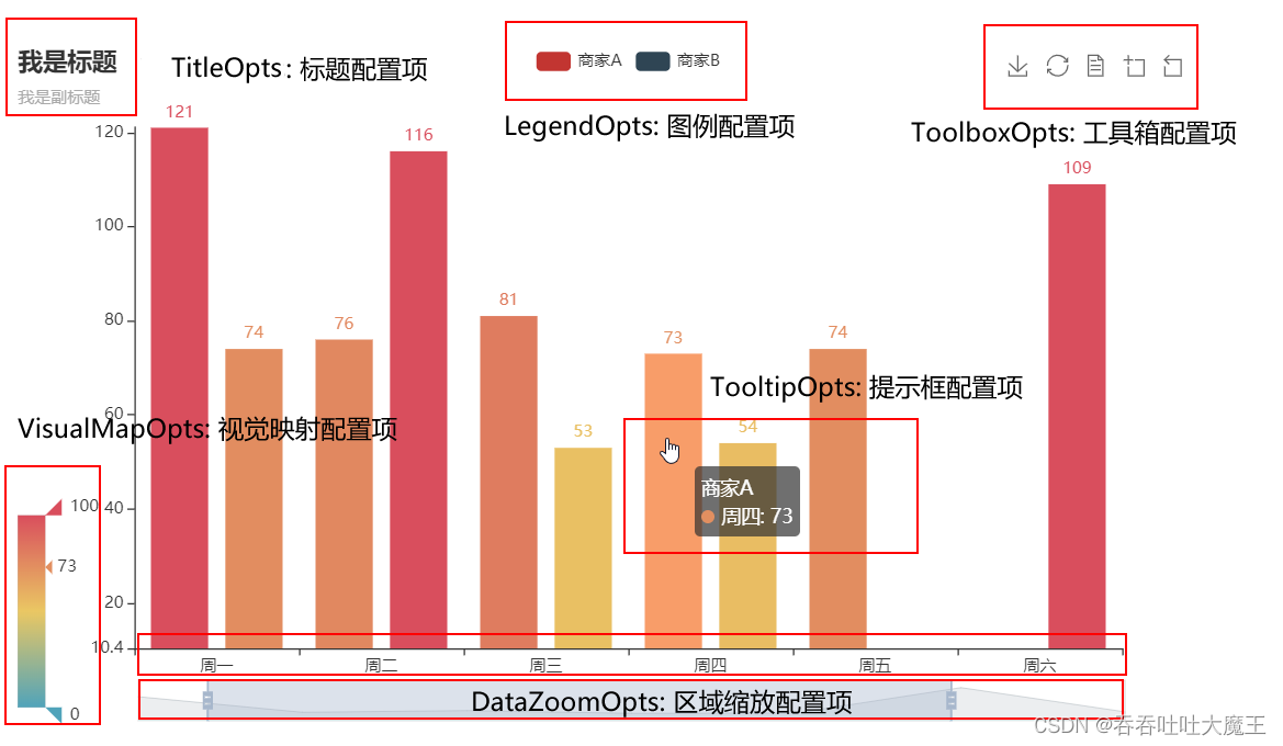
pyecharts 模块中有很多配置选项,常用到两个类别的选项:全局配置选项和系列配置选项。
全局配置选项可以通过 set_global_opts 方法来进行配置,通常对图表的一些通用的基础的元素进行配置,例如标题、图例、工具箱、鼠标移动效果等等,它们与图表的类型无关。
示例代码:通过折线图对象对折线图进行全局配置
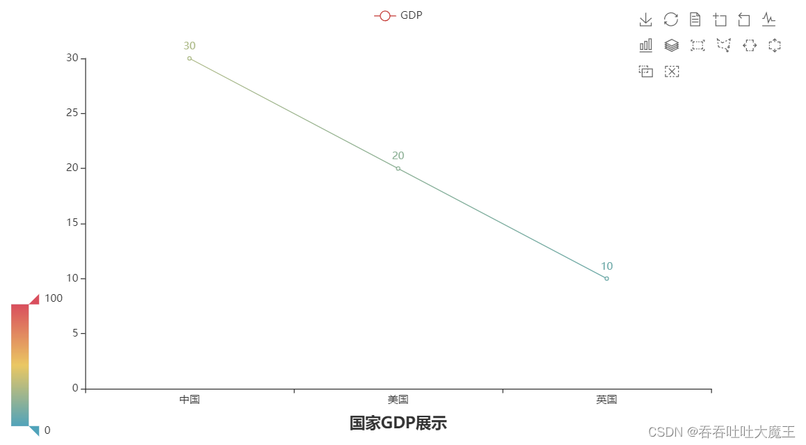
from pyecharts.charts import Line
from pyecharts.options import TitleOpts, LegendOpts, ToolboxOpts, VisualMapOpts

# 获取折线图对象
line = Line()

# 对折线图进行全局配置
line.set_global_opts(
    # 设置标题、标题的位置...
    title_opts=TitleOpts("国家GDP展示", pos_left="center", pos_bottom="1%"),
    # 设置图例是展示的...
    legend_opts=LegendOpts(is_show=True),
    # 设置工具箱是展示的
    toolbox_opts=ToolboxOpts(is_show=True),
    # 设置视觉映射是展示的
    visualmap_opts=VisualMapOpts(is_show=True)
)
系列配置选项是针对某个具体的参数进行配置,可以去 pyecharts 官网进行了解。

1.导包,导入 Line 功能构建折线图对象
from pyecharts.charts import Line
from pyecharts.options import TitleOpts, LegendOpts, ToolboxOpts, VisualMapOpts
2.获取折线图对象
line = Line()
3.添加 x、y 轴数据(添加系列配置)
line.add_xaxis(["中国", "美国", "英国"])
line.add_yaxis("GDP", [30, 20, 10])
4.添加全局配置
line.set_global_opts(
    # 设置标题、标题的位置...
    title_opts=TitleOpts("国家GDP展示", pos_left="center", pos_bottom="1%"),
    # 设置图例是展示的...
    legend_opts=LegendOpts(is_show=True),
    # 设置工具箱是展示的
    toolbox_opts=ToolboxOpts(is_show=True),
    # 设置视觉映射是展示的
    visualmap_opts=VisualMapOpts(is_show=True)
)
5.生成图表(通过 render 方法将代码生成图像)
line.render()
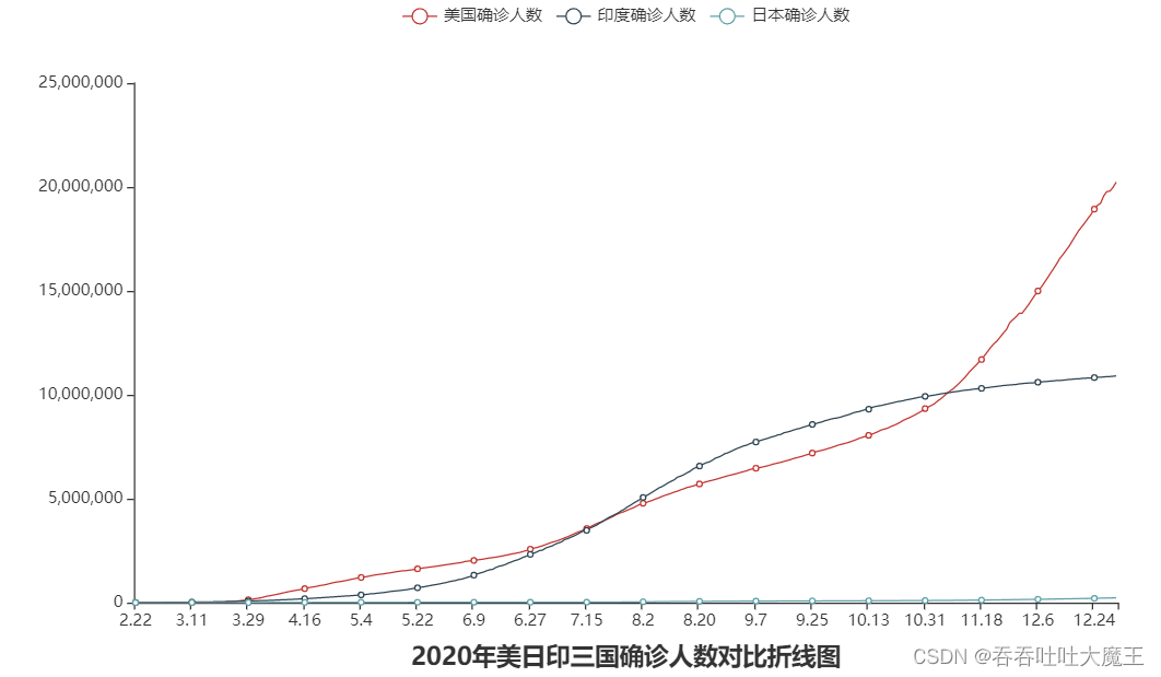
4.2 实现2020年美印日确诊人数对比折线图
import json
from pyecharts.charts import Line
# 获取不同国家疫情时间
from pyecharts.options import TitleOpts, LabelOpts
def getdata(file):
    # 处理数据
    try:
        f = open(file, 'r', encoding='utf8')
    except FileNotFoundError as e:
        print(f"文件不存在,具体错误为:{e}")
    else:
        data = f.read()

        # JSON 转 Python 字典
        dict = json.loads(data)

        # 获取 trend
        trend_data = dict['data'][0]['trend']

        # 获取日期数据,用于 x 轴(只拿2020年的数据)
        x_data = trend_data['updateDate'][:314]

        # 获取确认数据,用于 y 轴
        y_data = trend_data['list'][0]['data'][:314]

        # 返回结果
        return x_data, y_data
    finally:
        f.close()


# 获取美国数据
us_x_data, us_y_data = getdata("E:\\折线图数据\\美国.txt")

# 获取印度数据
in_x_data, in_y_data = getdata("E:\\折线图数据\\印度.txt")

# 获取日本数据
jp_x_data, jp_y_data = getdata("E:\\折线图数据\\日本.txt")

# 生成图表
line = Line()

# 添加 x 轴数据(日期,公用数据,不同国家都一样)
line.add_xaxis(us_x_data)

# 添加 y 轴数据(设置 y 轴的系列配置,将标签不显示)
line.add_yaxis("美国确诊人数", us_y_data, label_opts=LabelOpts(is_show=False))  # 添加美国数据
line.add_yaxis("印度确诊人数", in_y_data, label_opts=LabelOpts(is_show=False))  # 添加印度数据
line.add_yaxis("日本确诊人数", jp_y_data, label_opts=LabelOpts(is_show=False))  # 添加日本数据

# 配置全局选项
line.set_global_opts(
    # 设置标题
    title_opts=TitleOpts("2020年美日印三国确诊人数对比折线图", pos_left="center", pos_bottom="1%"),

)

# 生成图表
line.render()
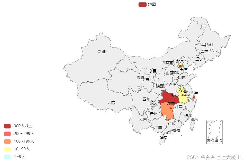
1.导包,导入 Map 功能获取地图对象
from pyecharts.charts import Map
from pyecharts.options import VisualMapOpts
2.获取地图对象
map = Map()
3.准备好数据
data = [
    ("北京", 99),
    ("上海", 199),
    ("广州", 299),
    ("湖南", 199),
    ("安徽", 99),
    ("湖北", 399),
]
4.添加数据到地图对象中
# 地图名称、传入的数据、地图类型(默认是中国地图)
map,add("地图", data, "china")
5.添加全局配置
map.set_global_opts(
    # 设置视觉映射配置
    visualmap_opts=VisualMapOpts(
        # 打开视觉映射(可能不精准,因此可以开启手动校准)
        is_show=True,
        # 开启手动校准范围
        is_piecewise=True,
        # 设置要校准参数的具体范围
        pieces=[
            {"min": 1, "max": 9, "label": "1~9人", "color": "#CCFFFF"},
            {"min": 10, "max": 99, "label": "10~99人", "color": "#FFFF99"},
            {"min": 100, "max": 199, "label": "100~199人", "color": "#FF9966"},
            {"min": 200, "max": 299, "label": "200~299人", "color": "#FF6666"},
            {"min": 300, "label": "300人以上", "color": "#CC3333"},
        ]
    )
)
6.生成地图
map.render()
import json
from pyecharts.charts import Map
from pyecharts.options import VisualMapOpts, TitleOpts, LegendOpts

# 读取数据
f = open("E:\\地图数据\\疫情.txt", 'r', encoding='utf8')
str_json = f.read()

# 关闭文件
f.close()

# JSON 转 python 字典
data_dict = json.loads(str_json)

# 取到各省数据
province_data_list = data_dict['areaTree'][0]['children']

# 组装每个省份和确诊人数为元组,并封装到列表内
data_list = []
for province_data in province_data_list:
    province_name = province_data['name']
    province_total_confirm = province_data['total']['confirm']
    data_list.append((province_name, province_total_confirm))

# 创建地图对象
map = Map()

# 添加数据
map.add("各省确诊总人数", data_list, "china")

# 设置全局配置,定制分段的视觉映射
map.set_global_opts(
    title_opts=TitleOpts('全国疫情地图', pos_left='center', pos_bottom='1%'),
    legend_opts=LegendOpts(is_show=True),
    visualmap_opts=VisualMapOpts(
        is_show=True,
        is_piecewise=True,
        pieces=[
            {"min": 1, "max": 9, "label": "1~9人", "color": "#CCFFFF"},
            {"min": 10, "max": 99, "label": "10~99人", "color": "#FFFF99"},
            {"min": 100, "max": 499, "label": "100~499人", "color": "#FF9966"},
            {"min": 500, "max": 999, "label": "500~999人", "color": "#FF6666"},
            {"min": 1000, "max": 9999, "label": "1000~9999人", "color": "#CC3333"},
            {"min": 10000, "label": "10000人以上", "color": "#990033"}
        ]
    )
)

# 绘图
map.render()
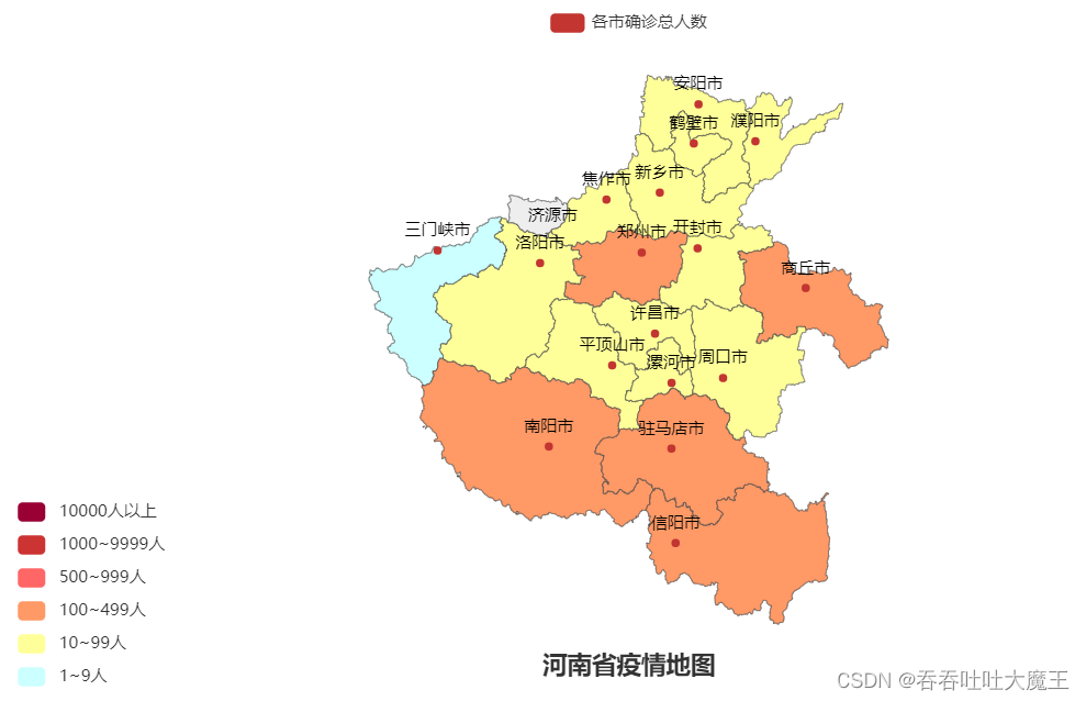
import json
from pyecharts.charts import Map
from pyecharts.options import VisualMapOpts, TitleOpts, LegendOpts

# 读取数据
f = open("E:\\地图数据\\疫情.txt", 'r', encoding='utf8')
str_json = f.read()

# 关闭文件
f.close()

# JSON 转 python 字典
data_dict = json.loads(str_json)

# 取到河南省数据
city_data_list = data_dict['areaTree'][0]['children'][3]['children']

# 组装每个市和确诊人数为元组,并封装到列表内
data_list = []
for city_data in city_data_list:
    city_name = city_data['name'] + "市"
    city_total_confirm = city_data['total']['confirm']
    data_list.append((city_name, city_total_confirm))

# 创建地图对象
map = Map()

# 添加数据
map.add("各市确诊总人数", data_list, "河南")

# 设置全局配置,定制分段的视觉映射
map.set_global_opts(
    title_opts=TitleOpts('河南省疫情地图', pos_left='center', pos_bottom='1%'),
    legend_opts=LegendOpts(is_show=True),
    visualmap_opts=VisualMapOpts(
        is_show=True,
        is_piecewise=True,
        pieces=[
            {"min": 1, "max": 9, "label": "1~9人", "color": "#CCFFFF"},
            {"min": 10, "max": 99, "label": "10~99人", "color": "#FFFF99"},
            {"min": 100, "max": 499, "label": "100~499人", "color": "#FF9966"},
            {"min": 500, "max": 999, "label": "500~999人", "color": "#FF6666"},
            {"min": 1000, "max": 9999, "label": "1000~9999人", "color": "#CC3333"},
            {"min": 10000, "label": "10000人以上", "color": "#990033"}
        ]
    )
)

# 绘图
map.render()
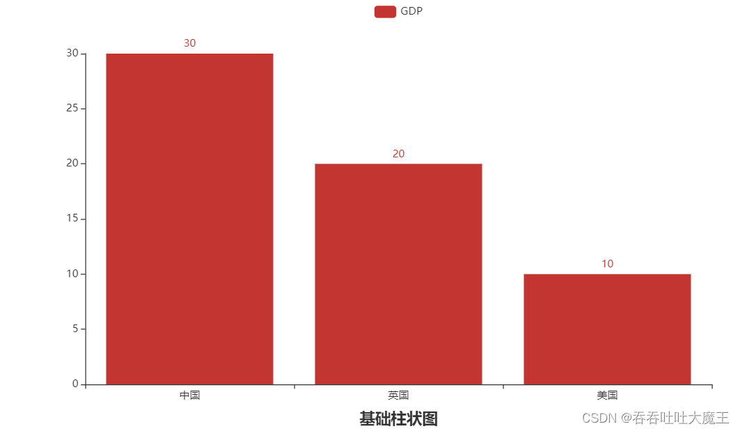
1.导包,导入 Bar 功能获取地图对象
from pyecharts.charts import Bar
from pyecharts.options import *
2.获取地图对象
bar = Bar()
3.添加 x 和 y 轴数据
# 添加 x 轴数据
bar.add_xaxis(["中国", "英国", "美国"])
# 添加 y 轴数据
bar.add_yaxis("GDP", [30, 20, 10])
4.添加全局配置
bar.set_global_opts(
    title_opts=TitleOpts("基础柱状图", pos_left='center', pos_bottom='1%')
)
5.生成地图
bar.render()
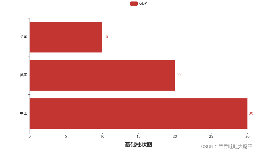
6.反转 xy 轴
bar.reversal_axis()

7.将数值标签添设置到右侧
bar.add_yaxis("GDP", [30, 20, 10], label_opts=LabelOpts(position='right'))
柱状图描述的是分类数据,但很难动态的描述一个趋势性的数据,为此 pyecharts 中提供了一种解决方案时间线。
如果说一个 Bar、Line 对象是一张图表的话,时间线就是创建一个一维的 x 轴,轴上的每一个点就是一个图表对象。
创建时间线的基础流程:
1.导包,导入时间线 Timeline
from pyecharts.charts import Bar, Timeline
from pyecharts.options import *
2.准备好图表对象并添加好数据
bar1 = Bar()
bar1.add_xaxis(["中国", "英国", "美国"])
bar1.add_yaxis("GDP", [30, 20, 10], label_opts=LabelOpts(position='right'))
bar1.reversal_axis()

bar2 = Bar()
bar2.add_xaxis(["中国", "英国", "美国"])
bar2.add_yaxis("GDP", [50, 20, 30], label_opts=LabelOpts(position='right'))
bar2.reversal_axis()

bar3 = Bar()
bar3.add_xaxis(["中国", "英国", "美国"])
bar3.add_yaxis("GDP", [60, 30, 40], label_opts=LabelOpts(position='right'))
bar3.reversal_axis()
3.创建时间线对象 Timeline
timeline = Timeline()
4.将图表添加到 Timeline 对象中
# 添加图表到时间线中(图表对象,点名称)
timeline.add(bar1, "2020年GDP")
timeline.add(bar2, "2021年GDP")
timeline.add(bar3, "2022年GDP")
5.通过时间线绘图
timeline.render()
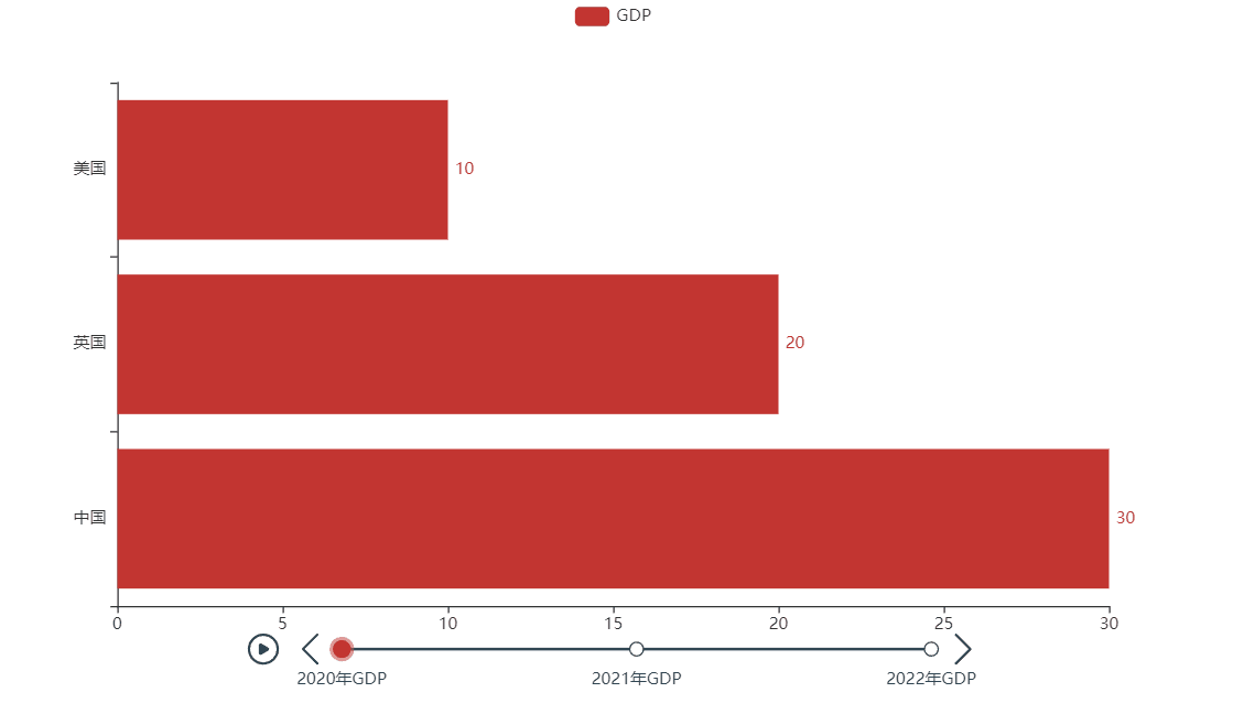
6.设置自动播放
timeline.add_schema(
    play_interval=1000,      # 自动播放的时间间隔,单位毫秒
    is_timeline_show=True,  # 是否显示自动播放的时候,显示时间线(默认 True)
    is_auto_play=True,       # 是否在自动播放(默认 False)
    is_loop_play=True        # 是否循环自动播放(默认 True)
)
7.设置时间线主题
# 导入 ThemeType
from pyecharts.globals import ThemeType

# 创建时间线对象时,设置主题参数
timeline = Timeline({"theme": ThemeType.DARK})
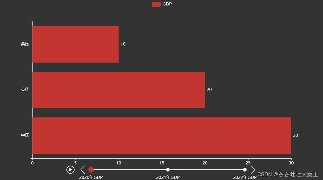
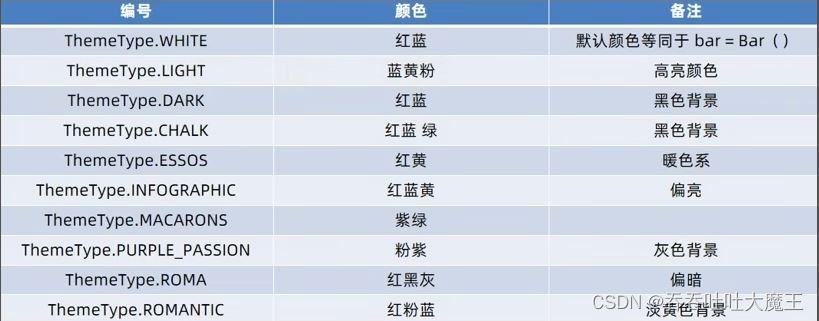
主题参数如下:
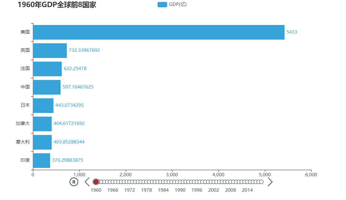
import json
from pyecharts.charts import Bar, Timeline
from pyecharts.options import *
from pyecharts.globals import ThemeType

# 读取数据
f = open("E:\\动态柱状图数据\\1960-2019全球GDP数据.csv", 'r', encoding='GB2312')
data_lines = f.readlines()

# 关闭文件
f.close()

# 删除第一条数据
data_lines.pop(0)

# 将数据转化为字典才能出,格式为 {年份1: [[国家1, GDP], [国家2, GDP]], 年份2: [国家, GDP], ...}
data_dict = dict()

for line in data_lines:
    year = int(line.split(',')[0])  # 年份
    country = line.split(',')[1]  # 国家
    gdp = float(line.split(',')[2])  # gdp 数据,通过 float 强制转换可以把带有科学计数法的数字转换为普通数字

    try:  # 如果 key 不存在,则会抛出异常 KeyError
        data_dict[year].append([country, gdp])
    except KeyError:
        data_dict[year] = [[country, gdp]]

# 排序年份(字典对象的 key 可能是无序的)
sorted_year_list = sorted(data_dict.keys())

# 创建时间线对象
timeline = Timeline({"theme": ThemeType.LIGHT})

# 组装数据到 Bar 对象中,并添加到 timeline 中
for year in sorted_year_list:
    data_dict[year].sort(key=lambda element: element[1], reverse=True)
    # 该年份GDP前八的国家
    year_data = data_dict[year][:8]
    x_data = []
    y_data = []
    for country_gdp in year_data:
        x_data.append(country_gdp[0])
        y_data.append(country_gdp[1] / 100000000)
    # 创建柱状图
    bar = Bar()
    x_data.reverse()
    y_data.reverse()
    # 添加 x y 轴数据
    bar.add_xaxis(x_data)
    bar.add_yaxis("GDP(亿)", y_data, label_opts=LabelOpts(position='right'))
    # 反转 x y 轴
    bar.reversal_axis()
    # 设置每一年的图表的标题
    bar.set_global_opts(
        title_opts=TitleOpts(f"{year}年GDP全球前8国家", pos_left='5%')
    )
    # 将 bar 对象添加到 timeline 中
    timeline.add(bar, year)

# 设置自动播放参数
timeline.add_schema(
    play_interval=1000,      # 自动播放的时间间隔,单位毫秒
    is_timeline_show=True,   # 是否显示自动播放的时候,显示时间线(默认 True)
    is_auto_play=True,       # 是否在自动播放(默认 False)
    is_loop_play=True        # 是否循环自动播放(默认 True)
)

# 通过时间线绘图
timeline.render("1960~2019全球GDP前8国家.html")