antd 是基于 Ant Design 设计体系的 React UI 组件库,主要用于研发企业级中后台产品。
国内镜像为:https://ant-design.gitee.io/docs/react/introduce-cn
速度很快
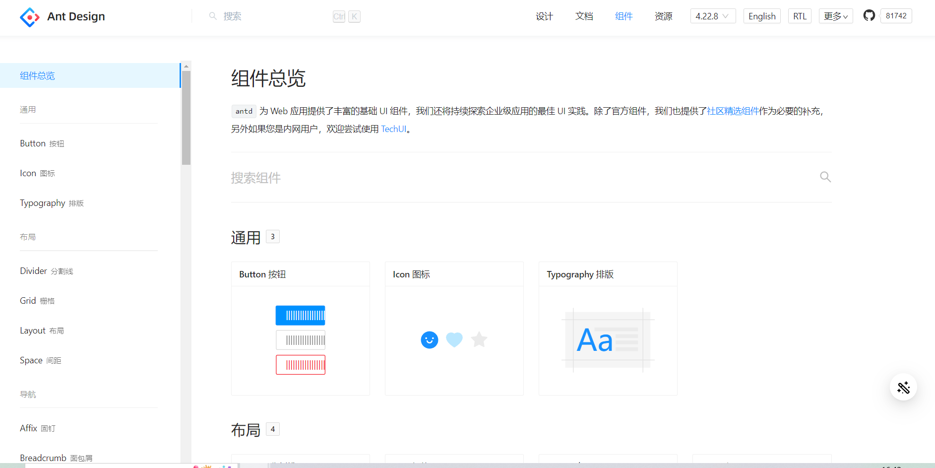
进入网页点击组件就可以看到网页需要的各种配件,如按钮、导航栏等等,并且配有各种使用方法的API,目前已经更新到4.22版本,原本是只支持react不过后来也支持vue了。
3.几版本的文档说明会更加详细
antd还可以更改主题颜色,按需引入组件的css,不过得小小操作一下,以后需要了再来补。
这里就简单展示一下antd的使用。
首先需要安装antd
yarn add antd
即可
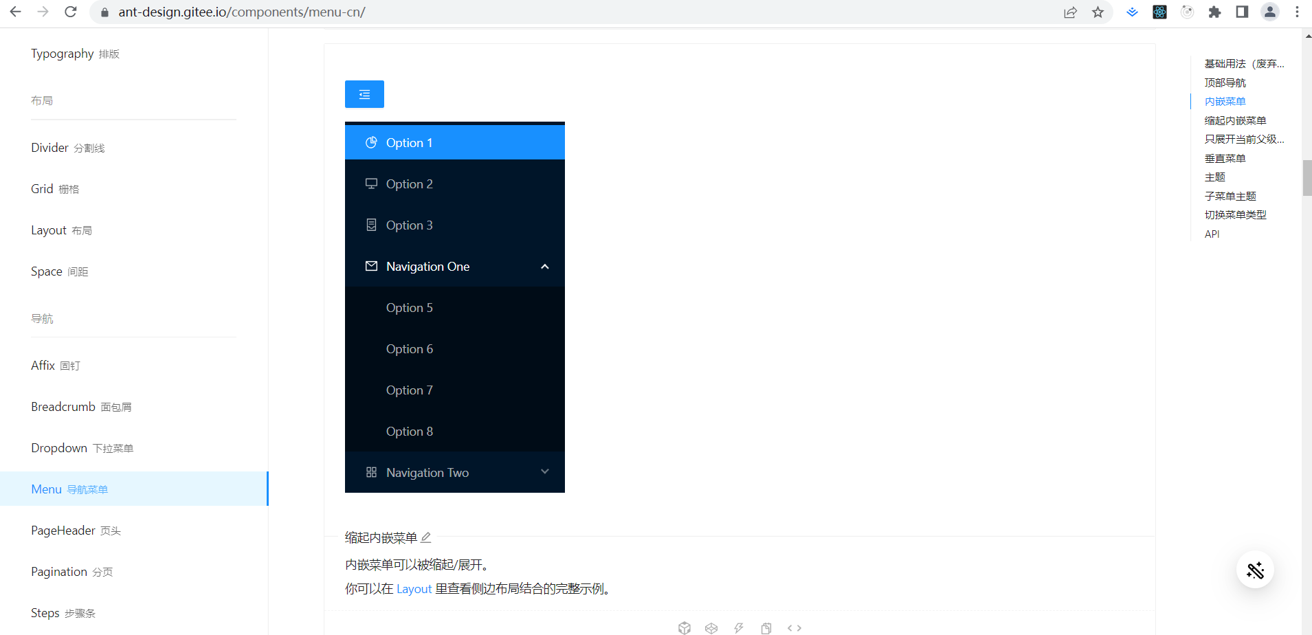
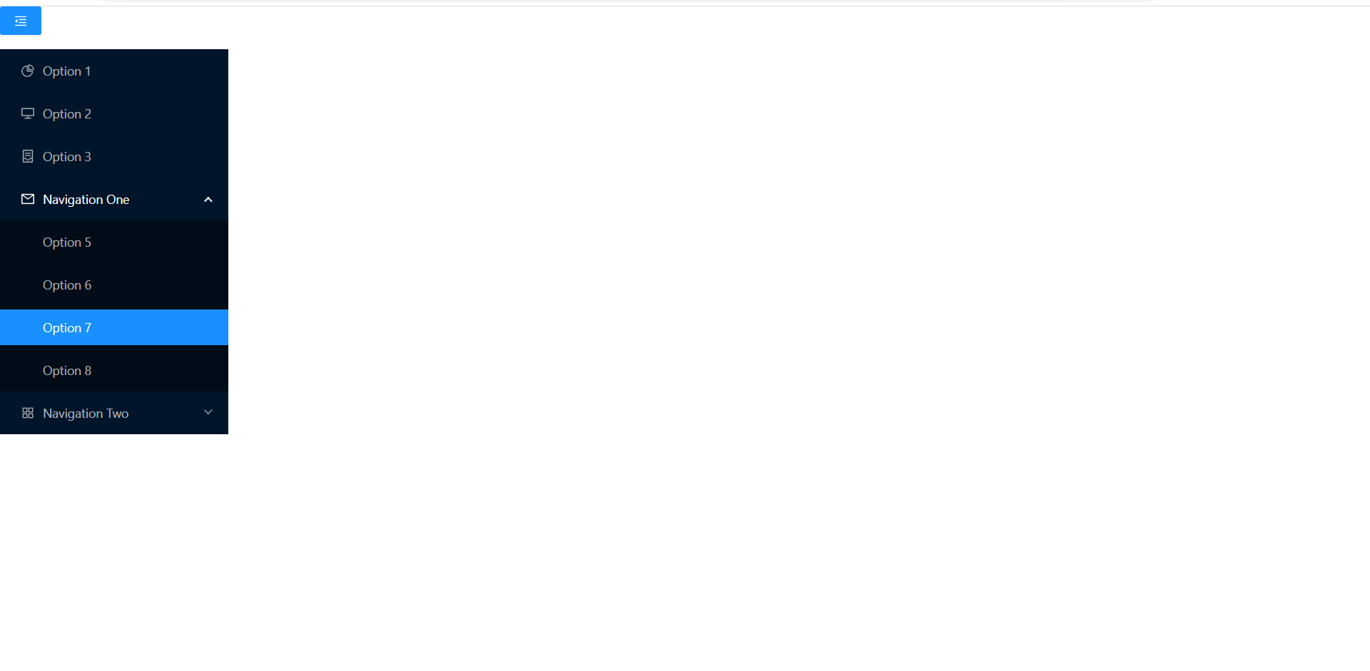
进入组件选一个比较好看的组件,比如我觉得这个导航栏不错。
然后copy代码就行了。
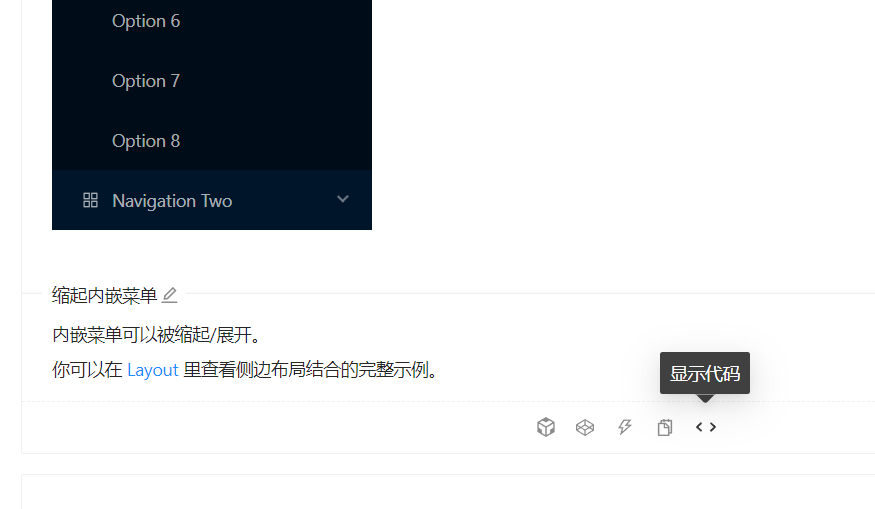
点击显示代码
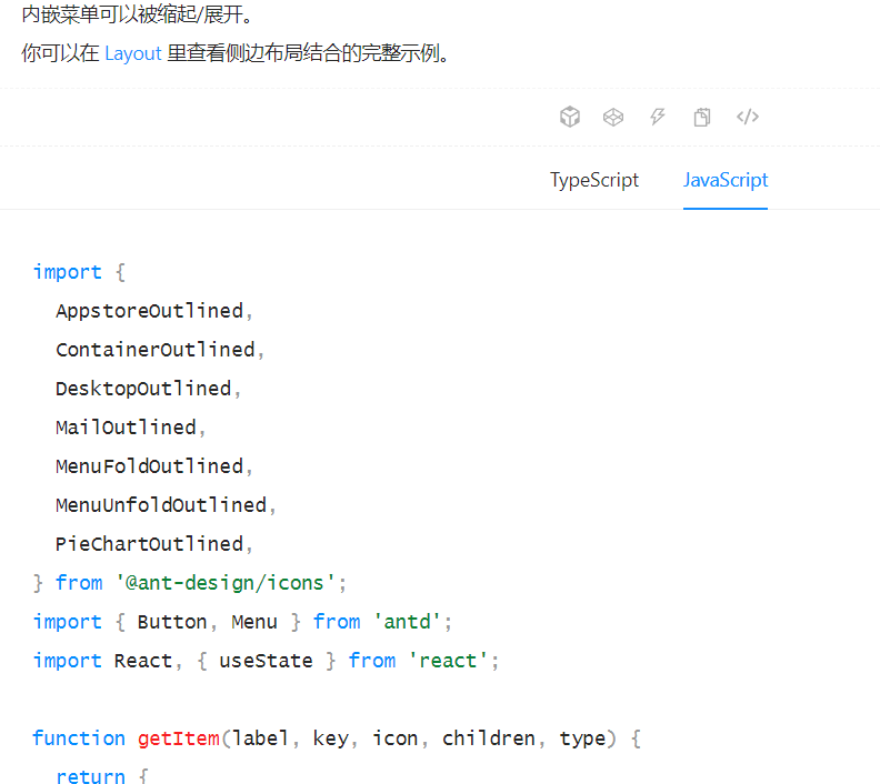
然后选择js的代码,copy到App组件就行了。
App.js:
import {
	AppstoreOutlined,
	ContainerOutlined,
	DesktopOutlined,
	MailOutlined,
	MenuFoldOutlined,
	MenuUnfoldOutlined,
	PieChartOutlined,
  } from '@ant-design/icons';
  import { Button, Menu } from 'antd';
  import React, { useState } from 'react';

  function getItem(label, key, icon, children, type) {
	return {
	  key,
	  icon,
	  children,
	  label,
	  type,
	};
  }

  const items = [
	getItem('Option 1', '1', <PieChartOutlined />),
	getItem('Option 2', '2', <DesktopOutlined />),
	getItem('Option 3', '3', <ContainerOutlined />),
	getItem('Navigation One', 'sub1', <MailOutlined />, [
	  getItem('Option 5', '5'),
	  getItem('Option 6', '6'),
	  getItem('Option 7', '7'),
	  getItem('Option 8', '8'),
	]),
	getItem('Navigation Two', 'sub2', <AppstoreOutlined />, [
	  getItem('Option 9', '9'),
	  getItem('Option 10', '10'),
	  getItem('Submenu', 'sub3', null, [getItem('Option 11', '11'), getItem('Option 12', '12')]),
	]),
  ];

  const App = () => {
	const [collapsed, setCollapsed] = useState(false);

	const toggleCollapsed = () => {
	  setCollapsed(!collapsed);
	};

	return (
	  <div
		style={{
		  width: 256,
		}}
	  >
		<Button
		  type="primary"
		  onClick={toggleCollapsed}
		  style={{
			marginBottom: 16,
		  }}
		>
		  {collapsed ? <MenuUnfoldOutlined /> : <MenuFoldOutlined />}
		</Button>
		<Menu
		  defaultSelectedKeys={['1']}
		  defaultOpenKeys={['sub1']}
		  mode="inline"
		  theme="dark"
		  inlineCollapsed={collapsed}
		  items={items}
		/>
	  </div>
	);
  };
  export default App;
index.js中还需要引入antd自己的样式
import React from 'react'
import ReactDOM from 'react-dom'
import App from "./App"
import "antd/dist/antd.min.css"
ReactDOM.render(<App/>,document.getElementById('root'))
然后启动脚手架
npm start
这样就引入成功了。
但是美中不足的就是大小有点不爽
我想让他全屏。
f12打开开发者工具
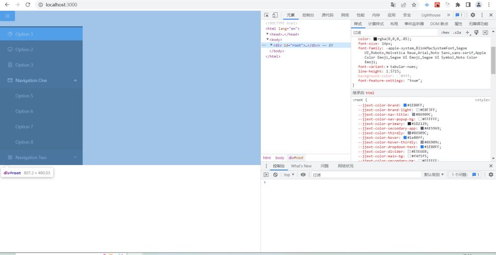
发现可能是root div太小了
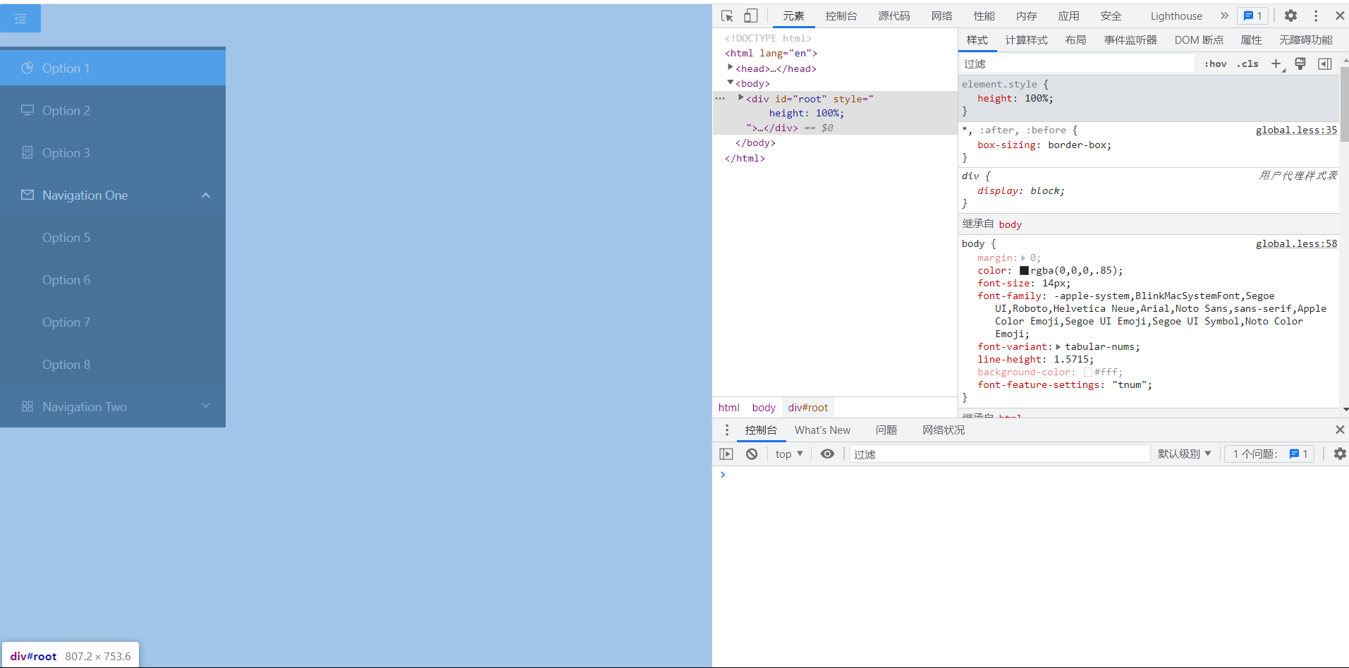
设置成100%但是还是不行
里面那个div设置100%还是不行
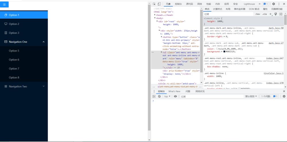
终于,ul设置一下就可以了。
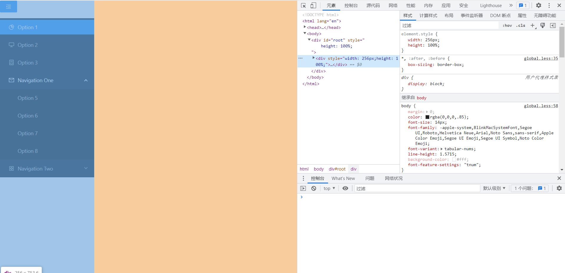
那么按上面的步骤代码里改下样式就行了
要改的地方如下:
index.html:
<!DOCTYPE html>
<html lang="en">
<head>
    <link rel="icon" href="%PUBLIC_URL%/favicon.ico" />
    <meta charset="UTF-8">
    <meta http-equiv="X-UA-Compatible" content="IE=edge">
    <meta name="viewport" content="width=device-width, initial-scale=1.0">
    <title>Document</title>
</head>
<body>
    <div id="root" style="height:100%"></div>
</body>
</html>
App.js:
import {
	AppstoreOutlined,
	ContainerOutlined,
	DesktopOutlined,
	MailOutlined,
	MenuFoldOutlined,
	MenuUnfoldOutlined,
	PieChartOutlined,
  } from '@ant-design/icons';
  import { Button, Menu } from 'antd';
  import React, { useState } from 'react';

  function getItem(label, key, icon, children, type) {
	return {
	  key,
	  icon,
	  children,
	  label,
	  type,
	};
  }

  const items = [
	getItem('Option 1', '1', <PieChartOutlined />),
	getItem('Option 2', '2', <DesktopOutlined />),
	getItem('Option 3', '3', <ContainerOutlined />),
	getItem('Navigation One', 'sub1', <MailOutlined />, [
	  getItem('Option 5', '5'),
	  getItem('Option 6', '6'),
	  getItem('Option 7', '7'),
	  getItem('Option 8', '8'),
	]),
	getItem('Navigation Two', 'sub2', <AppstoreOutlined />, [
	  getItem('Option 9', '9'),
	  getItem('Option 10', '10'),
	  getItem('Submenu', 'sub3', null, [getItem('Option 11', '11'), getItem('Option 12', '12')]),
	]),
  ];

  const App = () => {
	const [collapsed, setCollapsed] = useState(false);

	const toggleCollapsed = () => {
	  setCollapsed(!collapsed);
	};

	return (
	  <div
		style={{
		  width: 256,
		  height: '100%'
		}}
	  >
		<Button
		  type="primary"
		  onClick={toggleCollapsed}
		  style={{
			marginBottom: 16,
		  }}
		>
		  {collapsed ? <MenuUnfoldOutlined /> : <MenuFoldOutlined />}
		</Button>
		<Menu
		  defaultSelectedKeys={['1']}
		  defaultOpenKeys={['sub1']}
		  mode="inline"
		  theme="dark"
		  inlineCollapsed={collapsed}
		  items={items}
		  style={{height:'100%'}}
		/>
	  </div>
	);
  };

  export default App;
刷新页面

是想要的效果。

