添加ZButton.qml
import QtQuick 2.14
import QtQuick.Window 2.14
/*
    文件名即自定义控件名
    使用别名导出属性:相当于函数的变量形参
    不同的是导出的属性,调用控件是可以不使用(赋值)
*/
Rectangle {
    id: root

    //导出自定义属性
    property alias text: label.text
    property alias fontSize: label.font.pointSize
    property alias textColor: label.color
    property alias bgColor: root.color
    property alias borderRadius: root.radius
    property alias borderColor: root.border.color
    property alias borderWidth: root.border.width

    signal clicked

    width: 116; height: 36
    color: "blue"
    border.color: "#f3f3f3"
    border.width: 1
    radius: 4


    Text {
        id: label
        anchors.centerIn: parent
        text: "按钮"
        font.family: "微软雅黑"
        font.pointSize: parent.height/3
        color: "white"
    }

    MouseArea {
        anchors.fill: parent
        hoverEnabled: true
        cursorShape: "PointingHandCursor"
        onEntered: {
            root.opacity = 0.8
        }

        onExited: {
            root.opacity = 1
        }
        onClicked: {
            root.clicked()
        }

    }
}
注意
在自定义导出属性的时候不要和最外层的组件的属性名重复,会覆盖掉默认的属性。
使用
import QtQuick 2.14
import QtQuick.Window 2.14
Window {
width: 640
height: 240
visible: true
title: qsTr("Hello World")
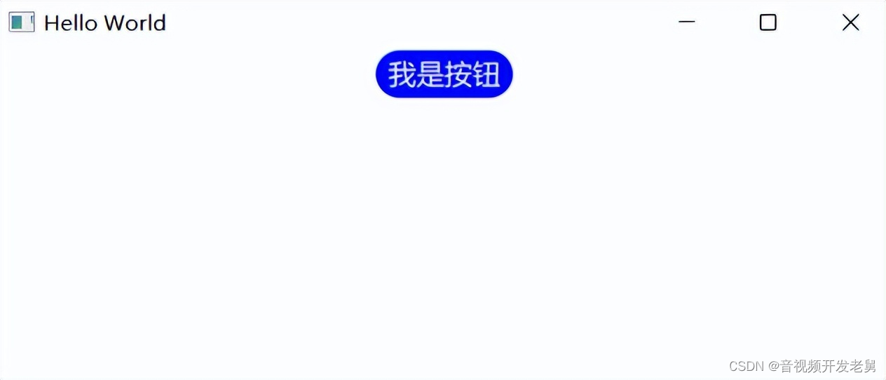
ZButton{
text: "我是按钮"
height: 36
width: 100
fontSize: 12
borderRadius: 18
anchors.horizontalCenter: parent.horizontalCenter
anchors.topMargin: 10
}
}
显示效果
添加ZComboBox.qml
import QtQuick 2.14
import QtQuick.Window 2.14
import QtQuick.Templates 2.14 as T
import QtQuick.Controls 2.14
import QtQuick.Controls.impl 2.14

T.ComboBox {
    id:control

    //checked选中状态,down按下状态,hovered悬停状态
    property color backgroundTheme: "#fefefe"
    //下拉框背景色
    property color backgroundColor: control.down ? "#eeeeee": control.hovered ? Qt.lighter(backgroundTheme) : backgroundTheme
    //边框颜色
    property color borderColor: Qt.darker(backgroundTheme)
    //item高亮颜色
    property color itemHighlightColor: "#eeeeee"
    //item普通颜色
    property color itemNormalColor: backgroundTheme
    //每个item的高度
    property int itemHeight: height
    //每个item文本的左右padding
    property int itemPadding: 10
    //下拉按钮左右距离
    property int indicatorPadding: 3
    //下拉按钮图标
    property url indicatorSource: "qrc:/qt-project.org/imports/QtQuick/Controls.2/images/double-arrow.png"
    //圆角
    property int radius: 4
    //最多显示的item个数
    property int showCount: 5
    //文字颜色
    property color textColor: "#333333"
    property color textSelectedColor: "#222222"
    //model数据左侧附加的文字
    property string textLeft: ""
    //model数据右侧附加的文字
    property string textRight: ""

    implicitWidth: 120
    implicitHeight: 30
    spacing: 0
    leftPadding: padding
    rightPadding: padding + indicator.width + spacing
    font{
        family: "微软雅黑"
        pixelSize: 16
    }

    //各item
    delegate: ItemDelegate {
        id: box_item
        height: control.itemHeight
        //Popup如果有padding,这里要减掉2*pop.padding
        width: control.width
        padding: 0
        contentItem: Text {
            text: control.textLeft+
                  (control.textRole
                   ? (Array.isArray(control.model)
                      ? modelData[control.textRole]
                      : model[control.textRole])
                   : modelData)+
                  control.textRight
            color: (control.highlightedIndex == index)
                   ? control.textSelectedColor
                   : control.textColor
            leftPadding: control.itemPadding
            rightPadding: control.itemPadding
            font: control.font
            elide: Text.ElideRight
            renderType: Text.NativeRendering
            verticalAlignment: Text.AlignVCenter
        }
        hoverEnabled: control.hoverEnabled
        background: Rectangle{
            radius: control.radius
            color: (control.highlightedIndex == index)
                   ? control.itemHighlightColor
                   : control.itemNormalColor
            //item底部的线
            Rectangle{
                height: 1
                width: parent.width-2*control.radius
                anchors.bottom: parent.bottom
                anchors.horizontalCenter: parent.horizontalCenter
                color: Qt.lighter(control.itemNormalColor)
            }
        }
    }

    indicator: Item{
        id: box_indicator
        x: control.width - width
        y: control.topPadding + (control.availableHeight - height) / 2
        width: box_indicator_img.width+control.indicatorPadding*2
        height: control.height
        //按钮图标
        Image {
            id: box_indicator_img
            anchors.centerIn: parent
            source: control.indicatorSource
        }
    }

    //box显示item
    contentItem: T.TextField{
        //control的leftPadding会挤过来,不要设置control的padding
        leftPadding: control.itemPadding
        rightPadding: control.itemPadding
        text: control.editable
              ? control.editText
              : (control.textLeft+control.displayText+control.textRight)
        font: control.font
        color: control.textColor
        verticalAlignment: Text.AlignVCenter
        //默认鼠标选取文本设置为false
        selectByMouse: true
        //选中文本的颜色
        selectedTextColor: "green"
        //选中文本背景色
        selectionColor: "white"
        clip: true
        //renderType: Text.NativeRendering
        enabled: control.editable
        autoScroll: control.editable
        readOnly: control.down
        inputMethodHints: control.inputMethodHints
        validator: control.validator
        renderType: Text.NativeRendering
        background: Rectangle {
            visible: control.enabled && control.editable
            border.width: parent && parent.activeFocus ? 1 : 0
            border.color: control.itemHighlightColor
            color: "transparent"
        }
    }

    //box框背景
    background: Rectangle {
        implicitWidth: control.implicitWidth
        implicitHeight: control.implicitHeight
        radius: control.radius
        color: control.backgroundColor
        border.color: control.borderColor
    }

    //弹出框
    popup: T.Popup {
        //默认向下弹出,如果距离不够,y会自动调整()
        y: control.height
        width: control.width
        //根据showCount来设置最多显示item个数
        implicitHeight: control.delegateModel
                        ?((control.delegateModel.count<showCount)
                          ?contentItem.implicitHeight
                          :control.showCount*control.itemHeight)+2
                        :0
        //用于边框留的padding
        padding: 1
        contentItem: ListView {
            clip: true
            implicitHeight: contentHeight
            model: control.popup.visible ? control.delegateModel : null
            currentIndex: control.highlightedIndex
            //按行滚动SnapToItem ;像素移动SnapPosition
            snapMode: ListView.SnapToItem
            //ScrollBar.horizontal: ScrollBar { visible: false }
            ScrollBar.vertical: ScrollBar { //定制滚动条
                id: box_bar
                implicitWidth: 10
                visible: control.delegateModel&&(control.delegateModel.count>showCount)
                //background: Rectangle{} //这是整体的背景
                contentItem: Rectangle{
                    implicitWidth:10
                    radius: width/2
                    color: box_bar.pressed
                           ? Qt.rgba(0.6,0.6,0.6)
                           : Qt.rgba(0.6,0.6,0.6,0.5)
                }
            }
        }

        //弹出框背景(只有border显示出来了,其余部分被delegate背景遮挡)
        background: Rectangle{
            border.width: 1
            border.color: control.borderColor
            radius: control.radius
        }
    }
}
使用方式
import QtQuick 2.14
import QtQuick.Window 2.14
Window {
width: 640
height: 280
visible: true
title: qsTr("Hello World")
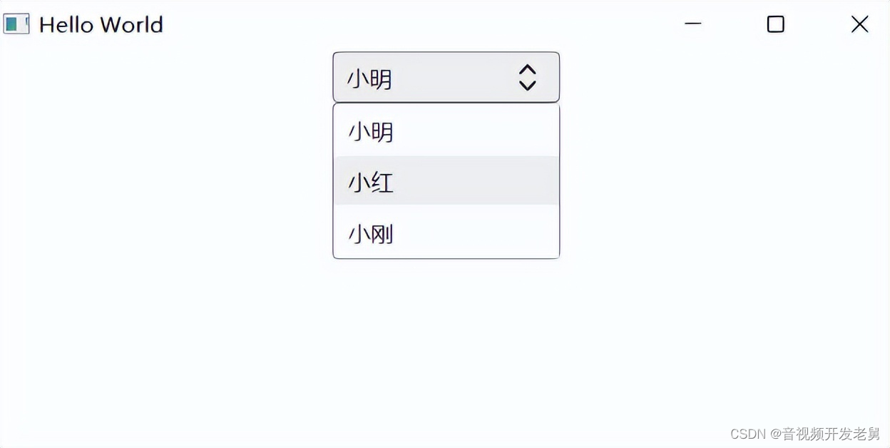
ZComboBox{
width: 160
height: 36
model: ["小明","小红","小刚"]
editable: false
anchors.horizontalCenter: parent.horizontalCenter
anchors.topMargin: 10
}
}效果

