本次Flutter稳定版本菜单系列组件新增了 MenuAnchor、MenuBar、SubmenuButton、MenuItemButton 组件, 这四个组件可以单独使用也可以相互配合使用。他们都位于menu_anchor.dart文件内,下面对这几个组件详细介绍下。
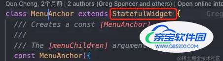
这是一个具有子菜单的独立区域组件,点进去我们可以看到是一个StatefulWidget组件, 这四个组件除了MenuBar是静态组件,其他都是动态组件。
说明我们可以当作普通的Widget组件去使用它们,MenuAnchor可以独立使用,通过这一个组件可以简单的实现下拉菜单的功能。
构造函数:
  const MenuAnchor({
    super.key,
    this.controller,// 控制器
    this.childFocusNode,//如果菜单是输入框,焦点控制
    this.style, //菜单样式
    this.alignmentOffset = Offset.zero,//相对于组件左下角位置
    this.clipBehavior = Clip.none,// 超出屏幕剪切 不常用
    this.anchorTapClosesMenu = false,// 设置为true时,菜单打开时,点击会重复打开。
    this.onOpen,//打开回调
    this.onClose,//关闭回调
    this.crossAxisUnconstrained = true,
    required this.menuChildren,//下拉菜单列表
    this.builder,//组件本身,通常是控制菜单的按钮
    this.child,//传递给上方builder里的child组件
  });
官方示例:

官方示例菜单后面的字母是自定义快捷键的操作,我们重点看下菜单的联动功能,菜单联动是和SubmenuButton实现的,例如官方示例中的设置背景色的菜单就是使用它实现的。接下来介绍下这个组件。
通过这个按钮可以实现菜单的联级调用,一般用来该选项下还有下级菜单时使用。该组件一般和MenuAnchor和MenuBar配合使用。
  const SubmenuButton({
    super.key,
    this.onHover,//按钮是否选中回调 在pc端属于鼠标指针在此菜单上
    this.onFocusChange,//是否获取焦点回调
    this.onOpen,//打开下级菜单回调
    this.onClose,//关闭下级菜单回调
    this.style,//按钮本身样式
    this.menuStyle,//下级菜单样式
    this.alignmentOffset,//相对位置偏移量 默认和组件上边对齐
    this.clipBehavior = Clip.none,
    this.focusNode,
    this.statesController,//组件状态扩展
    this.leadingIcon,//左边可选图标
    this.trailingIcon,//右边可选图标
    required this.menuChildren,//联级菜单
    required this.child,//组件本身
});具体菜单的选项,一般菜单选项没有下一级菜单时具有具体的功能使用,通过构造方法可以自定义快捷键,快捷键功能一般在PC端上使用。
构造方法:
  const MenuItemButton({
    super.key,
    this.onPressed,//点击事件
    this.onHover,//选中回调
    this.requestFocusOnHover = true,//指针悬停是否聚焦
    this.onFocusChange,//是否获取焦点回调
    this.focusNode,//焦点控制
    this.shortcut,//快捷键设置
    this.style,//本身样式
    this.statesController,//组件状态扩展
    this.clipBehavior = Clip.none,
    this.leadingIcon,//...
    this.trailingIcon,//...
    required this.child,//...
});此组件是管理多个联级菜单头部的组件,例如掘金编辑器下图,如果菜单选项只有1个可以使用MenuAnchor,多个时使用MenuBar.

红框内的组件集就是MenuBar组件的作用,它可以管理各个菜单之间的联动,默认他们共用一个控制器。一般和SubmenuButton、MenuItemButton配合使用。
const MenuBar({
super.key,
this.style,// 菜单样式
this.clipBehavior = Clip.none,
this.controller,
required this.children,
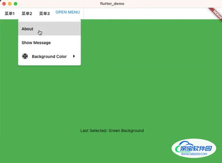
});示例效果:
左边的菜单1、2、3是一组MenuBar组件,右边是可以独立的MenuAnchor组件。
示例源码:
相较于官方示例,该示例下方展示了上方四个菜单组件的单独使用以及联合使用的简单示例,去掉了快捷键设置的属性,更直观的了解菜单组件的使用。快捷键的使用一般在PC端使用。
import 'package:flutter/material.dart';
void main() => runApp(const MenuApp());
enum MenuEntry {
  about('About'),
  showMessage('Show Message'),
  hideMessage('Hide Message'),
  colorMenu('Color Menu'),
  colorRed('Red Background'),
  colorGreen('Green Background'),
  colorBlue('Blue Background');

  final String label;
  const MenuEntry(this.label);
}

class MyCascadingMenu extends StatefulWidget {
  const MyCascadingMenu({super.key, required this.message});

  final String message;

  @override
  State<MyCascadingMenu> createState() => _MyCascadingMenuState();
}

class _MyCascadingMenuState extends State<MyCascadingMenu> {
  MenuEntry? _lastSelection;
  final FocusNode _buttonFocusNode = FocusNode(debugLabel: 'Menu Button');

  Color get backgroundColor => _backgroundColor;
  Color _backgroundColor = Colors.red;
  set backgroundColor(Color value) {
    if (_backgroundColor != value) {
      setState(() {
        _backgroundColor = value;
      });
    }
  }

  bool get showingMessage => _showingMessage;
  bool _showingMessage = false;
  set showingMessage(bool value) {
    if (_showingMessage != value) {
      setState(() {
        _showingMessage = value;
      });
    }
  }

  @override
  void dispose() {
    _buttonFocusNode.dispose();
    super.dispose();
  }

  @override
  Widget build(BuildContext context) {
    return Column(
      crossAxisAlignment: CrossAxisAlignment.start,
      children: <Widget>[
        MenuBar(
            style: MenuStyle(
                backgroundColor:
                    MaterialStateColor.resolveWith((states) => Colors.white),),
            children: [
              SubmenuButton(menuChildren: _meunList(), child: const Text("菜单1")),
              SubmenuButton(menuChildren: _meunList(), child: const Text("菜单2")),
              SubmenuButton(menuChildren: _meunList(), child: const Text("菜单3")),
               MenuAnchor(
          childFocusNode: _buttonFocusNode,
          menuChildren: _meunList(),
          builder:
              (BuildContext context, MenuController controller, Widget? child) {
            return TextButton(
              focusNode: _buttonFocusNode,
              onPressed: () {
                if (controller.isOpen) {
                  controller.close();
                } else {
                  controller.open();
                }
              },
              child: const Text('OPEN MENU'),
            );
          },
        ),
            ]),

        Expanded(
          child: Container(
            alignment: Alignment.center,
            color: backgroundColor,
            child: Column(
              mainAxisAlignment: MainAxisAlignment.center,
              children: <Widget>[
                Padding(
                  padding: const EdgeInsets.all(12.0),
                  child: Text(
                    showingMessage ? widget.message : '',
                    style: Theme.of(context).textTheme.headlineSmall,
                  ),
                ),
                Text(_lastSelection != null
                    ? 'Last Selected: ${_lastSelection!.label}'
                    : ''),
              ],
            ),
          ),
        ),
      ],
    );
  }

  void _activate(MenuEntry selection) {
    setState(() {
      _lastSelection = selection;
    });

    switch (selection) {
      case MenuEntry.about:
        showAboutDialog(
          context: context,
          applicationName: 'MenuBar Sample',
          applicationVersion: '1.0.0',
        );
        break;
      case MenuEntry.hideMessage:
      case MenuEntry.showMessage:
        showingMessage = !showingMessage;
        break;
      case MenuEntry.colorMenu:
        break;
      case MenuEntry.colorRed:
        backgroundColor = Colors.red;
        break;
      case MenuEntry.colorGreen:
        backgroundColor = Colors.green;
        break;
      case MenuEntry.colorBlue:
        backgroundColor = Colors.blue;
        break;
    }
  }

  List<Widget> _meunList() {
    return <Widget>[
      MenuItemButton(
        child: Text(MenuEntry.about.label),
        onPressed: () => _activate(MenuEntry.about),
      ),
      if (_showingMessage)
        MenuItemButton(
          onPressed: () => _activate(MenuEntry.hideMessage),
          child: Text(MenuEntry.hideMessage.label),
        ),
      if (!_showingMessage)
        MenuItemButton(
          onPressed: () => _activate(MenuEntry.showMessage),
          child: Text(MenuEntry.showMessage.label),
        ),
      SubmenuButton(
        leadingIcon: const Icon(Icons.ac_unit_sharp),
        menuChildren: <Widget>[
          MenuItemButton(
            onPressed: () => _activate(MenuEntry.colorRed),
            child: Text(MenuEntry.colorRed.label),
          ),
          MenuItemButton(
            onPressed: () => _activate(MenuEntry.colorGreen),
            child: Text(MenuEntry.colorGreen.label),
          ),
          MenuItemButton(
            onPressed: () => _activate(MenuEntry.colorBlue),
            child: Text(MenuEntry.colorBlue.label),
          ),
        ],
        child: const Text('Background Color'),
      ),
    ];
  }
}

class MenuApp extends StatelessWidget {
  const MenuApp({super.key});

  static const String kMessage = '"Talk less. Smile more." - A. Burr';

  @override
  Widget build(BuildContext context) {
    return const MaterialApp(
      home: Scaffold(body: MyCascadingMenu(message: kMessage)),
    );
  }
}构造方法:
构造方法内大多数参数使用的是 MaterialStateProperty<T>具有状态选择设置,这样做的好处是在PC端例如悬停、点击、不可点击等状态设置不同样式时,会非常的方便。例如系统自带的颜色、边框MaterialStateColor、MaterialStateBorderSide等都是通过 MaterialStateProperty扩展的。
const MenuStyle({
    this.backgroundColor,
    this.shadowColor,
    this.surfaceTintColor,
    this.elevation,
    this.padding,
    this.minimumSize,
    this.fixedSize,
    this.maximumSize,
    this.side,
    this.shape,
    this.mouseCursor,
    this.visualDensity,
    this.alignment,
});使用平台原生菜单组件实现,非Flutter渲染,例如在MacOS系统上特别有用,因为在MacOS上需要一个系统级菜单。
使用方法大同小异,区别就是这是基于不同平台实现的系统菜单选项。
上面就是本次更新新增的菜单相关使用的组件,可以看出这一系列组件更倾向于桌面端使用,里面加入了实现快捷键的操作,反而对于移动端操作需要的菜单以外部分的阴影,菜单弹出动画都没有找到支持的方法。

