最近研究Python数据分析,需要利用Matplotlib绘制图表,并将多个图表绘制在一张图中,经过一番折腾,利用matplotlib包下的subplot()函数即可实现此功能。
代码实现:
import matplotlib.pyplot as plt
import numpy as np

class Graph(object):
    def __init__(self):
        self.font = {
            'size': 13
        }

    plt.figure(figsize=(9, 6))
    plt.subplots_adjust(wspace=0.7, hspace=0.5)
    plt.rcParams['font.family'] = 'simhei'
    plt.rcParams['axes.unicode_minus'] = False

    def twinx(self):
        a1 = plt.subplot(231)
        plt.title('双纵轴折线图', fontdict=self.font)
        a1.plot(subjects, v1, label='v1')
        a1.set_ylabel('v1')
        a1.legend(loc='upper right', bbox_to_anchor=[-0.5, 0, 0.5, 1], fontsize=7)
        a2 = a1.twinx()
        a2.plot(subjects, v2, 'r--', label='v2')
        a2.set_ylabel('v2')
        a2.legend(loc='upper left', bbox_to_anchor=[1, 0, 0.5, 1], fontsize=7)

    def scatter(self):
        plt.subplot(232)
        plt.title('散点图', fontdict=self.font)
        x = range(50)
        y_jiangsu = [np.random.uniform(15, 25) for i in x]
        y_beijing = [np.random.uniform(5, 18) for i in x]
        plt.scatter(x, y_beijing, label='v1')
        plt.scatter(x, y_jiangsu, label='v2')
        plt.legend(loc='upper left', bbox_to_anchor=[1, 0, 0.5, 1], fontsize=7)

    def hist(self):
        plt.subplot(233)
        plt.title('直方图', fontdict=self.font)
        x = np.random.normal(size=100)
        plt.hist(x, bins=30)

    def bar_dj(self):
        plt.subplot(234)
        plt.title('堆积柱状图', fontdict=self.font)
        plt.bar(np.arange(len(v1)), v1, width=0.6, label='v1')
        for x, y in enumerate(v1):
            plt.text(x, y, y, va='top', ha='center')
        plt.bar(np.arange(len(v2)), v2, width=0.6, bottom=v1, label='v2')
        for x, y in enumerate(v2):
            plt.text(x, y + 60, y, va='bottom', ha='center')
        plt.ylim(0, 200)
        plt.legend(loc='upper left', bbox_to_anchor=[1, 0, 0.5, 1], fontsize=7)
        plt.xticks(np.arange(len(v1)), subjects)

    def bar_bl(self):
        plt.subplot(235)
        plt.title('并列柱状图', fontdict=self.font)
        plt.bar(np.arange(len(v1)), v1, width=0.4, color='tomato', label='v1')
        for x, y in enumerate(v1):
            plt.text(x - 0.2, y, y)
        plt.bar(np.arange(len(v2)) + 0.4, v2, width=0.4, color='steelblue', label='v2')
        for x, y in enumerate(v2):
            plt.text(x + 0.2, y, y)
        plt.ylim(0, 110)
        plt.xticks(np.arange(len(v1)), subjects)
        plt.legend(loc='upper left', bbox_to_anchor=[1, 0, 0.5, 1], fontsize=7)

    def barh(self):
        plt.subplot(236)
        plt.title('水平柱状图', fontdict=self.font)
        plt.barh(np.arange(len(v1)), v1, height=0.4, label='v1')
        plt.barh(np.arange(len(v2)) + 0.4, v2, height=0.4, label='v2')
        plt.legend(loc='upper left', bbox_to_anchor=[1, 0, 0.5, 1], fontsize=7)
        plt.yticks(np.arange(len(v1)), subjects)


def main():
    g = Graph()
    g.twinx()
    g.scatter()
    g.hist()
    g.bar_dj()
    g.bar_bl()
    g.barh()
    plt.savefig('坐标轴类.png')
    plt.show()


if __name__ == '__main__':
    subjects = ['语文', '数学', '英语', '物理', '化学']
    v1 = [77, 92, 83, 74, 90]
    v2 = [63, 88, 99, 69, 66]
    main()
效果如下:
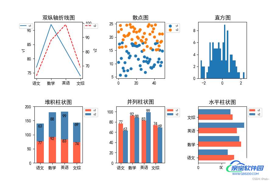
可以看到,一个画板上放了6个子图。达到了我们想要的效果。
现在来解析刚刚的部分代码:
plt.figure(1):表示取第一块画板,一个画板就是一张图,如果你有多个画板,那么最后就会弹出多张图。plt.subplot(231):221表示将画板划分为2行3列,然后取第1个区域。那么第几个区域是怎么界定的呢?这个规则遵循行优先数数规则.优先从行开始数,从左到右按顺序1234……然后再下一行。import os
import cv2
import pytz
import numpy as np
from tqdm import tqdm
import matplotlib.pyplot as plt
from matplotlib import animation
from matplotlib.gridspec import GridSpec
from datetime import datetime
# (200,125) ,(300,185)
def ave_area(arrays, left_top=(350, 180), right_lower=(400,255)):
np_array = arrays[left_top[0]:right_lower[0], left_top[1]:right_lower[1]].reshape(1, -1)
delete_0 = np_array[np_array != 0]
return np.mean(delete_0) / 1000
img_depths_x = []
img_depths_y = []
img_colors = []
dirs = r'Z:\10.1.22.215\2021-09-09-18'
for file in tqdm(os.listdir(dirs)[4000:4400]):
try:
img_path = os.path.join(dirs, file)
data = np.load(img_path, allow_pickle=True)
depthPix, colorPix = data['depthPix'], data['colorPix']
#rgbimage = cv2.cvtColor(colorPix, cv2.COLOR_BGR2RGB)
font = cv2.FONT_HERSHEY_SIMPLEX
text = file.replace('.npz', '')
cv2.putText(colorPix, text, (10, 30), font, 0.75, (0, 0, 255), 2)
cv2.putText(depthPix, text, (10, 30), font, 0.75, (0, 0, 255), 2)
#cv2.imshow('example', colorPix)
cv2.waitKey(10)
indexes = file.replace('.npz', '')
key = datetime.strptime(indexes, '%Y-%m-%d-%H-%M-%S-%f').astimezone(pytz.timezone('Asia/ShangHai')).timestamp() #格式时间转换
img_depths_x.append(key)
img_depths_y.append(ave_area(depthPix))
img_colors.append(cv2.cvtColor(colorPix,cv2.COLOR_BGR2RGB))
except:
continue
fig = plt.figure(dpi=100,
constrained_layout=True, # 类似于tight_layout,使得各子图之间的距离自动调整【类似excel中行宽根据内容自适应】
figsize=(15, 12)
)
gs = GridSpec(3, 1, figure=fig)#GridSpec将fiure分为3行3列,每行三个axes,gs为一个matplotlib.gridspec.GridSpec对象,可灵活的切片figure
ax1 = fig.add_subplot(gs[0:2, 0])
ax2 = fig.add_subplot(gs[2:3, 0])
xdata, ydata = [], []
rect = plt.Rectangle((350, 180), 75, 50, fill=False, edgecolor = 'red',linewidth=1)
ax1.add_patch(rect)
ln1 = ax1.imshow(img_colors[0])
ln2, = ax2.plot([], [], lw=2)
def init():
ax2.set_xlim(img_depths_x[0], img_depths_x[-1])
ax2.set_ylim(12, 14.5)
return ln1, ln2
def update(n):
ln1.set_array(img_colors[n])
xdata.append(img_depths_x[n])
ydata.append(img_depths_y[n])
ln2.set_data(xdata, ydata)
return ln1, ln2
ani = animation.FuncAnimation(fig,
update,
frames=range(len(img_depths_x)),
init_func=init,
blit=True)
ani.save('vis.gif', writer='imagemagick', fps=10)以上为个人经验,希望能给大家一个参考,也希望大家多多支持。

