在本文中你将收获
在根目录新建components文件夹,建立cell 文件夹,右击创建cell的Component组件
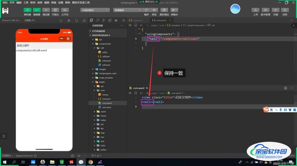
页面的xxx.json ,usingComponent注册
"usingComponents": {
"item":"/components/item/item"
}
<item></item>

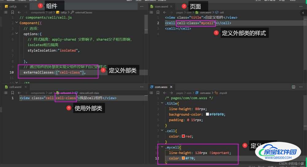
cell.wxml 文件
<view class="cell cell-class">
</view>
cell.wxss
/* pages/com/com.wxss */
.cell{
  color: tomato;
}
.mycell{
  color: #f70;
  line-height: 120rpx !important;
}
cell.js 文件
  /* 选项 */
  options:{
    /* 样式隔离:apply-shared 父影响子
    shared 父子相互影响   isolated 相互隔离
    */
    styleIsolation:'isolated',
  },
  //通过组件的外部类实现父组件控制自己的样式
  externalClasses:["cell-class"],
<cell></cell>
<cell cell-class="mycell"></cell>

cell.wxml
 <view class="cell">
  我是cell组件
  <slot></slot>
</view>
cell.js
  /* 选项 */
  options:{
    //允许多个插槽
    multipleSlots:true,
  },
cell.wxss
.cell{
  height: 88rpx;
  line-height: 88rpx;
  border-bottom: 1rpx solid #cccccc;
}
使用cell组件
<cell>
  <text>放假</text>
  <text>快点到来</text>
</cell>
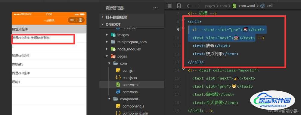
cell.wxml
 <view class="cell cell-class">
  <slot name="pre"></slot>
  我是cell组件
  <slot></slot>
  <slot name="next"></slot>
</view>
cell.js
  /* 选项 */
  options:{
    //允许多个插槽
    multipleSlots:true,
  },
cell.wxss
.cell{
  height: 88rpx;
  line-height: 88rpx;
  border-bottom: 1rpx solid #cccccc;
}
com.wxml

