需要引入awesome-bootstrap-checkbox.css、font-awesome.css以及font awesome对应的字体font文件,可在上面的网站上下载。
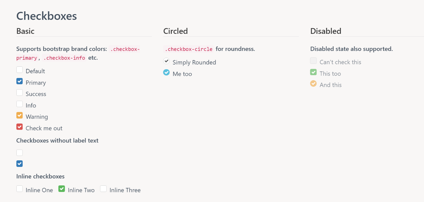
checkboxs的样式
radio的样式
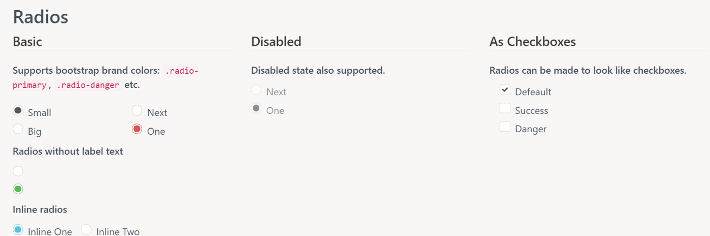
radio样式
只要引入上面所说的文件之后,也可以自己定制样式,代码如下:
.checkbox label::before {
content: "";
display: inline-block;
position: absolute;
width: 20px;
height: 20px;
left: 0;
margin-left: -20px;
border: 1px solid #cccccc;<!--没选中时的边框颜色-->
border-radius: 3px;
background-color: #fff;<!--没选中时的颜色-->
-webkit-transition: border 0.15s ease-in-out, color 0.15s ease-in-out;
-o-transition: border 0.15s ease-in-out, color 0.15s ease-in-out;
transition: border 0.15s ease-in-out, color 0.15s ease-in-out;
}
.checkbox label::after {
display: inline-block;
position: absolute;
width: 16px;
height: 16px;
left: 0;
top: 0;
margin-left: -19px;<!--可以改变“√”的位置-->
padding-left: 3px;<!--可以改变“√”的位置-->
padding-top: 1px;<!--可以改变“√”的位置-->
font-size: 13px;<!--选中后的中间打钩的字体大小(字体越大中间的勾越大越明显)-->
color: #FAD500;<!--选中后的中间打钩的颜色-->
}
.checkbox input[type="checkbox"],
.checkbox input[type="radio"] {
opacity: 0;
z-index: 1;
}
.checkbox input[type="checkbox"]:focus + label::before,
.checkbox input[type="radio"]:focus + label::before {
outline: thin dotted;
outline: 5px auto -webkit-focus-ring-color;
outline-offset: -2px;
background-color: black;
border-color: black;
}
.checkbox input[type="checkbox"]:checked + label::before,
.checkbox input[type="radio"]:checked + label::before {
background-color: black;<!--选中后的背景颜色-->
border-color: black;<!--选中后的边框颜色-->
}
.checkbox input[type="checkbox"]:checked + label::after,
.checkbox input[type="radio"]:checked + label::after {
font-family: "FontAwesome";
content: "\f00c";
}
.checkbox input[type="checkbox"]:disabled + label,
.checkbox input[type="radio"]:disabled + label {
opacity: 0.65;
}
.checkbox input[type="checkbox"]:disabled + label::before,
.checkbox input[type="radio"]:disabled + label::before {
background-color: #eeeeee;
cursor: not-allowed;
}
.checkbox.checkbox-circle label::before {
border-radius: 50%;
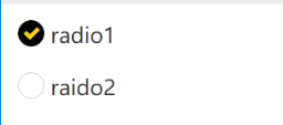
<div>
<div class="checkbox checkbox-circle">
<input id="radio1" class="styled" type="radio" name="radio">
<label for="radio1" class="font-bolder">
radio1
</label>
</div>
<div class="checkbox checkbox-circle">
<input id="radio2" class="styled" type="radio" name="radio">
<label for="radio2" class="font-bolder">
raido2
</label>
</div>
</div>
上面代码执行的效果
以上所述是小编给大家介绍的Bootstrap复选框和单选按钮美化插件,希望对大家有所帮助,如果大家有任何疑问请给我留言,小编会及时回复大家的。在此也非常感谢大家对网站的支持!

