HTML5现在本领太大了,PC端已经无法满足它的胃口了,它将强势攻入移动端,所以移动端中各种特效也得基于HTML5实现,看看我们将要介绍的slideout.js,能帮我们实现怎么样的侧边栏滑动特效呢
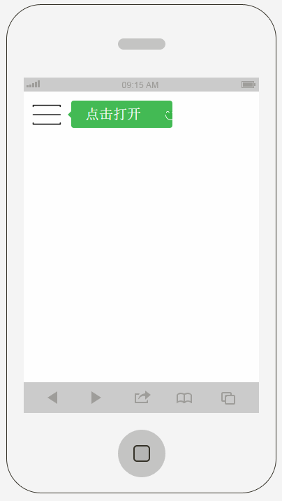
先看下运行效果:
一、准备资料
只需要准备slideout.js库即可:
https://github.com/Mango/slideout/blob/masterhttps://img.qb5200.com/download-x/dist/slideout.js
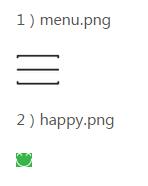
小图标:
二、实现代码
HTML代码:
<!doctype html>
<html lang="zh">
<head>
<meta charset="UTF-8">
<meta http-equiv="X-UA-Compatible" content="IE=edge,chrome=1">
<meta name="viewport" content="width=device-width, initial-scale=1.0">
<title>适合移动手机的侧边栏滑动代码 - 站长素材</title>
<link rel="stylesheet" href="css/styles.css">
</head>
<body>
<nav id="menu" class="menu">
 <a href="#" target="_blank">
 <header class="menu-header">
 <span class="menu-header-title">主题</span>
 </header>
 </a>

 <section class="menu-section">
 <h3 class="menu-section-title">脚本代码</h3>
 <ul class="menu-section-list">
 <li><a href="#" target="_blank">jQuery</a></li>
 <li><a href="#" target="_blank">CSS3</a></li>
 <li><a href="#" target="_blank">HTML5</a></li>
 <li><a href="#" target="_blank">动画效果</a></li>
 </ul>
 </section>

 <section class="menu-section">
 <h3 class="menu-section-title">flash动画</h3>
 <ul class="menu-section-list">
 <li><a href="#" target="_blank">节日动画</a></li>
 <li><a href="#" target="_blank">flash植物</a></li>
 <li><a href="#">flash动物</a></li>
 </ul>
 </section>

 <section class="menu-section">
 <h3 class="menu-section-title">音效下载</h3>
 <ul class="menu-section-list">
 <li><a href="#" target="_blank">鸟叫声</a></li>
 <li><a href="#" target="_blank">狗叫声</a></li>
 </ul>
 </section>
</nav>
<main id="main" class="panel">
 <button class="btn-hamburger js-slideout-toggle">
 <span class="tooltip">点击打开</span>
 </button>
</main>

<script type="text/javascript" src="js/slideout.min.js"></script>
<script type="text/javascript">
 var slideout = new Slideout({
 'panel': document.getElementById('main'),
 'menu': document.getElementById('menu'),
 'padding': 256,
 'tolerance': 70
 });

 document.querySelector('.js-slideout-toggle').addEventListener('click', function() {
 slideout.toggle();
 });

 document.querySelector('.menu').addEventListener('click', function(eve) {
 if (eve.target.nodeName === 'A') { slideout.close(); }
 });

</script>

</body>
</html>
结构代码一项简单,主要注意一下slideout的用法,它传的几个参数:
panel:是指主要面板,指整个内容展示区域
menu:是指被隐藏的左侧菜单栏区域
padding:指点击按钮后,向右滑动的距离
CSS代码:
html,
body {
 width: 100%;
 height: 100%;
 font: 100%/1.4em 'Calibre Light', 'Helvetica Neue', Helvetica, Arial, sans-serif;
 margin: 0 auto;
 color: #222;
 -webkit-text-size-adjust: none;
 -webkit-font-smoothing: antialiased;
}

pre {
 margin: 0;
 font-size: 14px;
}

body,
.panel {
 background-color: #fff;
}

.menu {
 background-color: #1D1F20;
 background-image: linear-gradient(145deg, #1D1F20, #404348);
}

a {
 color: #4B5;
 text-decoration: none;
}

.menu a {
 color: #fff;
}

.menu a:hover {
 text-decoration: underline;
}

.menu-header {
 border-bottom: 1px solid #2a2d2f;
 padding: 20px 0 20px 60px;
 background: url('../images/github.png') no-repeat 15px 15px;
 background-size: 32px;
}

.menu-header-title {
 font-weight: 400;
 letter-spacing: 0.5px;
 margin: 0;
}

.menu-section {
 margin: 25px 0;
}

.menu-section-title {
 text-transform: uppercase;
 color: #85888d;
 font-weight: 200;
 font-size: 13px;
 letter-spacing: 1px;
 padding: 0 20px;
 margin:0;
}

.menu-section-list {
 padding:0;
 margin: 10px 0;
 list-style:none;
}

.menu-section-list a {
 display: block;
 padding: 10px 20px;
}

.menu-section-list a:hover {
 background-color: rgba(255, 255, 255, 0.1);
 text-decoration: none;
}

.panel {
 text-align: center;
 padding-top: 5px;
 min-height: 100%;
}


/**
 * hamburger
 */
.btn-hamburger {
 border: none;
 position: absolute;
 top: 12px;
 left: 12px;
 outline:none;
 background: url('../images/menu.png') no-repeat left center;
}

.tooltip {
 font-size: 20px;
 line-height: 19px;
 display: inline-block;
 background: #4B5 url('../images/happy.png') no-repeat 135px 15px;
 color: #fff;
 padding: 10px 45px 10px 20px;
 border-radius: 4px;
 position: relative;
 left: 50px;
}


/**
 * Medium Screens
 */
@media all and (min-width:40em) {

 .btn-hamburger {
 top: 20px;
 left: 30px;
 }

 .panel-header {
 margin-top: 40px;
 width: 455px;
 }

 .title {
 font-size: 4.2em;
 }

 .subtitle {
 font-size: 1.8em;
 }

 .btn-download {
 margin-right: 20px;
 }

 .btn-fork {
 margin-left: 20px;
 }

}

.menu,
.slideout-menu {
 position: fixed;
 left: 0;
 top: 0;
 bottom: 0;
 right: 0;
 z-index: 0;
 width: 256px;
 overflow-y: scroll;
 -webkit-overflow-scrolling: touch;
 display: none;
}

.panel,
.slideout-panel {
 position: relative;
 z-index: 1;
}

.slideout-open,
.slideout-open body {
 overflow: hidden;
}

.slideout-open .slideout-menu {
 display: block;
}
上面css代码可能有些有点多余,但是我们没必要care这么多细节呀,出来效果不就行了么。

