本文着重讲解了python绘制分布折线图的代码实例,帮助大家更好的利用python绘制图像,欢迎大家阅读
用Python 绘制分布(折线)图,使用的是 plot()函数。
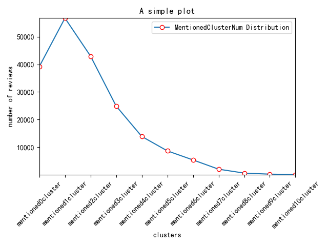
一个简单的例子:
# encoding=utf-8
import matplotlib.pyplot as plt
from pylab import * # 支持中文

mpl.rcParams['font.sans-serif'] = ['SimHei']
# 'mentioned0cluster',
names = ['mentioned1cluster','mentioned2cluster', 'mentioned3cluster', 'mentioned4cluster', 'mentioned5cluster', 'mentioned6cluster', 'mentioned7cluster', 'mentioned8cluster', 'mentioned9cluster', 'mentioned10cluster']
x = range(len(names))
# y_0625 = [39266,56796,42996,24872,13849,8609,5331,1971,554,169,26]

y_0626_1=[4793,100,0,0,0,0,0,0,0,0]
# y_0626_2=[2622,203,0,0,0,0,0,0,0,0,0]

# plt.plot(x, y, 'ro-')
# plt.plot(x, y1, 'bo-')
# pl.xlim(-1, 11) # 限定横轴的范围
# pl.ylim(-1, 110) # 限定纵轴的范围
plt.plot(x, y_0626_1, marker='o', mec='r', mfc='w', label='HighRating:MentionedClusterNum Distribution')
# plt.plot(x, y_0626_2, marker='o', mec='r', mfc='w', label='LowRating:MentionedClusterNum Distribution')
# plt.plot(x, y1, marker='*', ms=10, label=u'y=x^3曲线图')
plt.legend() # 让图例生效
plt.xticks(x, names, rotation=45)
plt.margins(0)
plt.subplots_adjust(bottom=0.15)
# plt.xlabel(u"time(s)邻居") # X轴标签
plt.xlabel("clusters")
plt.ylabel("number of reviews") # Y轴标签
plt.title("A simple plot") # 标题

plt.show()
结果: