Flutter开发过程中,Drawer控件的使用频率也是比较高的,其实有过移动端开发经验的人来说,Flutter中的Drawer控件就相当于ios开发或者Android开发中的“抽屉”效果,从侧边栏滑出导航菜单。对于Flutter中的Drawer控件的常规用法就不多介绍,网上大把的教程。
那么本篇博文分享一个网上教程不多的一个知识点,那就是自定义Drawer的滑出位置的大小,自定义Drawer滑出位置就需要修改一个double的widthPercent属性,widthPercent一般默认值是0.7,然后想要修改widthPercent的默认值,或者设置想要的任何大于0小于1之间的值都可以根据这个来设置。具体操作如下所示:
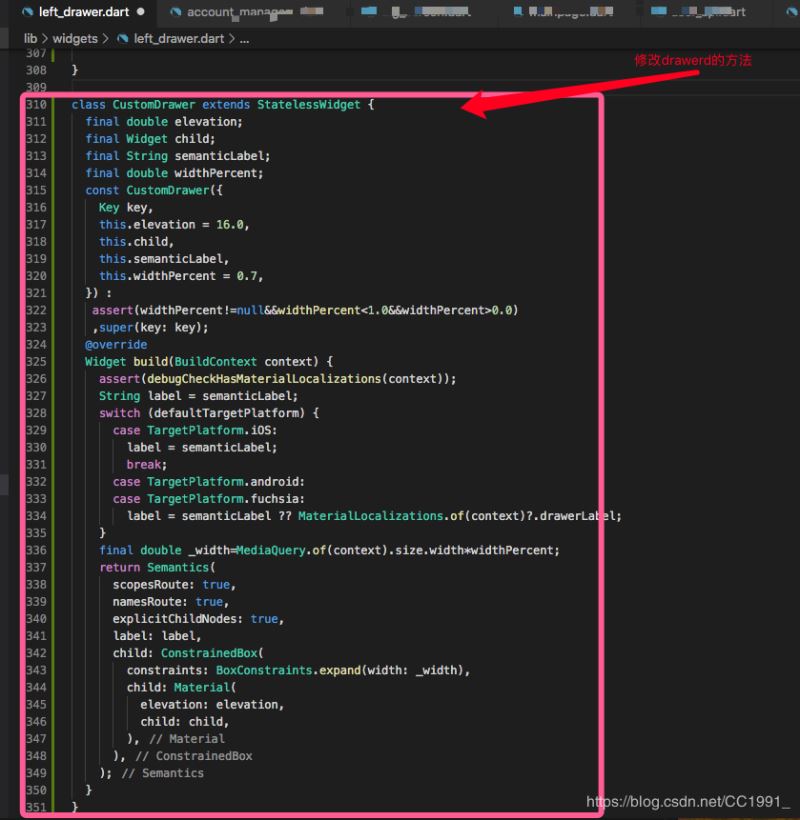
1、首先封装这个方法(看官可以直接复制使用)
class CustomDrawer extends StatelessWidget {

 final double elevation;

 final Widget child;

 final String semanticLabel;

 final double widthPercent;

 const CustomDrawer({

  Key key,

  this.elevation = 16.0,

  this.child,

  this.semanticLabel,

  this.widthPercent = 0.7,

 }) :

  assert(widthPercent!=null&&widthPercent<1.0&&widthPercent>0.0)

  ,super(key: key);

 @override

 Widget build(BuildContext context) {

  assert(debugCheckHasMaterialLocalizations(context));

  String label = semanticLabel;

  switch (defaultTargetPlatform) {

   case TargetPlatform.iOS:

    label = semanticLabel;

    break;

   case TargetPlatform.android:

   case TargetPlatform.fuchsia:

    label = semanticLabel ?? MaterialLocalizations.of(context)?.drawerLabel;

  }

  final double _width=MediaQuery.of(context).size.width*widthPercent;

  return Semantics(

   scopesRoute: true,

   namesRoute: true,

   explicitChildNodes: true,

   label: label,

   child: ConstrainedBox(

    constraints: BoxConstraints.expand(width: _width),

    child: Material(

     elevation: elevation,

     child: child,

    ),

   ),

  );

 }

}
2、调用的地方

 @override

 Widget build(BuildContext context) {

  return InkWell(

   onTap: () {

    Navigator.of(context).pop();

    Navigator.of(context).push(new MaterialPageRoute(

      builder: (BuildContext context) => new AccountManagersPage('')));

   },

   child: new CustomDrawer( //调用修改Drawer的方法

    widthPercent:0.5, //设置Drawer滑出位置居屏幕的一半宽度

    child: Container(

     color: Color(0xFF1F1D5B),

     child: Column(

      children: <Widget>[

       Expanded(

        child: ListView(children: <Widget>[

         Column(

          children: <Widget>[

           ListTile(

            title: Text('设备列表',

              style: TextStyle(color: Color(0xFF8B89EF))),

            contentPadding: EdgeInsets.symmetric(

              horizontal: 15.0, vertical: 0.0),

           ),

           ListTile(

             leading: CircleAvatar(

              backgroundImage: new ExactAssetImage(

                'images/menu_lamp_pole.png'),

              radius: 15.0,

             ),

             title: Text('灯杆',

               style: TextStyle(

                color: Color(0xFFffffff),

                fontSize: 18.0,

               )),

             onTap: () {

              Navigator.of(context).pop();

              //Navigator.of(context).push(new MaterialPageRoute(builder:(BuildContext context) => new BigScreenPage(0,'灯杆列表')));

              Navigator.of(context).push(new MaterialPageRoute(

                builder: (BuildContext context) =>

                  new MainPoleView()));

             }),

           // Divider(),

           ListTile(

             leading: CircleAvatar(

              backgroundImage:

                new ExactAssetImage('images/menu_charge.png'),

              radius: 15.0,

             ),

             title: Text('充电桩',

               style: TextStyle(

                color: Color(0xFFffffff),

                fontSize: 18.0,

               )),

             onTap: () {

              Navigator.of(context).pop();

              Navigator.of(context).push(new MaterialPageRoute(

                builder: (BuildContext context) =>

                  new BigScreenPage(6, '充电桩列表')));

             }),

           ],

         )

        ]),

       )

      ],

     ),

    ),

   ),

  );

 }
实现效果如下所示:

总结

