我就废话不多说了,大家还是直接看代码吧!
绘制曲线:
import time
import numpy as np
import matplotlib.pyplot as plt
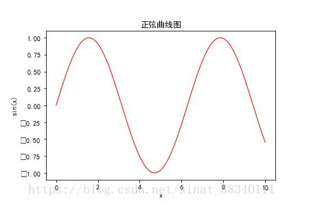
x = np.linspace(0, 10, 1000)
y = np.sin(x)
plt.figure(figsize=(6,4))
plt.plot(x,y,color="red",linewidth=1 )
plt.xlabel("x") #xlabel、ylabel:分别设置X、Y轴的标题文字。
plt.ylabel("sin(x)")
plt.title("正弦曲线图") # title:设置子图的标题。
plt.ylim(-1.1,1.1)# xlim、ylim:分别设置X、Y轴的显示范围。
plt.savefig('quxiantu.png',dpi=120,bbox_inches='tight')
# plt.show()
# plt.close()
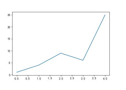
import matplotlib.pyplot as plt
squares=[1,4,9,6,25]
plt.plot(squares)
plt.savefig('zhexiantu.png',dpi=120,bbox_inches='tight') #dpi 代表像素
#绘制折线图
补充知识:matplotlib 画箭头的两种方式
如下所示:
def drawArrow(A, B):
 fig = plt.figure(figsize=(5, 5))
 print("xasxcsasdc")
 ax = fig.add_subplot(121)
 # fc: filling color
 # ec: edge color


 """第一种方式"""
 ax.arrow(A[0], A[1], B[0]-A[0], B[1]-A[1],
    width=0.01,
    length_includes_head=True, # 增加的长度包含箭头部分
    head_width=0.25,
    head_length=1,
    fc='r',
    ec='b')
 ax.set_xlim(0, 5)
 ax.set_ylim(0, 5)
 ax.grid()
 ax.set_aspect('equal')

 """第二种方式"""
 # 这种方式是在图上做标注时产生的
 # Example:
 ax = fig.add_subplot(122)
 ax.annotate("",
    xy=(B[0], B[1]),
    xytext=(A[0], A[1]),
    # xycoords="figure points",
    arrowprops=dict(arrowstyle="->", color="r"))
 ax.set_xlim(0, 5)
 ax.set_ylim(0, 5)
 ax.grid()
 ax.set_aspect('equal') #x轴y轴等比例

 #x轴y轴等比例
 plt.show()

第一种
Axes.arrow(x,y,# 坐标x, y
dx,dy, # 箭头两端横纵坐标距离差
* * kwargs) # 箭头架构和属性设置
Constructor arguments
width 箭头尾巴的线宽
length_includes_head: bool (default: False) # 增加的长度包含箭头部分
head_width: float or None (default: 3*width) # 箭头部分的宽度
head_length: float or None (default: 1.5 * head_width) # 箭头部分的长度
shape: [‘full', ‘left', ‘right'] (default: ‘full') # 箭头是否全部显示 full 完整显示 left左半部 right 右半部
overhang: float (default: 0) # 不知道怎么形容 会改变箭头部分的形状
alpha:透明度
color 箭头的颜色
fc : 箭头尾部的
ec:箭头边界的颜色
fill:箭头部分是否填充颜色
antialiased :False时会让箭头部分带上锯齿
hatch:箭头部分的填充形状
{'/', ‘', ‘|', ‘-', ‘+', ‘x', ‘o', ‘O', ‘.', ‘*'}
第二种
Axes.annotate(s, 标注的信息
xy, 标注点的坐标
*args,
**kwargs)[source]
参数:
s : str 标注的信息
xy : (float, float) 标注点的坐标(箭头的头端点)
xytext : (float, float), 标注的位置(箭头的尾巴)
arrowprops : dict, optional
标注指向的线条的形状:
‘-' 、 ‘->' 、 ‘-[' 、 ‘|-|' 、 ‘-|>' 、 ‘<-' 、 ‘<->' 、 ‘<|-' 、 ‘<|-|>'、 ‘fancy' 、 ‘simple' 、 ‘wedge' 、
以上这篇matplotlib 曲线图 和 折线图 plt.plot()实例就是小编分享给大家的全部内容了,希望能给大家一个参考,也希望大家多多支持。

