近期做的项目有个需求是做一个类似菜鸟的取件时间选择器,去找了很久没找到合适的,没办法只能自己收撸,经过好几个小版本修改之后也算是定型了,这里总结一篇文档备忘,把源码贴出来后续方便后续copy
技术
uniapp + vue2 + uni-popup
因为目前我的项目只用到这三端,其他的都还没测,所以兼容不保证
| 环境 | 兼容 |
|---|---|
| 支付宝小程序 | ✔ |
| 微信小程序 | ✔ |
| H5 | ✔ |

1、弹窗从底部弹出
2、左侧日期选择器
3、右侧时间选择器
先做一下基础布局,简单的分成上左右三大块,并做一些基础的配置

<template>
	<uni-popup
		mask-background-color="rgba(0, 0, 0, .8)"
		ref="datePickerPop"
		type="bottom"
		background-color="#fff"
		:is-mask-click="false"
	>
		<view class="date_pop">
			<view class="popup_header">
				<view class="pop_title">请选择取件时间</view>
				<view class="pop-close" @click="handleClose('datePop')" />
			</view>
			<!-- 日期 -->
			<view class="date_con">
				<scroll-view scroll-y="true" class="date_box">
				</scroll-view>
				<!-- 时间 -->
				<scroll-view scroll-y="true" class="time_box">
				</scroll-view>
			</view>
		</view>
	</uni-popup>
</template>
<script>
	export default {
		name: 'TimePicker',
		props: {
			visible: {
				required: true,
				default: false
			}
		},
		watch: {
			visible(newVal) {
				if (newVal) {
					if (!this.selectedDate.date_zh) {
						this.selectedDate = this.effectRecentDate[0];
					}
					this.$refs.datePickerPop.open();
				} else {
					this.$refs.datePickerPop.close();
				}
			}
		},
		methods: {
			handleClose() {
				this.$emit('update:visible', false);
			},
		}
	};
</script>
<style scoped lang="scss">
	.date_pop {
		padding: 0;
		height: 750rpx;
		.popup_header {
			display: flex;
			align-items: center;
			justify-content: space-between;
			box-sizing: border-box;
			padding: 60rpx 40rpx;
			.pop_title {
				font-weight: bold;
				font-size: 32rpx;
				width: 90%;
			}
			.pop-close {
				width: 60rpx;
				height: 60rpx;
				background: url('~@/static/images/close.png');
				background-size: 22rpx;
				background-position: center;
				background-repeat: no-repeat;
			}
		}
		.date_con {
			font-size: 28rpx;
			position: relative;
			height: 600rpx;
		}
		.date_box {
			position: absolute;
			top: 0;
			left: 0;
			width: 40%;
			height: 100%;
			background: #f7f7f9;
			overflow-y: scroll;
			.date_item {
				padding: 0 40rpx;
				line-height: 100rpx;
			}
		}
		.time_box {
			position: absolute;
			top: 0;
			right: 0;
			width: 60%;
			height: 100%;
		}
		.date_active {
			background: #fff;
		}
	}
</style>
按照需求我重新设计了一下功能及交互
日期选择器
时间选择器
基础功能
可选功能
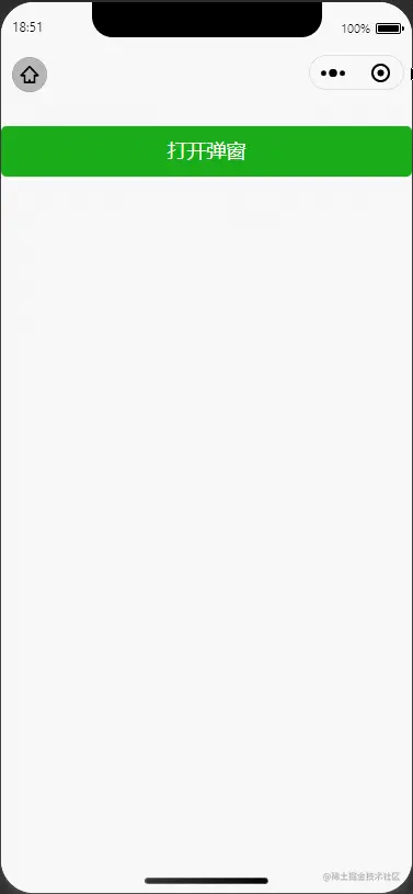
先看效果

