#柱形图
import pandas
import numpy
import matplotlib
from matplotlib import pyplot as plt
#导入数据
data_columns=pandas.read_csv('D://Python projects//reference data//6.4//data.csv')
#定义中文格式
font={'family':'MicroSoft Yahei',
'weight':'bold',
'size':12}
matplotlib.rc('font',**font)
#使用手机品牌作为分组列,月消费作为统计列
result_columns=data_columns.groupby(
by=['手机品牌'],
as_index=False)['月消费(元)'
].agg({'月总消费':numpy.sum
})
#生成一个间隔为1的序列
index=numpy.arange(result_columns.月总消费.size)
#绘制纵向柱形图
plt.bar(index,result_columns['月总消费'])
#%matplotlib qt
plt.show()
#配置颜色
maincolor=(42/256,87/256,141/256,1)
plt.bar(index,
result_columns['月总消费'])
plt.show()
#配置X轴标签
plt.bar(index,
result_columns['月总消费'])
plt.xticks(index,result_columns.手机品牌)
plt.show()
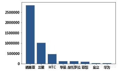
#对数据进行降序排序后展示
result_asd=result_columns.sort_values(
by='月总消费',
ascending=False)
plt.bar(index,
result_asd.月总消费,
color=maincolor)
plt.xticks(index,result_asd.手机品牌)
plt.show()结果为:
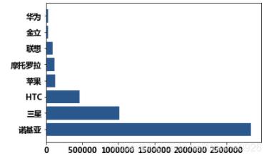
#横向柱形图
result_asd=result_columns.sort_values(
        by='月总消费',
        ascending=False)
plt.barh(index,
        result_asd.月总消费,
        color=maincolor)
plt.yticks(index,result_asd.手机品牌)
plt.show()
结果为:
#计算出交叉表的数据
result=data_columns.pivot_table(
        values='月消费(元)',
        index='手机品牌',
        columns='通信品牌',
        aggfunc=numpy.sum)
结果为:

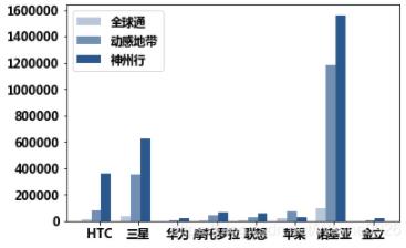
#定义三个颜色
index=numpy.arange(len(result))
mincolor=(42/256,87/256,141/256,1/3)
midcolor=(42/256,87/256,141/256,2/3)
maxcolor=(42/256,87/256,141/256,1)
#建立簇状柱形图
plt.bar(
        index,
        result['全球通'],
        color=mincolor,
        width=1/4)
plt.bar(
        index+1/4,
        result['动感地带'],
        color=midcolor,
        width=1/4)
plt.bar(
        index+1/2,
        result['神州行'],
        color=maxcolor,
        width=1/4)
plt.xticks(index+1/3,result.index)
#添加图例
plt.legend(['全球通','动感地带','神州行'])
plt.show()
结果为:
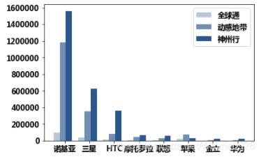
#重新排序进行绘制
result=result.sort_values(
        by='神州行',
        ascending=False)
plt.bar(
        index,
        result['全球通'],
        color=mincolor,
        width=1/4)
plt.bar(
        index+1/4,
        result['动感地带'],
        color=midcolor,
        width=1/4)
plt.bar(
        index+1/2,
        result['神州行'],
        color=maxcolor,
        width=1/4)
plt.xticks(index+1/3,result.index)
plt.legend(['全球通','动感地带','神州行'])
plt.show()
结果为:
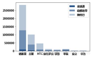
#绘制堆叠柱形图
result=result.sort_values(
        by='神州行',
        ascending=False)
plt.bar(
        index,
        result['全球通'],
        color=maxcolor)
plt.bar(
        index,
        result['动感地带'],
        bottom=result['全球通'],
        color=midcolor)
plt.bar(
        index,
        result['神州行'],
        bottom=result['全球通']+result['动感地带'],
        color=mincolor)
plt.xticks(index,result.index)
plt.legend(['全球通','动感地带','神州行'])
plt.show()
结果为:
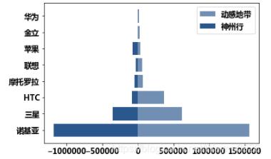
#绘制双向柱形图
plt.barh(
        index,
        result['神州行'],
        color=midcolor)
plt.barh(
        index,
        -result['动感地带'],
        color=maxcolor)
plt.yticks(index,
           result.index)
plt.legend(['动感地带','神州行'])
plt.show()
结果为: