通常情况下,我们在做小红点效果的时候,会有两种选择:
自定义BadgeView,然后设置给目标Viewxml写一个View,然后设置shape
有的同学可能会想,能实现不就行了吗,是的,代码优不优雅的不重要,代码和人只要有一个能跑就行…
不过,今天来介绍一种不同的方式来实现小红点效果,或许会让你眼前一亮~
Theme.MaterialComponents.*18+ 也就Android 4.3以上(api等级对应关系见文末)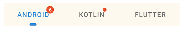
xml:
    <com.google.android.material.tabs.TabLayout
        android:id="@+id/tab_layout"
        android:layout_width="0dp"
        android:layout_height="wrap_content"
        android:layout_margin="10dp"
        android:background="#FFFAF0"
        android:textAllCaps="false"
        app:layout_constraintLeft_toLeftOf="parent"
        app:layout_constraintRight_toRightOf="parent"
        app:layout_constraintTop_toBottomOf="@+id/include"
        app:tabIndicator="@drawable/shape_tab_indicator"
        app:tabIndicatorColor="@color/colorPrimary"
        app:tabIndicatorFullWidth="false"
        app:tabMaxWidth="200dp"
        app:tabMinWidth="100dp"
        app:tabMode="fixed"
        app:tabSelectedTextColor="@color/colorPrimary"
        app:tabTextColor="@color/gray">

        <com.google.android.material.tabs.TabItem
            android:layout_width="wrap_content"
            android:layout_height="wrap_content"
            android:text="Android" />

        <com.google.android.material.tabs.TabItem
            android:layout_width="wrap_content"
            android:layout_height="wrap_content"
            android:text="Kotlin" />

        <com.google.android.material.tabs.TabItem
            android:layout_width="wrap_content"
            android:layout_height="wrap_content"
            android:text="Flutter" />

    </com.google.android.material.tabs.TabLayout>
kotlin:
    private fun initTabLayout() {
        // 带数字小红点
        mBinding.tabLayout.getTabAt(0)?.let {
            it.orCreateBadge.apply {
                backgroundColor = ContextCompat.getColor(this@BadgeDrawableActivity, R.color.red)
                badgeTextColor = ContextCompat.getColor(this@BadgeDrawableActivity, R.color.white)
                number = 6
            }
        }

        // 不带数字小红点
        mBinding.tabLayout.getTabAt(1)?.let {
            it.orCreateBadge.apply {
                backgroundColor = ContextCompat.getColor(this@BadgeDrawableActivity, R.color.red)
                badgeTextColor = ContextCompat.getColor(this@BadgeDrawableActivity, R.color.white)
            }
        }
    }

xml:
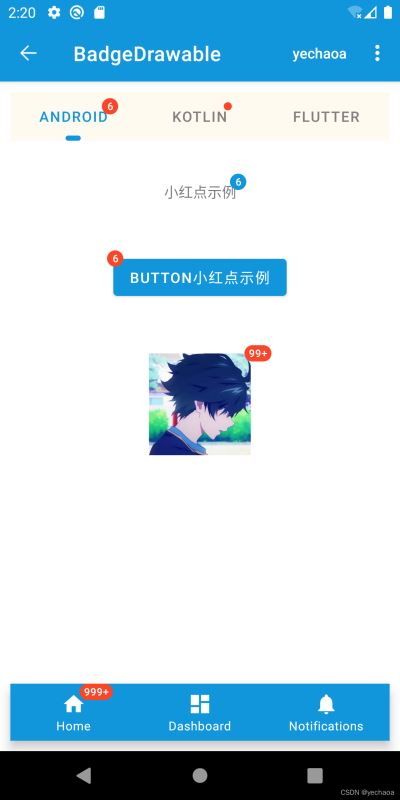
    <TextView
        android:id="@+id/tv_badge"
        android:layout_width="wrap_content"
        android:layout_height="wrap_content"
        android:layout_marginTop="30dp"
        android:text="小红点示例"
        android:textAllCaps="false"
        app:layout_constraintLeft_toLeftOf="parent"
        app:layout_constraintRight_toRightOf="parent"
        app:layout_constraintTop_toBottomOf="@+id/tab_layout" />
kotlin:
    private fun initTextView() {
        // 在视图树变化
        mBinding.tvBadge.viewTreeObserver.addOnGlobalLayoutListener(object : ViewTreeObserver.OnGlobalLayoutListener {
            override fun onGlobalLayout() {
                BadgeDrawable.create(this@BadgeDrawableActivity).apply {
                    badgeGravity = BadgeDrawable.TOP_END
                    number = 6
                    backgroundColor = ContextCompat.getColor(this@BadgeDrawableActivity, R.color.colorPrimary)
                    isVisible = true
                    BadgeUtils.attachBadgeDrawable(this, mBinding.tvBadge)
                }
                mBinding.tvBadge.viewTreeObserver.removeOnGlobalLayoutListener(this)
            }
        })
    }
xml:
    <FrameLayout
        android:id="@+id/fl_btn"
        android:layout_width="wrap_content"
        android:layout_height="wrap_content"
        android:layout_marginTop="30dp"
        android:padding="10dp"
        app:layout_constraintLeft_toLeftOf="parent"
        app:layout_constraintRight_toRightOf="parent"
        app:layout_constraintTop_toBottomOf="@+id/tv_badge">

        <com.google.android.material.button.MaterialButton
            android:id="@+id/mb_badge"
            android:layout_width="wrap_content"
            android:layout_height="wrap_content"
            android:text="Button小红点示例" />

    </FrameLayout>
kotlin:
    private fun initButton() {
        mBinding.mbBadge.viewTreeObserver.addOnGlobalLayoutListener(object : ViewTreeObserver.OnGlobalLayoutListener {
            @SuppressLint("UnsafeOptInUsageError")
            override fun onGlobalLayout() {
                BadgeDrawable.create(this@BadgeDrawableActivity).apply {
                    badgeGravity = BadgeDrawable.TOP_START
                    number = 6
                    backgroundColor = ContextCompat.getColor(this@BadgeDrawableActivity, R.color.red)
                    // MaterialButton本身有间距,不设置为0dp的话,可以设置badge的偏移量
                    verticalOffset = 15
                    horizontalOffset = 10
                    BadgeUtils.attachBadgeDrawable(this, mBinding.mbBadge, mBinding.flBtn)
                }
                mBinding.mbBadge.viewTreeObserver.removeOnGlobalLayoutListener(this)
            }
        })
    }
关于MaterialButton的使用及解析可查看:Android MaterialButton使用详解,告别shape、selector
xml:
    <FrameLayout
        android:id="@+id/fl_img"
        android:layout_width="match_parent"
        android:layout_height="wrap_content"
        android:layout_marginTop="30dp"
        android:padding="10dp"
        app:layout_constraintLeft_toLeftOf="parent"
        app:layout_constraintRight_toRightOf="parent"
        app:layout_constraintTop_toBottomOf="@+id/fl_btn">

        <com.google.android.material.imageview.ShapeableImageView
            android:id="@+id/siv_badge"
            android:layout_width="wrap_content"
            android:layout_height="wrap_content"
            android:layout_gravity="center"
            android:contentDescription="Image小红点示例"
            android:src="@mipmap/ic_avatar" />

    </FrameLayout>
kotlin:
    private fun initImageView() {
        mBinding.sivBadge.viewTreeObserver.addOnGlobalLayoutListener(object : ViewTreeObserver.OnGlobalLayoutListener {
            @SuppressLint("UnsafeOptInUsageError")
            override fun onGlobalLayout() {
                BadgeDrawable.create(this@BadgeDrawableActivity).apply {
                    badgeGravity = BadgeDrawable.TOP_END
                    number = 99999
                    // badge最多显示字符,默认999+ 是4个字符(带'+'号)
                    maxCharacterCount = 3
                    backgroundColor = ContextCompat.getColor(this@BadgeDrawableActivity, R.color.red)
                    BadgeUtils.attachBadgeDrawable(this, mBinding.sivBadge, mBinding.flImg)
                }
                mBinding.sivBadge.viewTreeObserver.removeOnGlobalLayoutListener(this)
            }
        })
    }
关于ShapeableImageView的使用及解析可查看:Android ShapeableImageView使用详解,告别shape、三方库
xml:
    <com.google.android.material.bottomnavigation.BottomNavigationView
        android:id="@+id/navigation_view"
        android:layout_width="0dp"
        android:layout_height="wrap_content"
        android:layout_margin="10dp"
        android:layout_marginStart="0dp"
        android:layout_marginEnd="0dp"
        android:background="?android:attr/windowBackground"
        app:itemBackground="@color/colorPrimary"
        app:itemIconTint="@color/white"
        app:itemTextColor="@color/white"
        app:layout_constraintBottom_toBottomOf="parent"
        app:layout_constraintLeft_toLeftOf="parent"
        app:layout_constraintRight_toRightOf="parent"
        app:menu="@menu/navigation" />
kotlin:
    private fun initNavigationView() {
        mBinding.navigationView.getOrCreateBadge(R.id.navigation_home).apply {
            backgroundColor = ContextCompat.getColor(this@BadgeDrawableActivity, R.color.red)
            badgeTextColor = ContextCompat.getColor(this@BadgeDrawableActivity, R.color.white)
            number = 9999
        }
    }
TabLayout和BottomNavigationView源码中直接提供了创建
BadgeDrawable的api,未提供的使用BadgeUtils。
| API | 描述 |
|---|---|
| backgroundColor | 背景色 |
| badgeTextColor | 文本颜色 |
| alpha | 透明度 |
| number | 显示的提示数字 |
| maxCharacterCount | 最多显示字符数量(99+包括‘+’号) |
| badgeGravity | 显示位置 |
| horizontalOffset | 水平方向偏移量 |
| verticalOffset | 垂直方向偏移量 |
| isVisible | 是否显示 |
来一段最简单的代码示例看看:
BadgeDrawable.create(this@BadgeDrawableActivity).apply {
    // ...
    BadgeUtils.attachBadgeDrawable(this, mBinding.mbBadge, mBinding.flBtn)
}
不难发现,有两个关键点:
下面继续跟一下,看看源码里究竟是做了什么
create实际调用的是构造方法:
  private BadgeDrawable(@NonNull Context context) {
    this.contextRef = new WeakReference<>(context);
    ThemeEnforcement.checkMaterialTheme(context);
    Resources res = context.getResources();
    badgeBounds = new Rect();
    shapeDrawable = new MaterialShapeDrawable();

    badgeRadius = res.getDimensionPixelSize(R.dimen.mtrl_badge_radius);
    badgeWidePadding = res.getDimensionPixelSize(R.dimen.mtrl_badge_long_text_horizontal_padding);
    badgeWithTextRadius = res.getDimensionPixelSize(R.dimen.mtrl_badge_with_text_radius);

    textDrawableHelper = new TextDrawableHelper(/* delegate= */ this);
    textDrawableHelper.getTextPaint().setTextAlign(Paint.Align.CENTER);
    this.savedState = new SavedState(context);
    setTextAppearanceResource(R.style.TextAppearance_MaterialComponents_Badge);
  }
构造方法里有这么一行:ThemeEnforcement.checkMaterialTheme(context); 检测Material主题,如果不是会直接抛出异常
  private static void checkTheme(
      @NonNull Context context, @NonNull int[] themeAttributes, String themeName) {
    if (!isTheme(context, themeAttributes)) {
      throw new IllegalArgumentException(
          "The style on this component requires your app theme to be "
              + themeName
              + " (or a descendant).");
    }
  }
这也是上面为什么说主题要使用Theme.MaterialComponents.*
然后创建了一个文本绘制帮助类,TextDrawableHelper
比如设置文本居中:textDrawableHelper.getTextPaint().setTextAlign(Paint.Align.CENTER);
其他的就是text属性的获取和设置,跟我们平时设置一毛一样,比较好理解。
绘制文本之后怎么显示出来呢?继续跟attachBadgeDrawable。
    public static void attachBadgeDrawable(@NonNull BadgeDrawable badgeDrawable, @NonNull View anchor, @Nullable FrameLayout customBadgeParent) {
        setBadgeDrawableBounds(badgeDrawable, anchor, customBadgeParent);
        if (badgeDrawable.getCustomBadgeParent() != null) {
            badgeDrawable.getCustomBadgeParent().setForeground(badgeDrawable);
        } else {
            if (USE_COMPAT_PARENT) {
                throw new IllegalArgumentException("Trying to reference null customBadgeParent");
            }
            anchor.getOverlay().add(badgeDrawable);
        }
    }
这里先是判断badgeDrawable.getCustomBadgeParent() != null,这个parent view的类型就是FrameLayout,不为空的情况下,层级前置。
为空的情况下先是判断了if (USE_COMPAT_PARENT),这里其实是对api level的判断
    static {
        USE_COMPAT_PARENT = VERSION.SDK_INT < 18;
    }
核心代码:
anchor.getOverlay().add(badgeDrawable);
如果有同学做过类似全局添加View的需求,这行代码就看着比较熟悉了。
ViewOverlay,视图叠加,也可以理解为浮层,在不影响子view的情况下,可以添加、删除View,这个api就是android 4.3加的,这也是为什么前面说api 要求18+。
ok,至此关于BadgeDrawable的使用和源码解析就介绍完了。
https://github.com/yechaoa/MaterialDesign
| Platform Version | API Level | VERSION_CODE |
|---|---|---|
| 13.0(beta) | ||
| 12.0 | 32 | S_V2 |
| 12.0 | 31 | S |
| 11.0 | 30 | R |
| 10.0 | 29 | Q |
| 9.0 | 28 | P |
| 8.1 | 27 | O_MR1 |
| 8.0 | 26 | O |
| 7.1 | 25 | N_MR1 |
| 7.0 | 24 | N |
| 6.0 | 23 | M |
| 5.1 | 22 | LOLLIPOP_MR1 |
| 5.0 | 21 | LOLLIPOP |
| 4.4w | 20 | KITKAT_WATCH |
| 4.4 | 19 | KITKAT |
| 4.3 | 18 | JELLY_BEAN_MR2 |
| 4.2 | 17 | JELLY_BEAN_MR1 |
| 4.1 | 16 | JELLY_BEAN |
| 4.0.3 | 15 | ICE_CREAM_SANDWICH_MR1 |
| 4.0 | 14 | ICE_CREAM_SANDWICH |
| 3.2 | 13 | HONEYCOMB_MR2 |
| 3.1 | 12 | HONEYCOMB_MR1 |
| 3.0 | 11 | HONEYCOMB |
| 2.3.3-2.3.4 | 10 | GINGERBREAD_MR1 |
| 2.3.0-2.3.2 | 9 | GINGERBREAD |
| 2.2 | 8 | FROYO |
| 2.1 | 7 | ECLAIR_MR1 |
| 2.0.1 | 6 | ECLAIR_0_1 |
| 2.0 | 5 | ECLAIR |
| 1.6 | 4 | DONUT |
| 1.5 | 3 | CUPCAKE |
| 1.1 | 2 | BASE_1_1 |
| 1.0 | 1 | BASE |

